
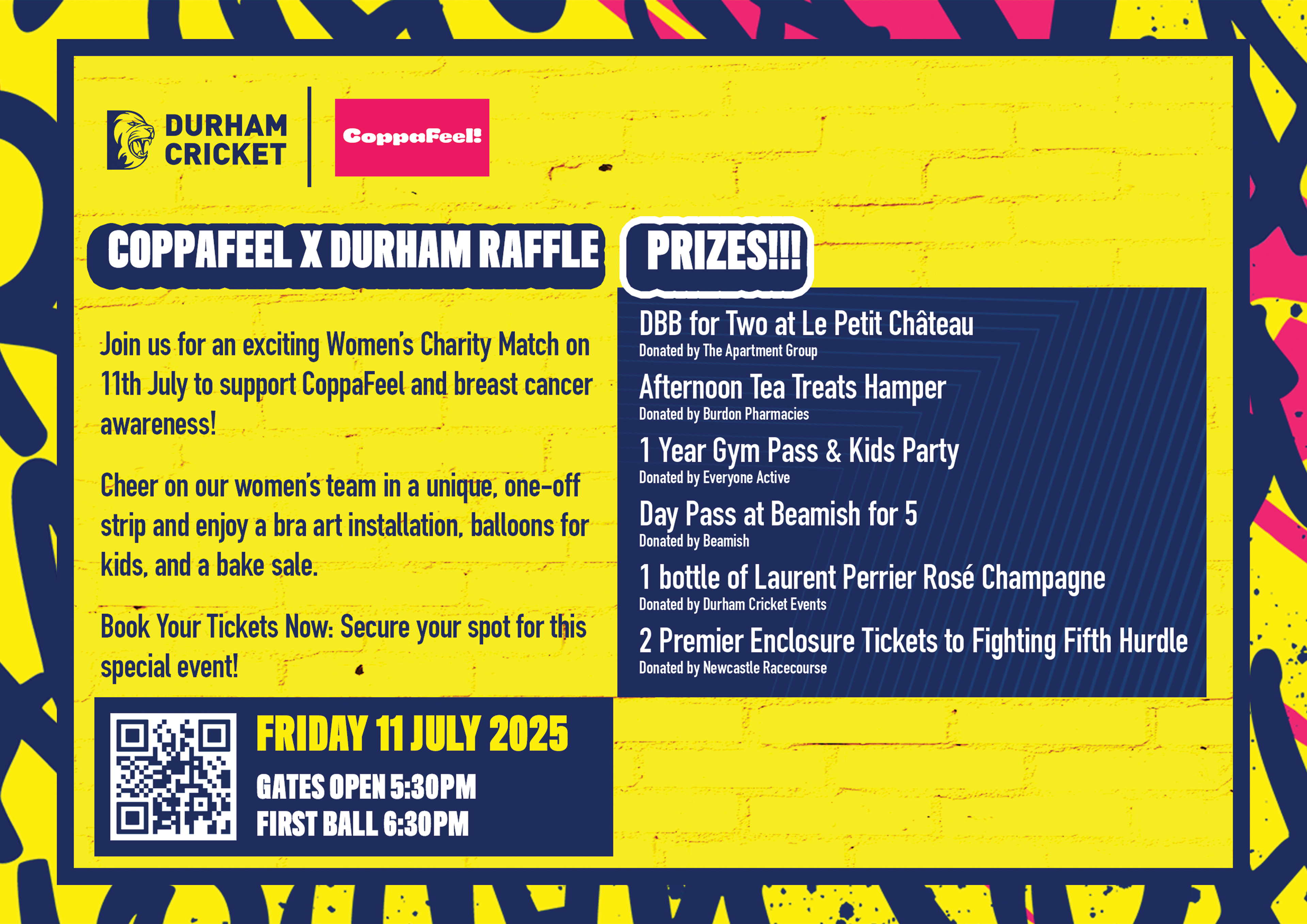
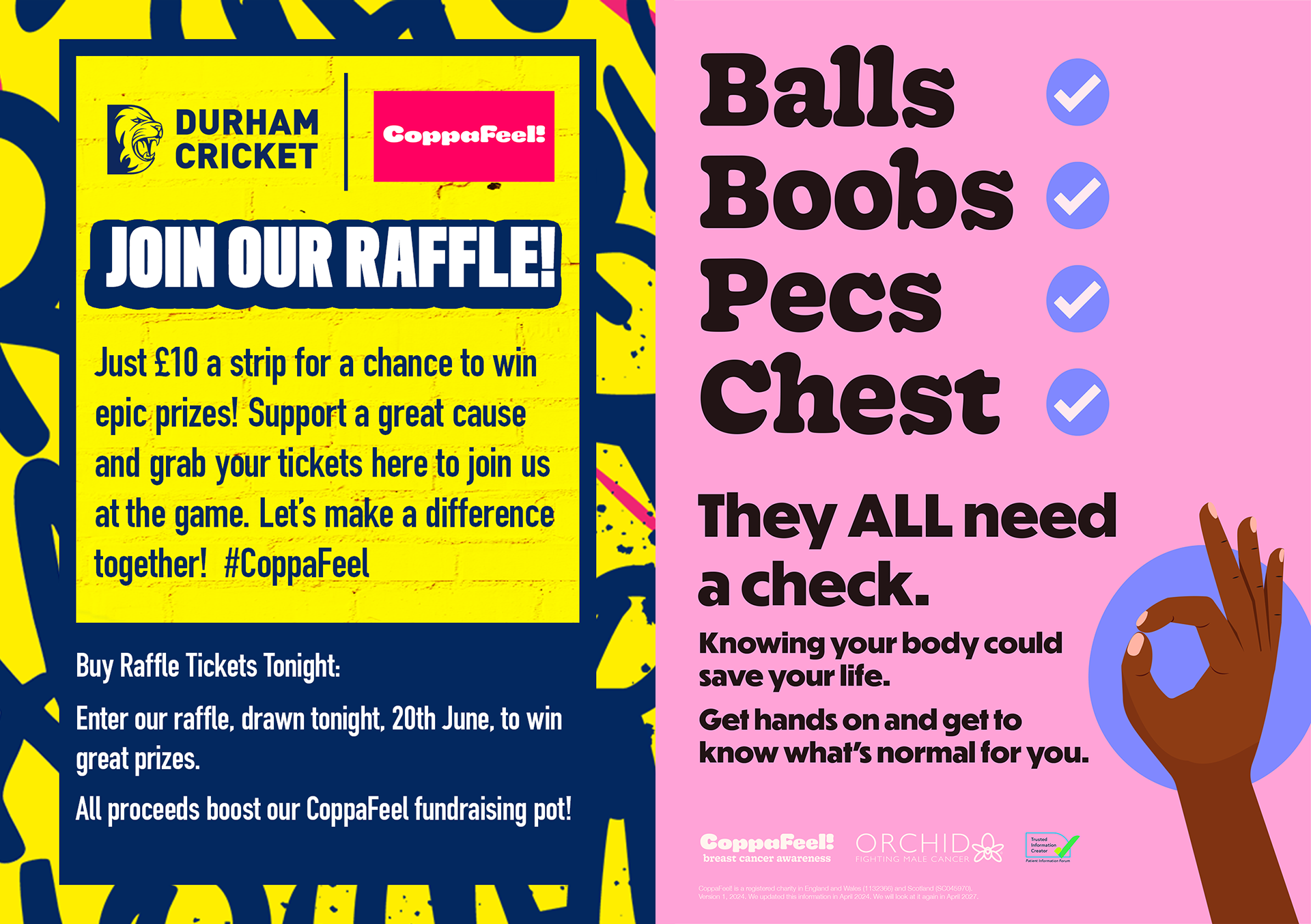
Project Overview
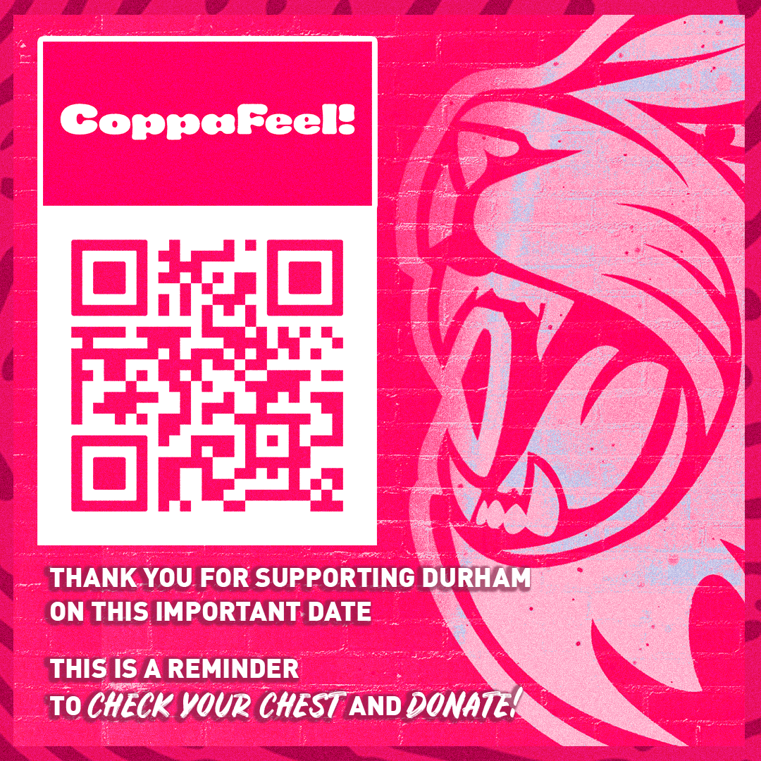
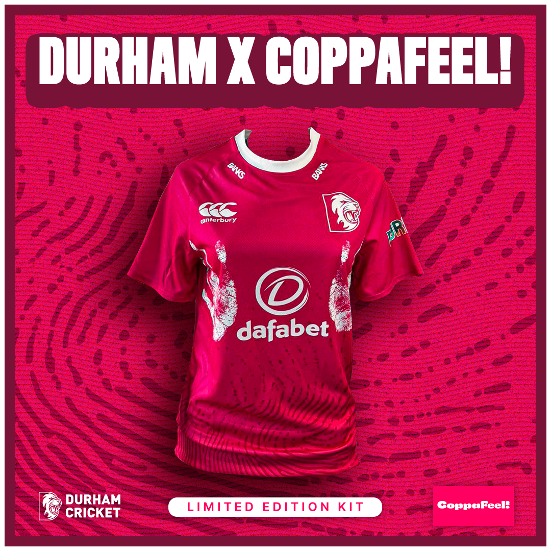
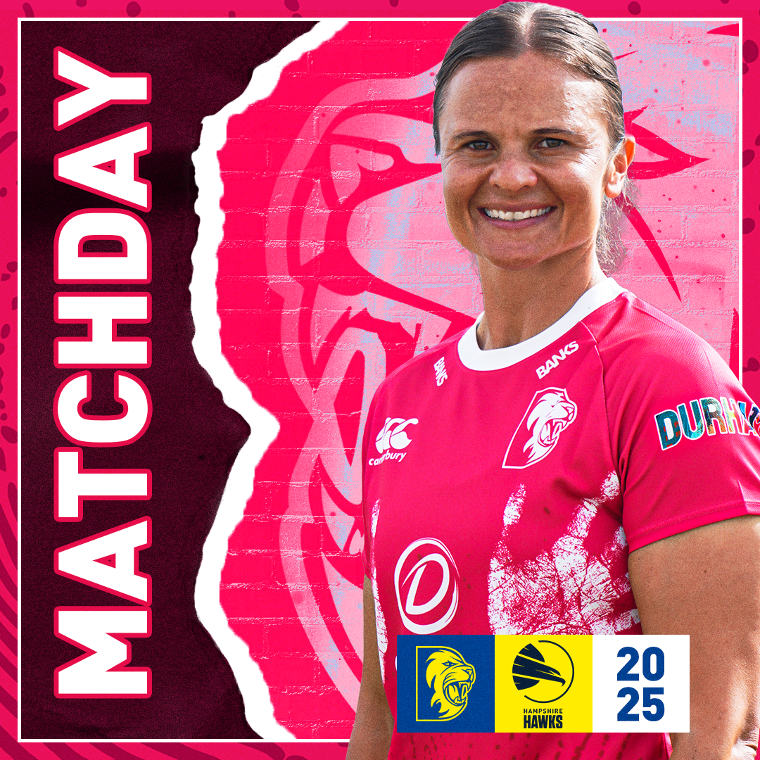
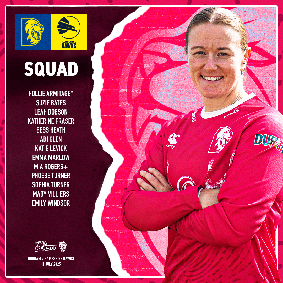
Durham Cricket partnered with CoppaFeel! for a special pink-themed T20 match aimed at raising awareness for breast cancer. I was tasked with rebranding our existing T20 marketing materials to align with CoppaFeel!’s visual identity. This included adapting our usual design templates and introducing a fresh colour palette, alternative patterns, and a softer tone to suit the campaign. It was a fun and creatively rewarding project, as it allowed me to step away from Durham’s traditional blue and yellow branding and explore a completely different look while still keeping the designs professional, on-brand, and campaign-appropriate.
This supports me in evidencing KSB: K1, K2, K4, K7, S1, S2, S4, S5, B1, B2, B4, B5.

Project Reflection
The CoppaFeel! graphics received great feedback and helped make the campaign feel unique and eye-catching, thanks to the bold pink colour scheme and break from our usual Durham palette. The designs played an important role in raising awareness and contributing to the success of the event, which raised a strong amount of money for CoppaFeel! and generated a lot of positive attention across social channels.
One standout moment was that one of our players, Emily Windsor had this as her debut game due to not starting earlier due to injury. She also had previously played with someone affected by breast cancer, which made the occasion even more meaningful. On top of that, we won the game – adding to the overall success of the campaign.
If I were to improve anything, I’d have liked to explore more physical applications of the graphics or develop more animated assets. However, the overall outcome was strong and I’m proud of the work produced.
This supports me in evidencing KSB: K1, K2, K7, S1, S2, S4, B1, B2, B4, B5.