Project Overview
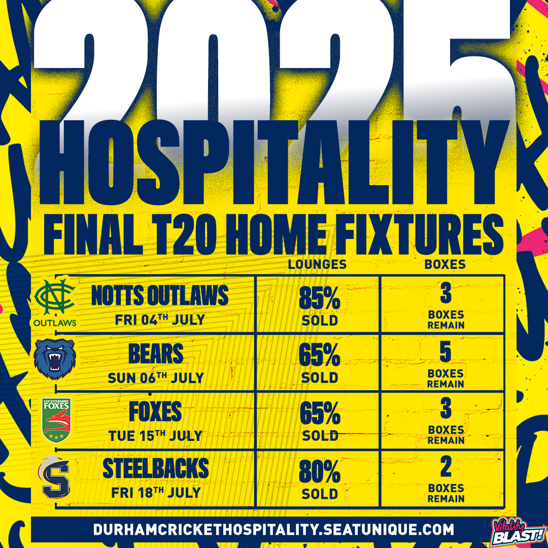
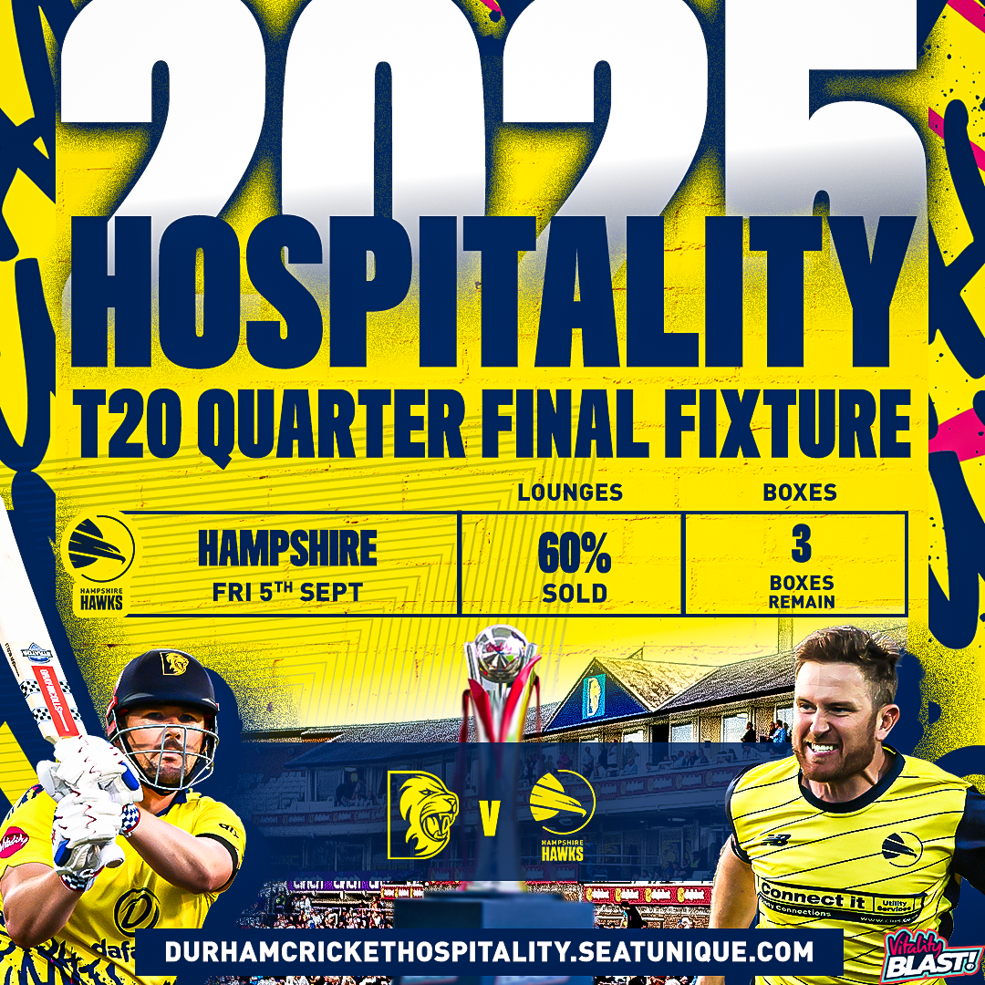
The aim of these graphics was to help sell and market the tickets. These designs went through several updates during the build-up to the season as phrases were added and removed to create scarcity and encourage urgency, such as ‘only 100 left’ or ‘early bird prices’. This helped make fans feel the need to buy their tickets quickly.
This supports me in evidencing KSB: K1, K2, K7, S1, S2, S4, S5, B1, B2, B3, B4, B5.


Project Reflection
Looking back at creating these graphics I would experiment a bit more with the typography as I found the new dynamic text tool in Photoshop was very effective for vertical alignment and will continue to use this going forward. Initially the first graphic wasn't really following any guidelines as I had just started my role as a new designer at Durham. As you can see the T20 graphics in particular became more 'on brand' , as later on more towards the season beginning, I was able to adapt the kit pattern and use that in our T20 Marketing materials. I was able to use this pattern and style in graphics going forward keeping it on brand, which I feel I have done very effectively.
This supports me in evidencing KSB: K1, K2, K7, S1, S2, S4, B1, B2, B4, B5.