Project Overview
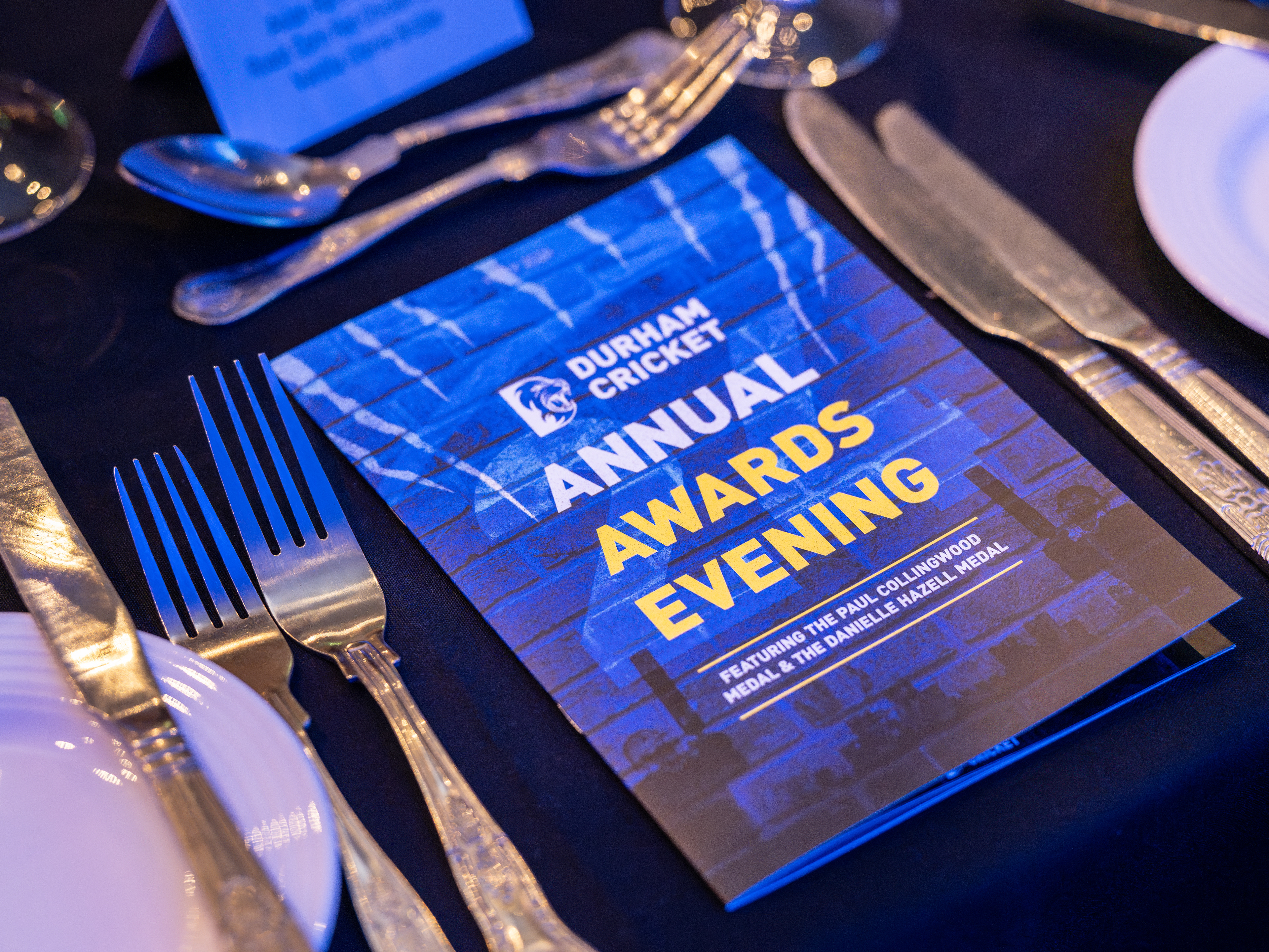
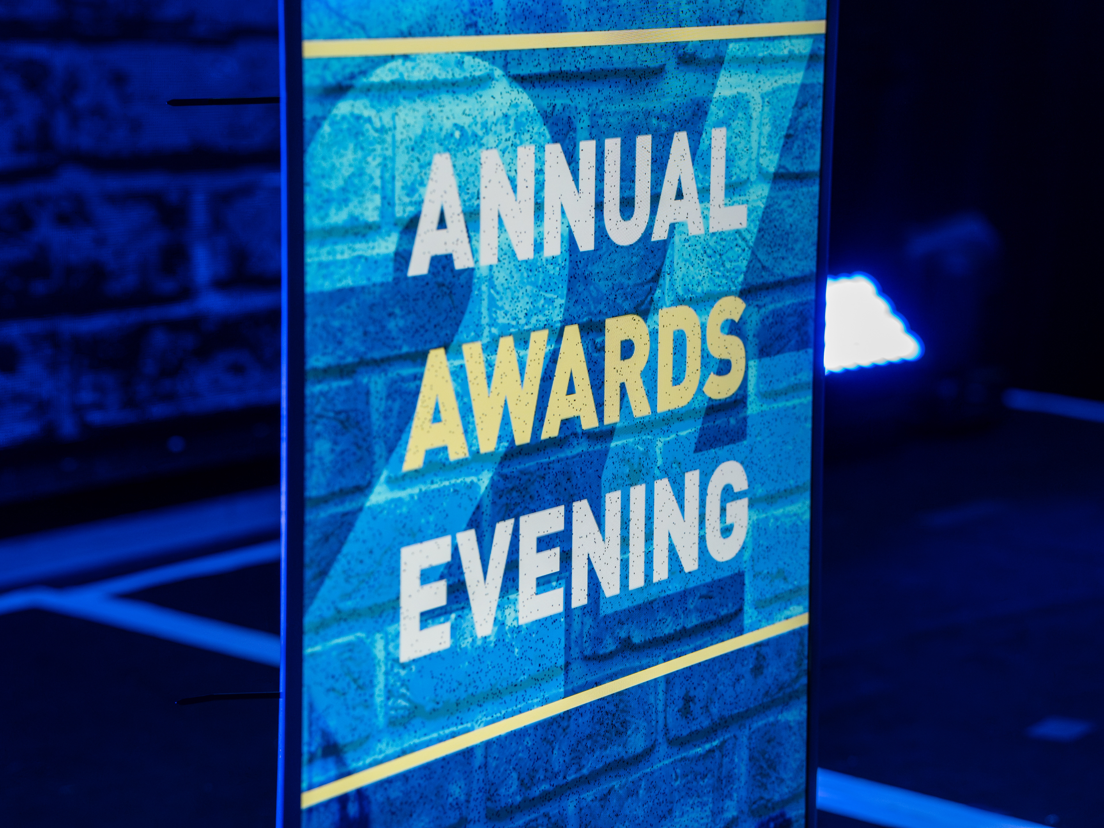
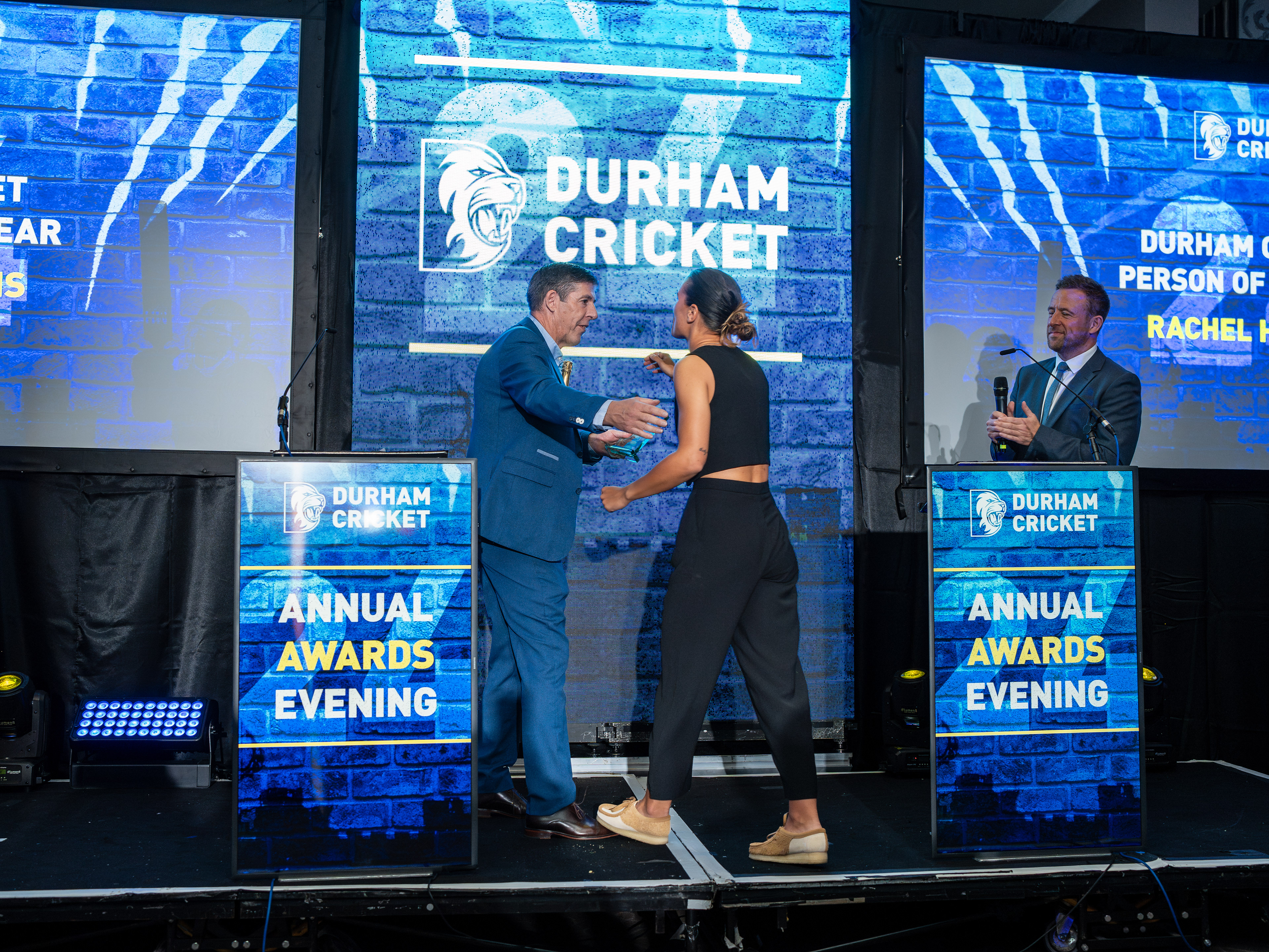
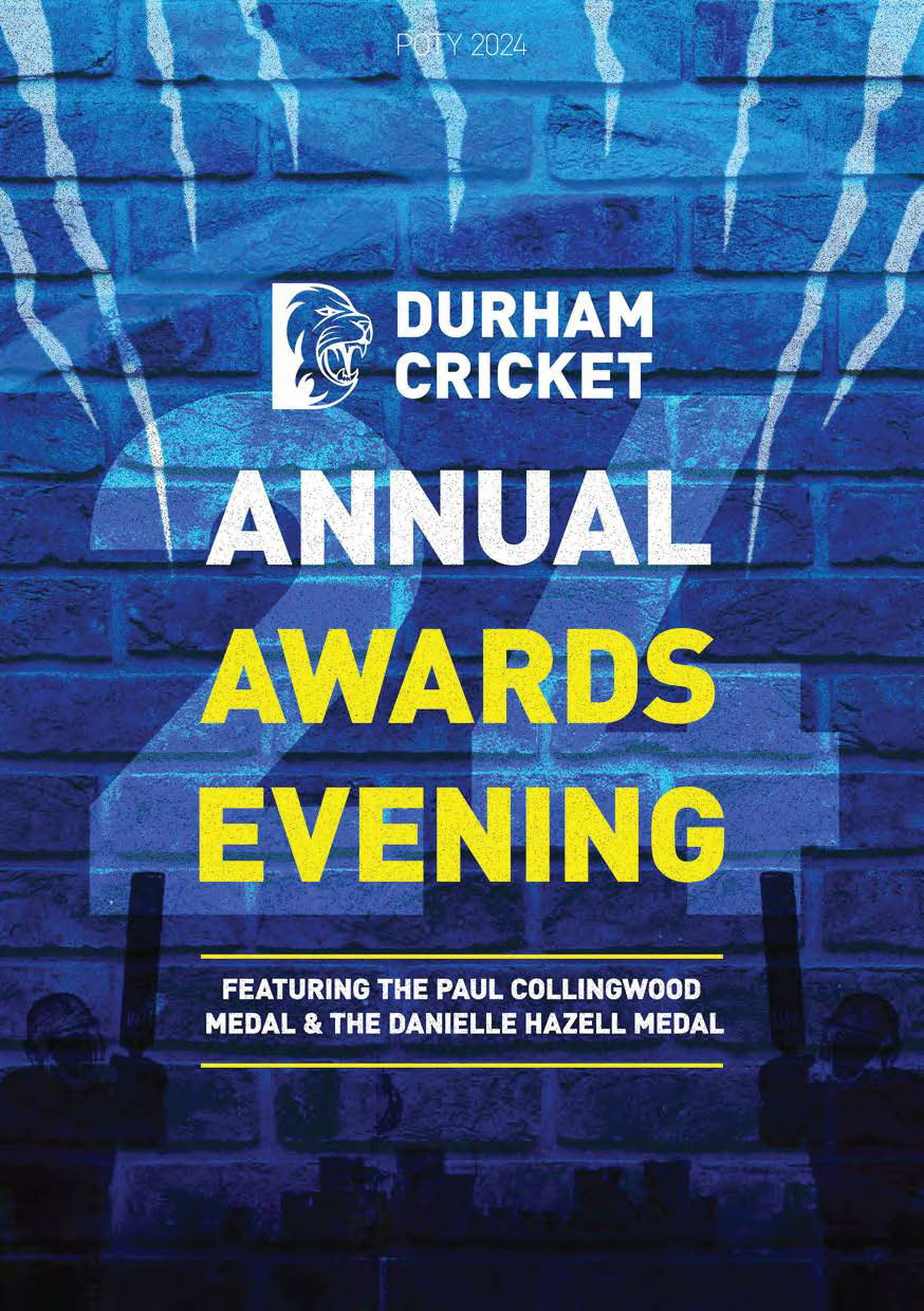
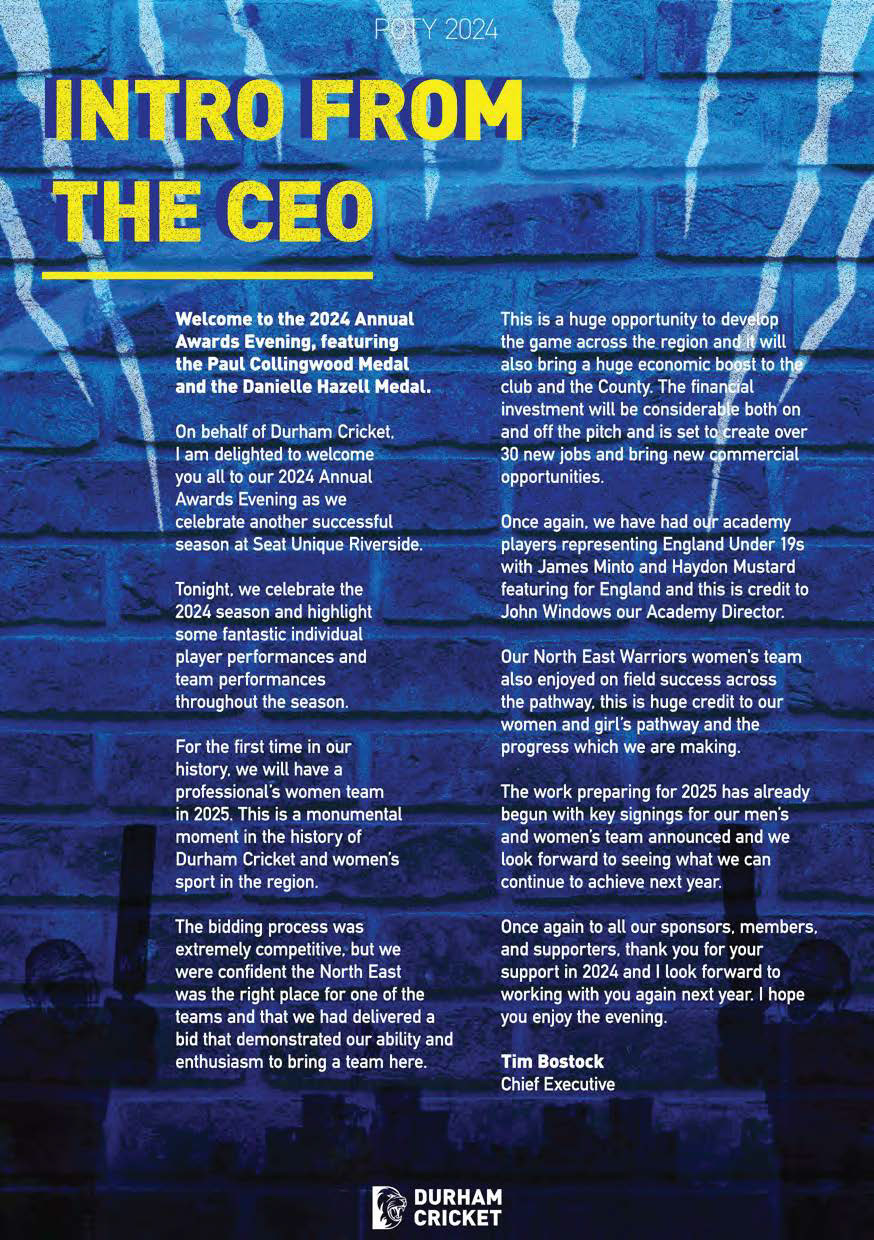
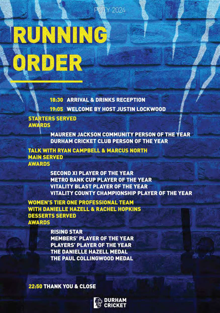
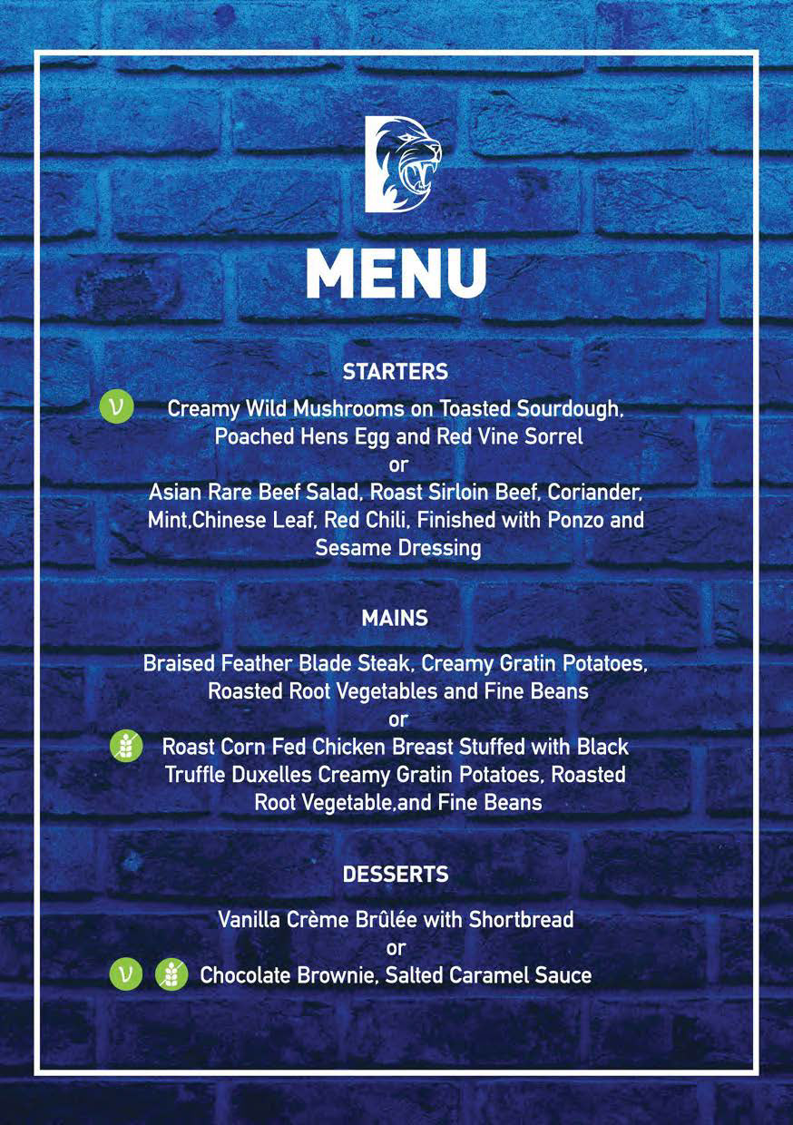
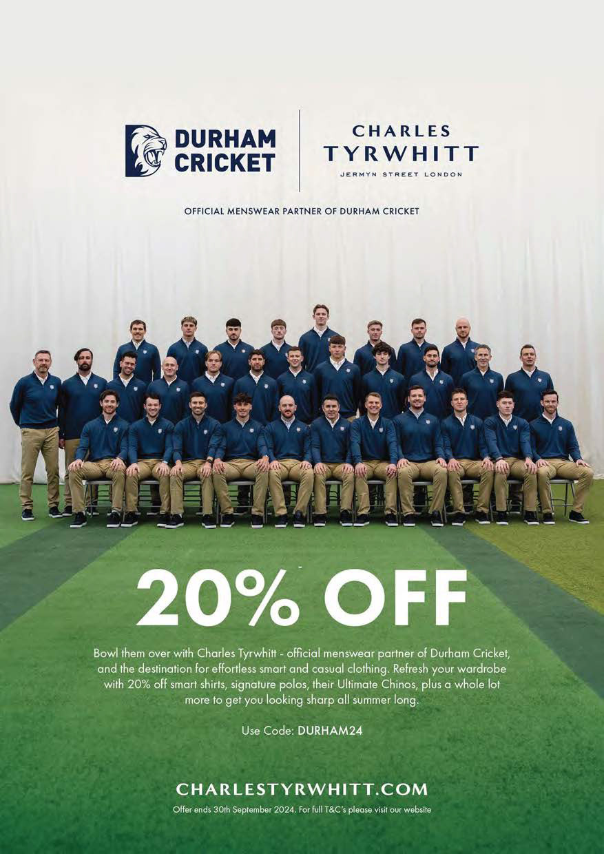
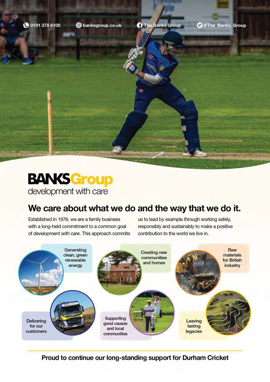
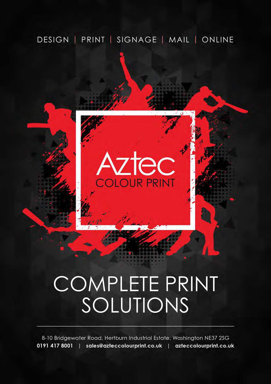
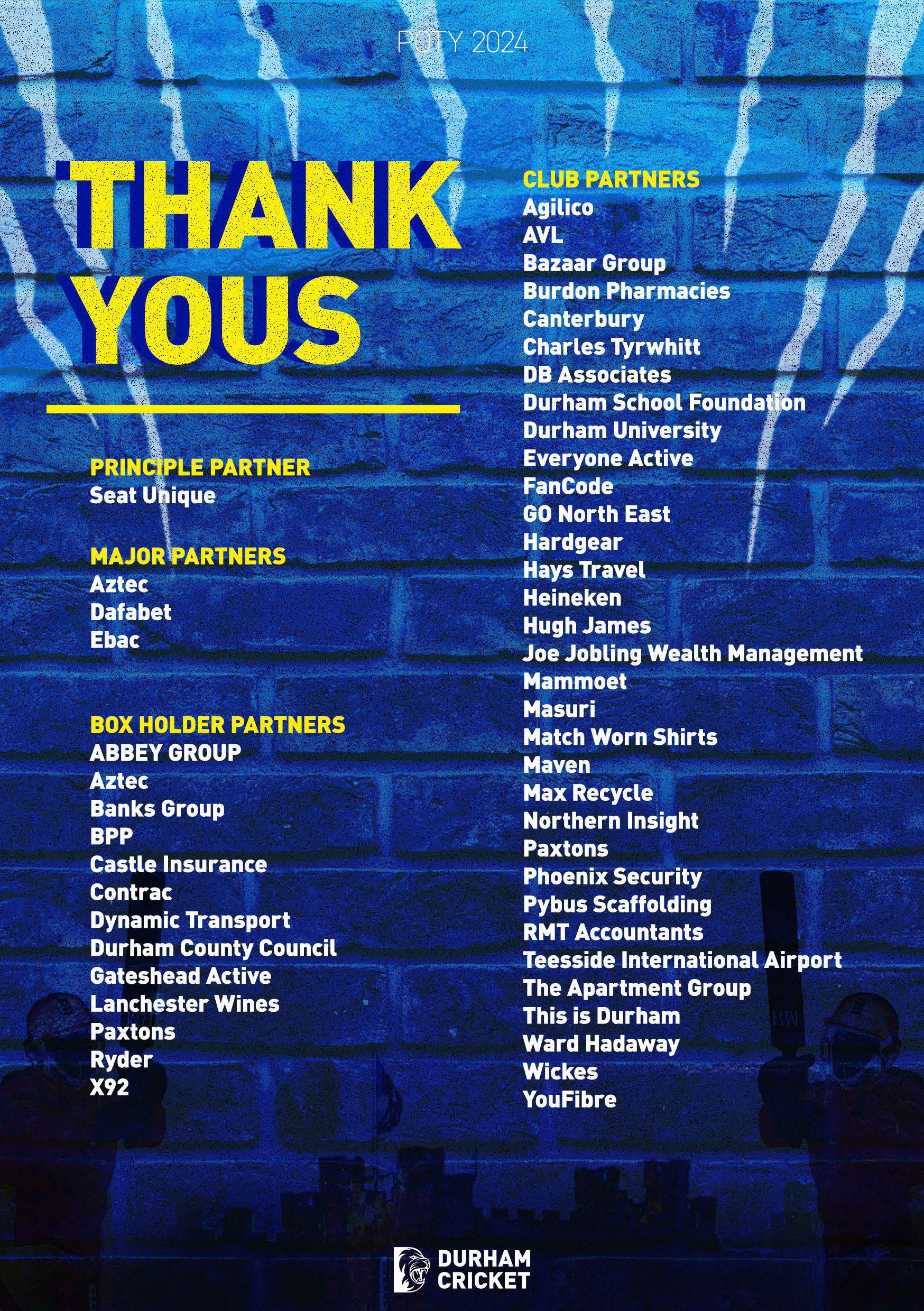
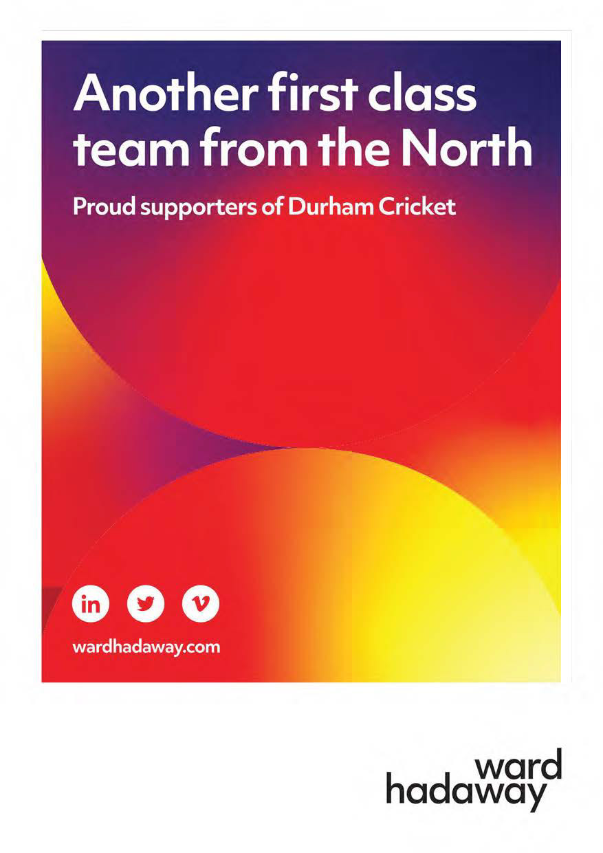
The aim of these materials was to support Durham Cricket’s Annual Awards Evening, held at Ramside Hall. This event celebrated standout player performances across the season. I was responsible for producing a full suite of designs for the evening including printed brochures featuring menus, sponsor recognition and thank you messages. Alongside this I created presentation slides used throughout the ceremony and developed large scale graphics for visual impact at the venue.
This supports me in evidencing KSB: K1, K2, K7, S1, S2, S4, B1, B2, B4, B5.






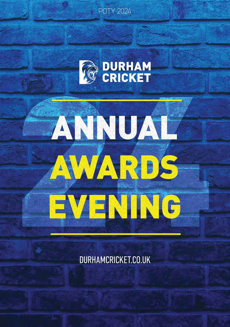
Annual Awards Evening Brochure Reflection
Overall, for my first ever brochure design I think this went really well. I received great feedback from team members and other staff who attended the event, which gave me a lot of confidence. I designed this using Photoshop as at the time I didn’t yet know how to use Indesign, which really shows how far I’ve come and how much I’ve developed as a designer since joining Durham Cricket with this being my first major design task.
This supports me in evidencing KSB: K1, K2, K7, S1, S2, S4, B1, B2, B4, B5.
Hospitality Brochure - Project Overview
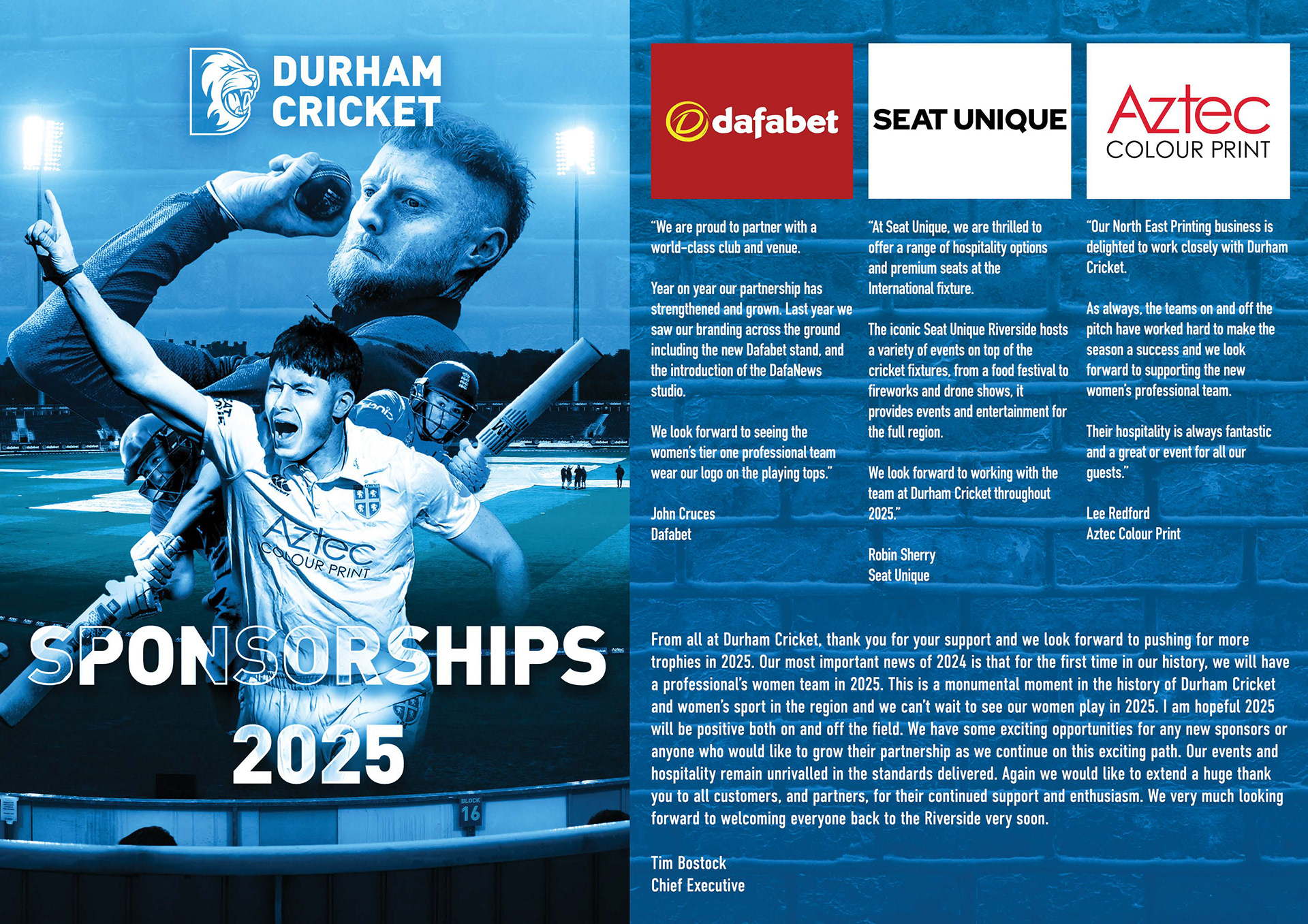
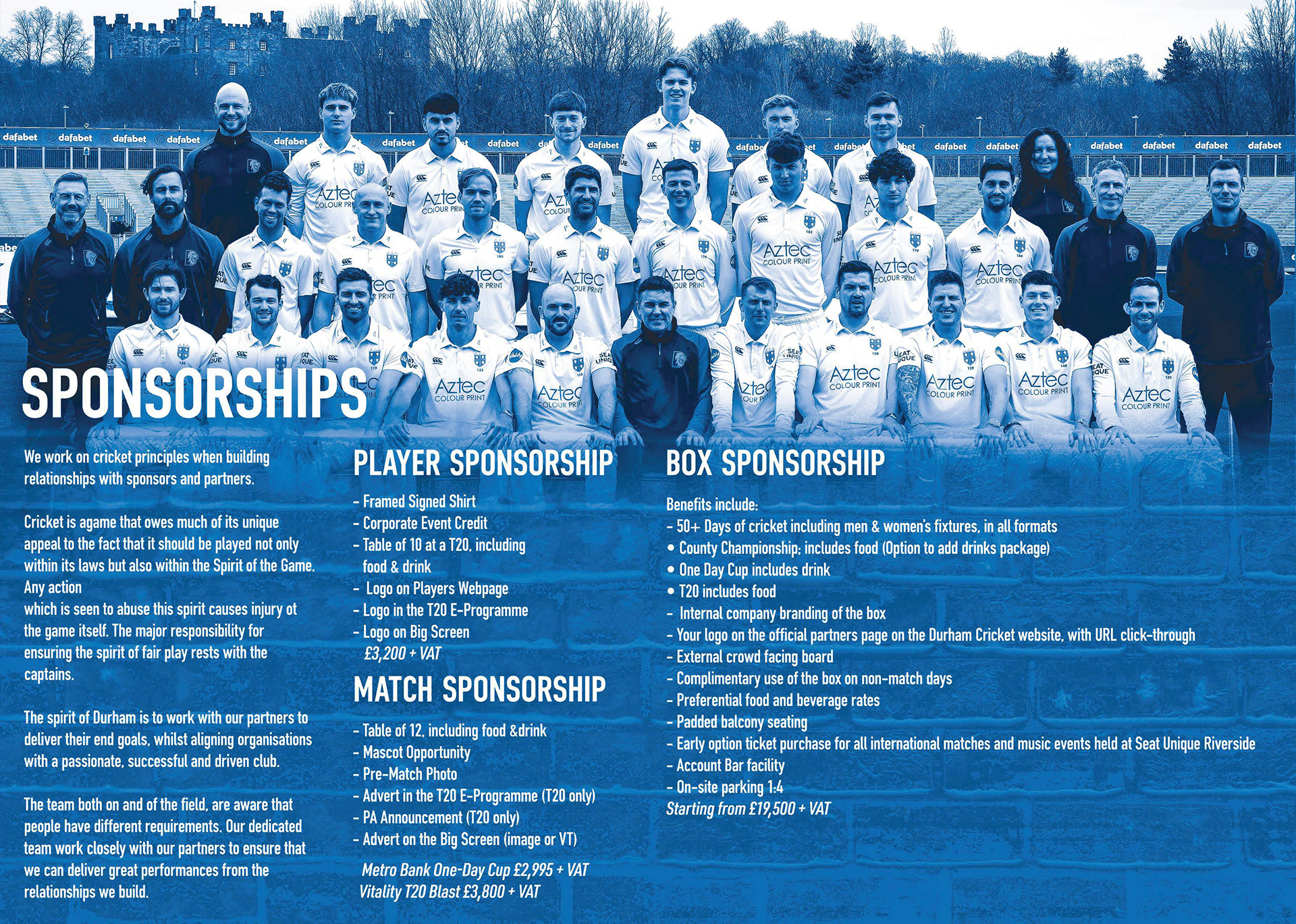
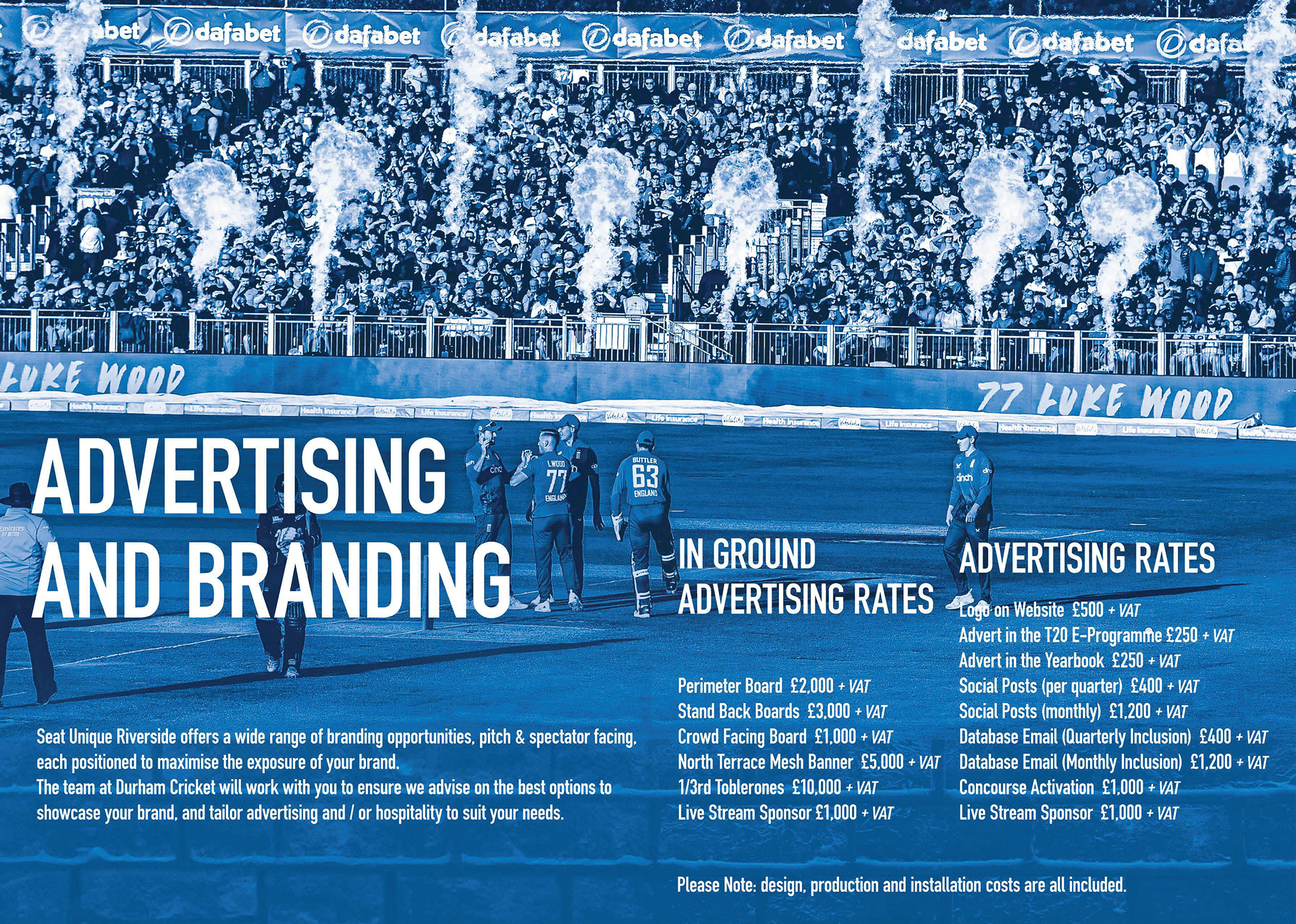
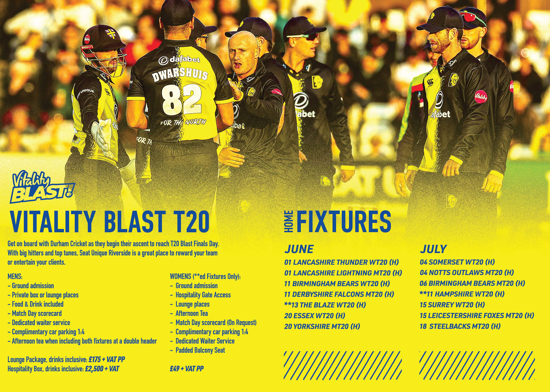
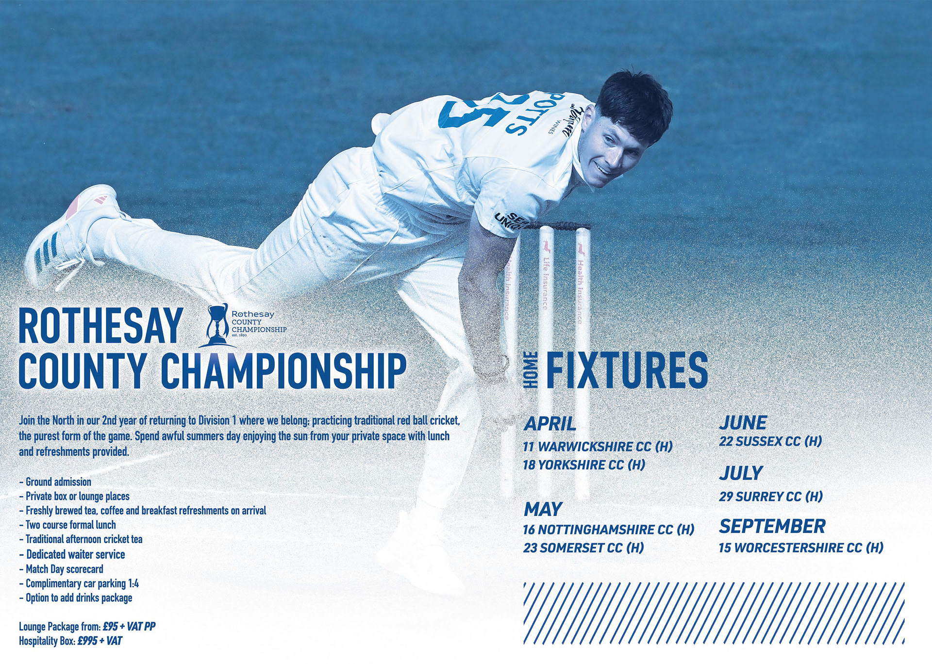
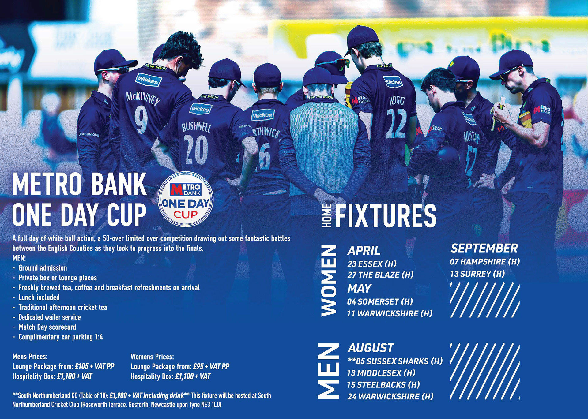
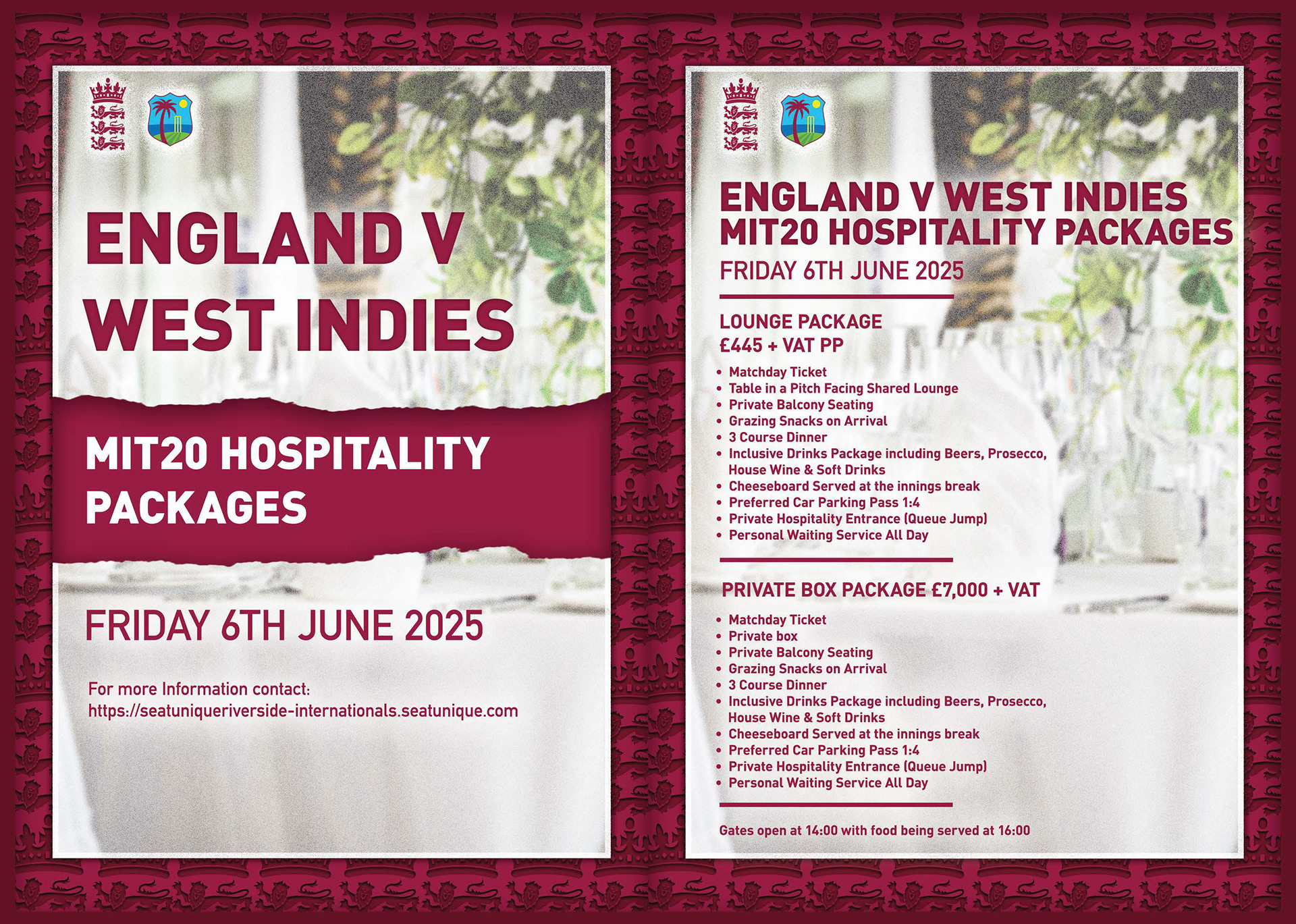
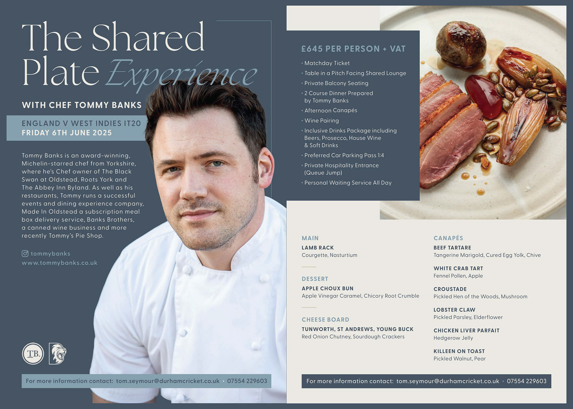
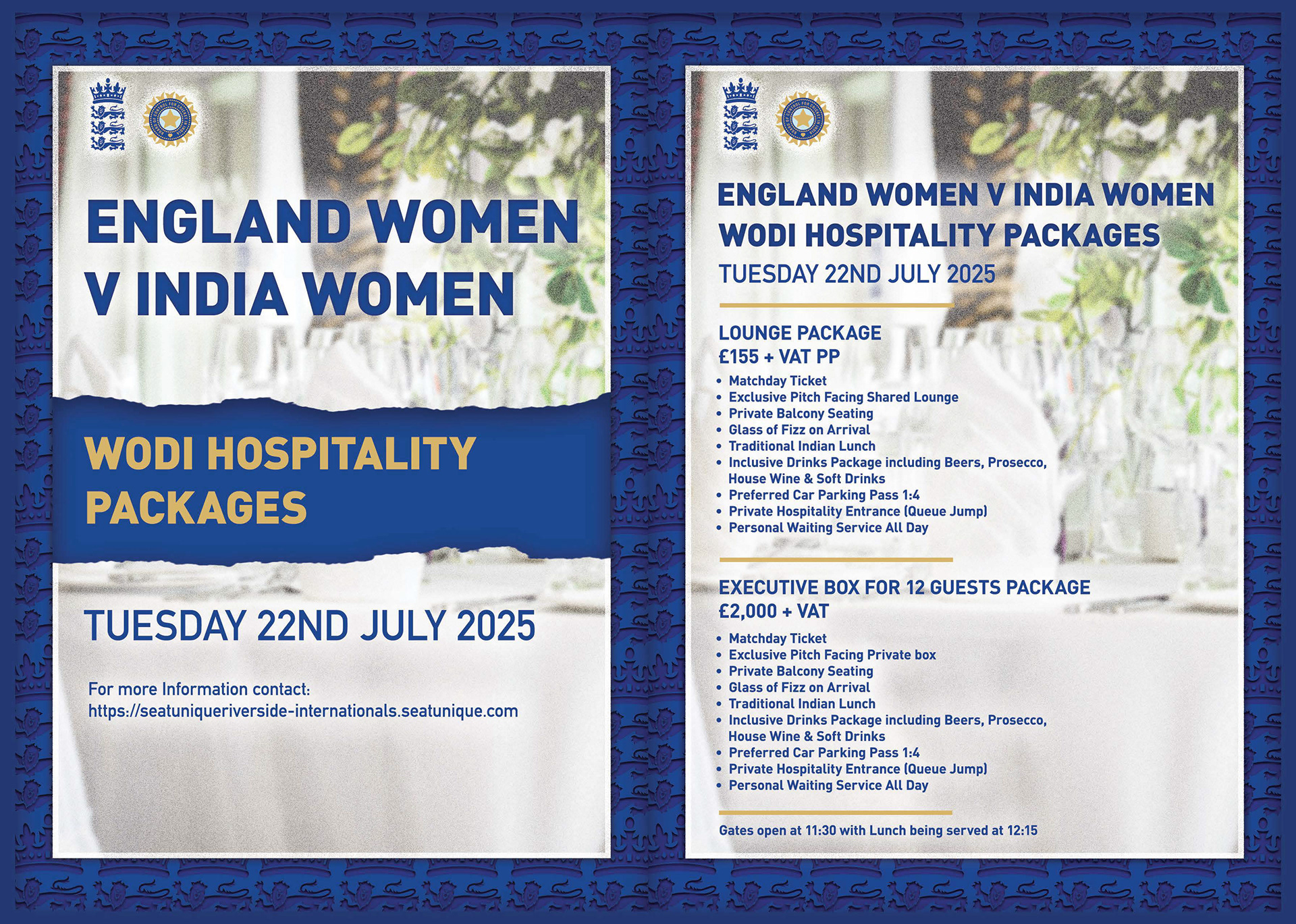
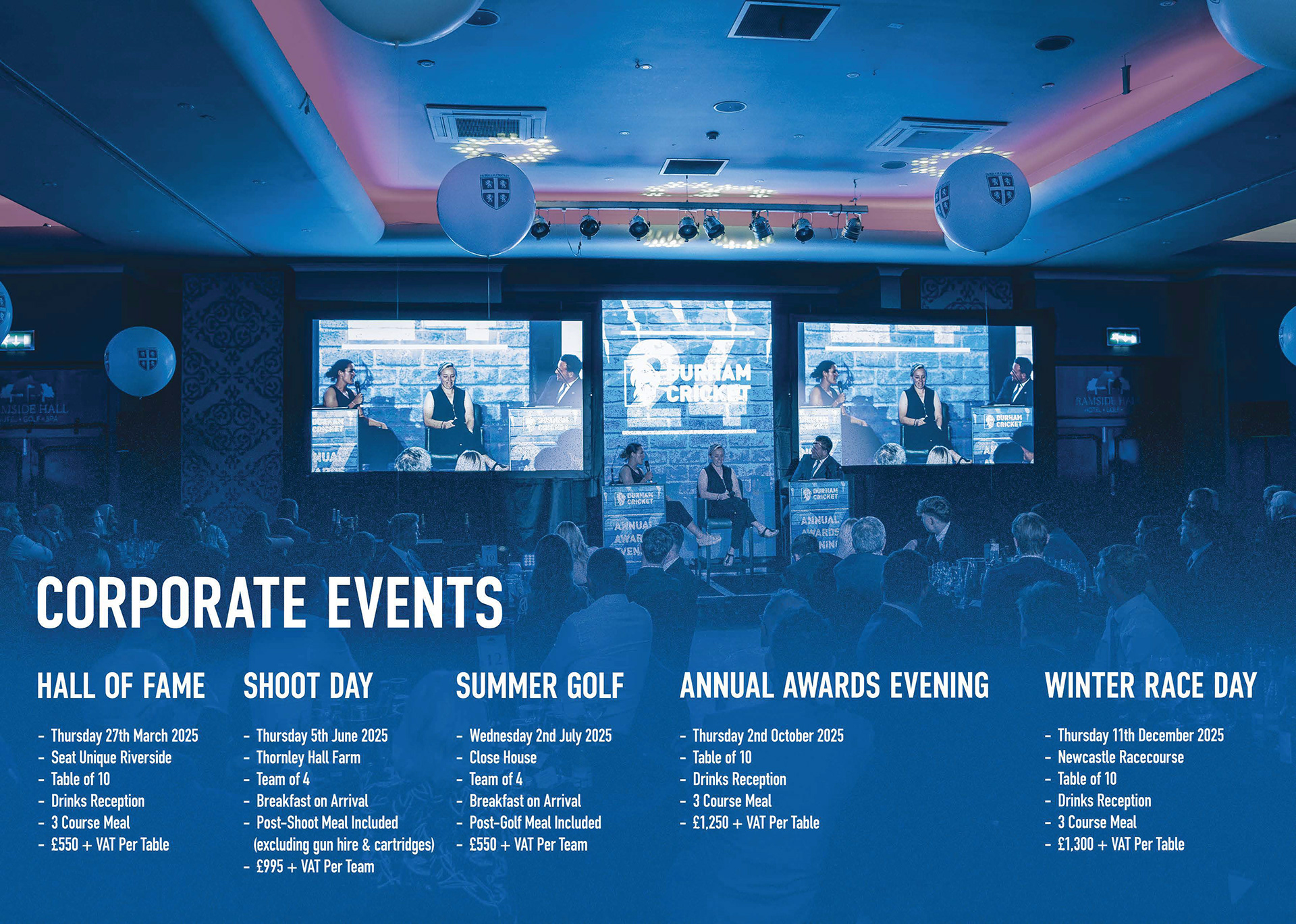
This aim of this project was to produce a brochure that could be used both digitally and for print. This brochure was created to show Durham Cricket's offerings for company Sponsorships, advertising and branding around our ground, hospitality options for our international fixtures, aswell as corporate events. I created this for the Commercial Director who takes charge on selling these offerings.
This supports me in evidencing KSB: K1, K2, K7, S1, S2, S4, B1, B2, B4, B5.


Project Reflection
Overall this project was a success as I made the job of selling these offerings easier by creating a visually appealing design for the brochure pages, especially for cover pages and the international offerings as these were made to feel premium, which is easier to sell than a boring bland page. However the design process of this could be streamlined better and made more efficient. This helped me realise that Indesign would be a better suited method for the formatting slides, whereas we can keep using photoshop for most of the photo editing and designs. Creating a workflow between softwares to use their main advantages and avoid their disadvantages by using another softwares advantage is the way forward which I will be thinking about more on future designs, to improve my creative process.
This supports me in evidencing KSB: K1, K2, K7, S1, S2, S4, B1, B2, B4, B5.
Project Overview
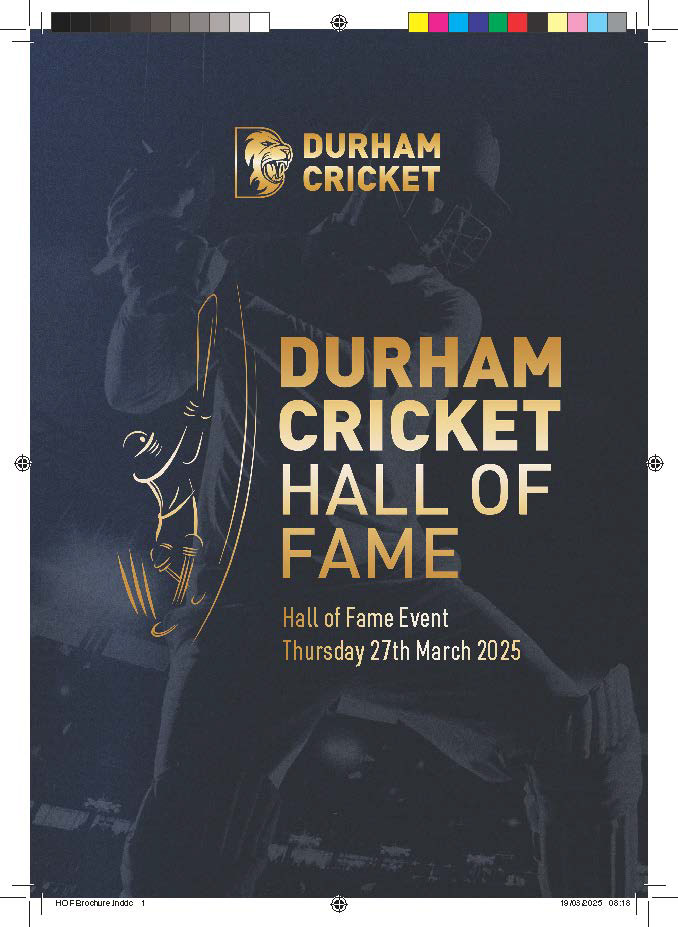
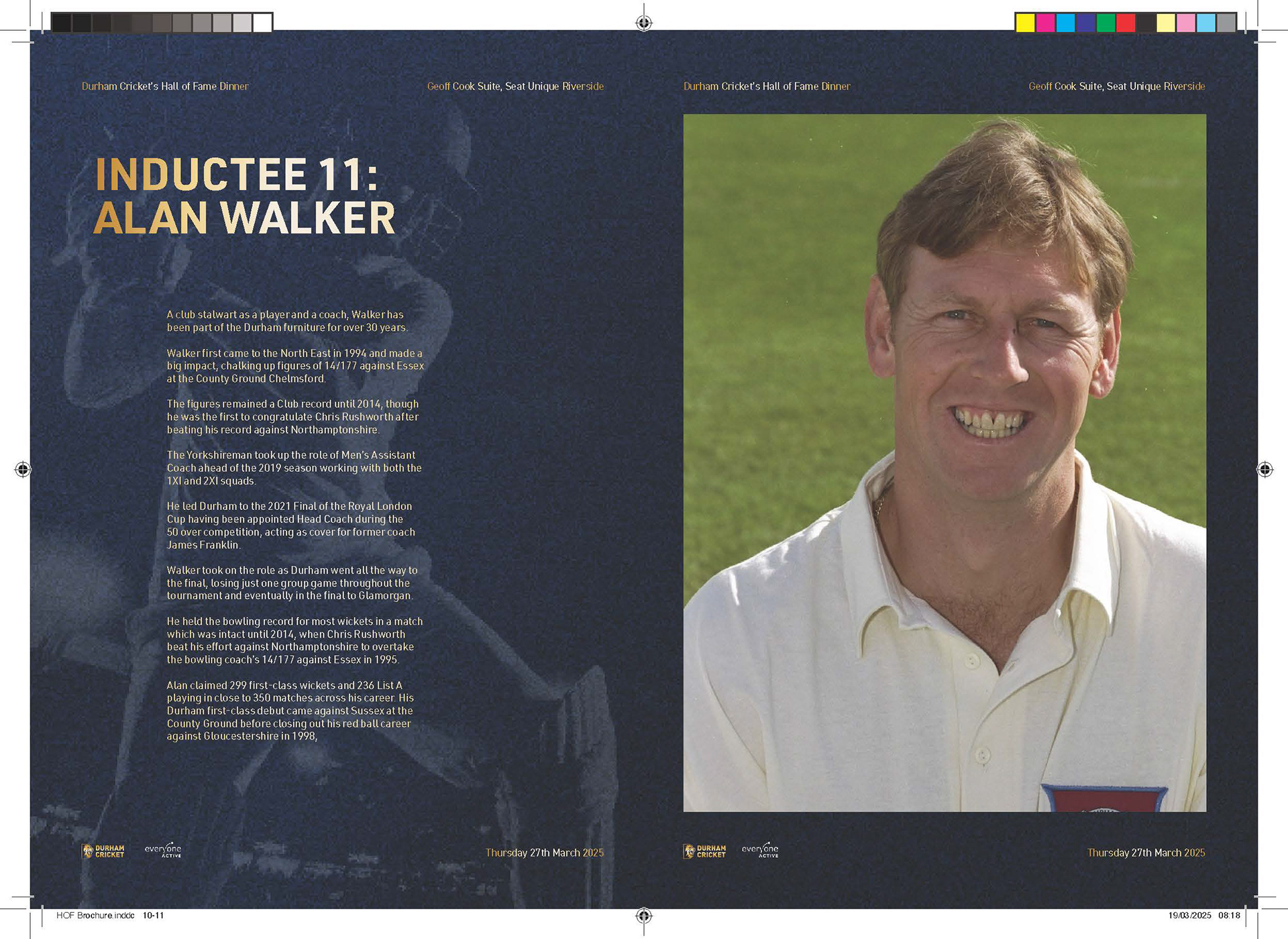
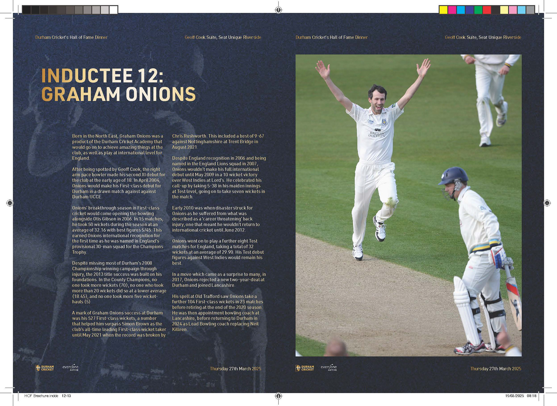
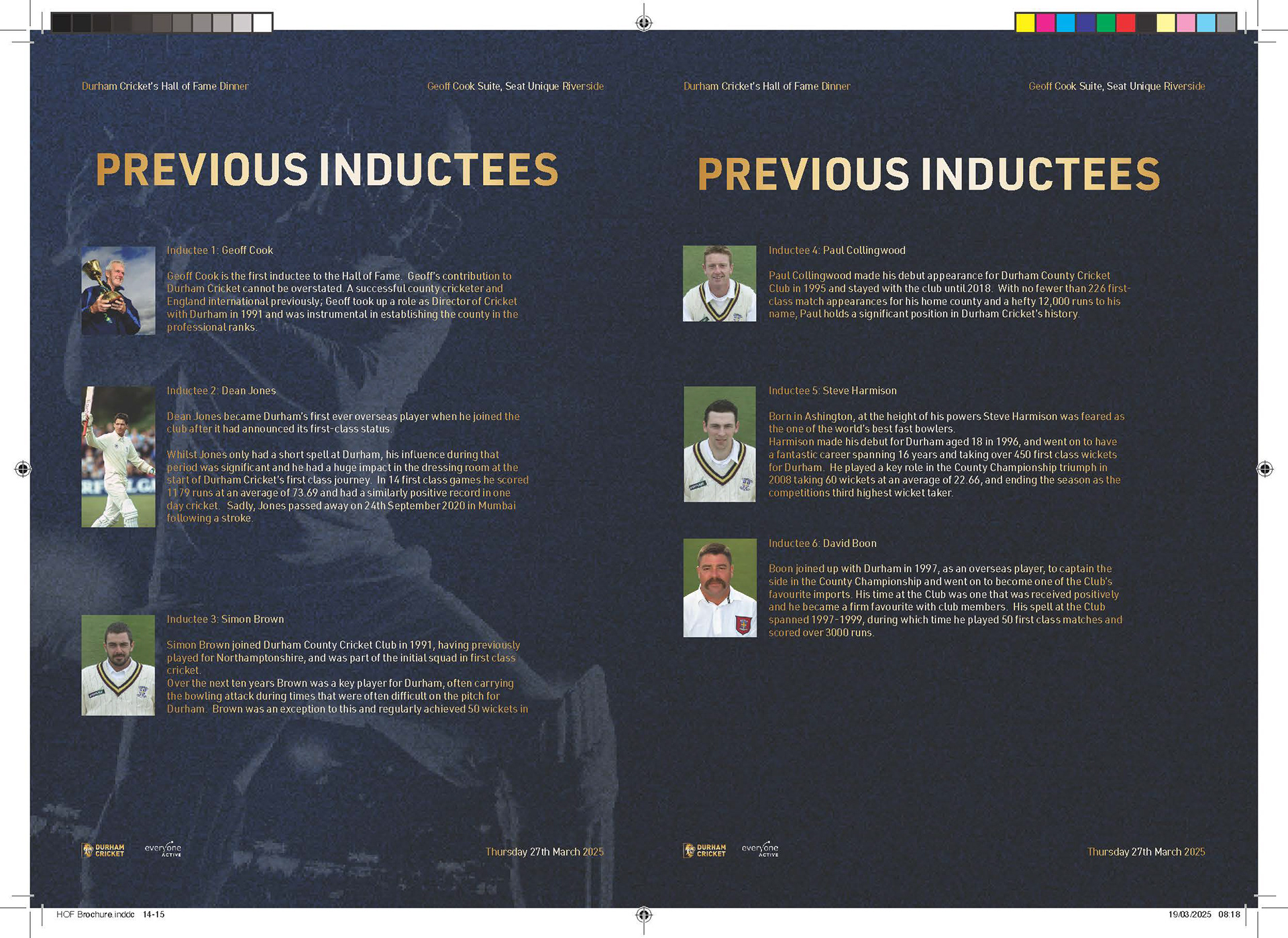
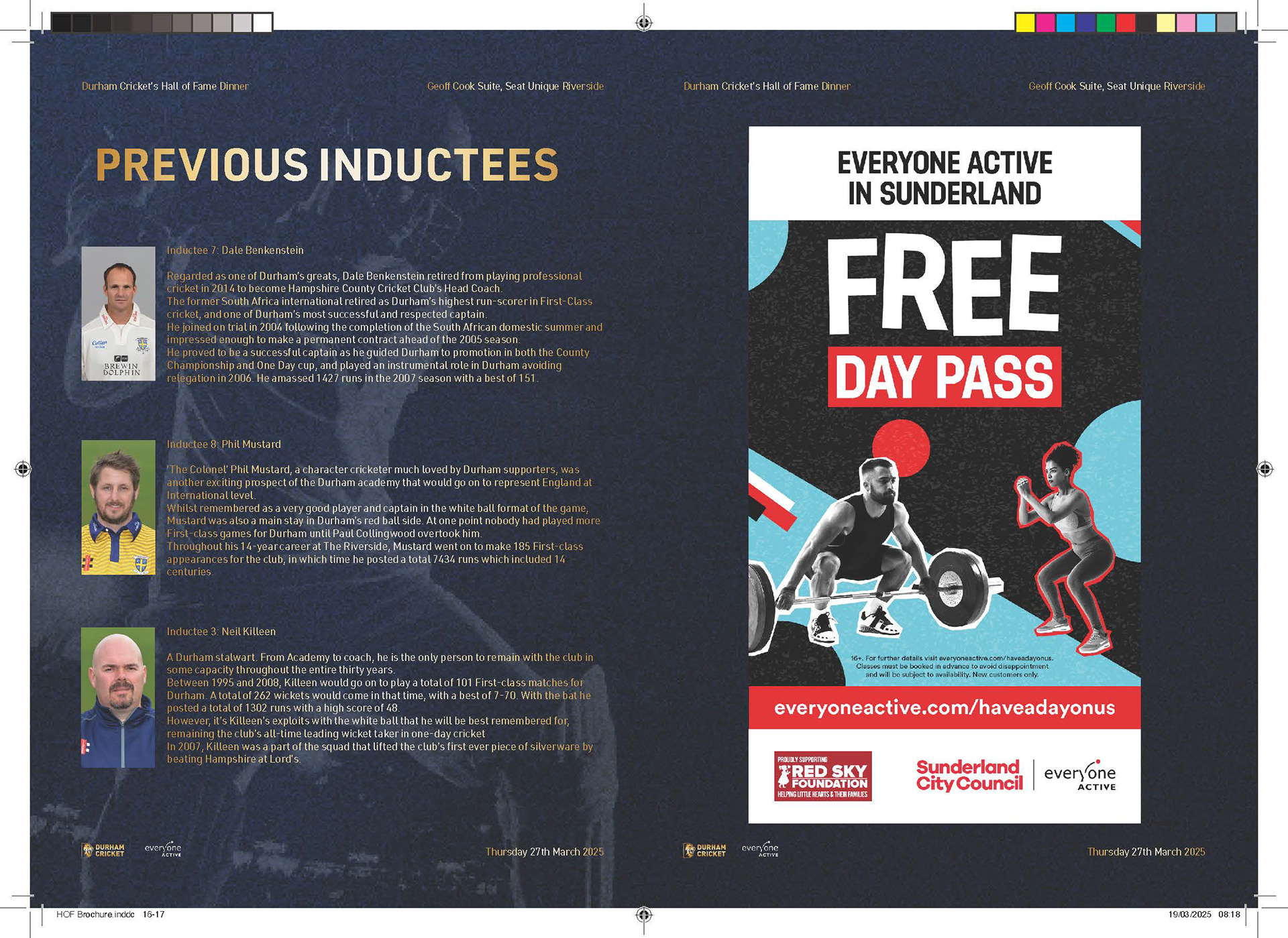
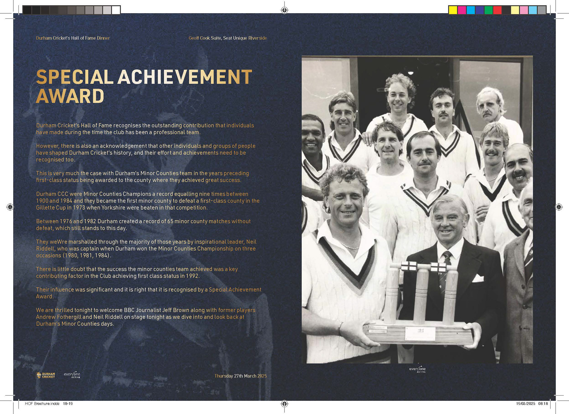
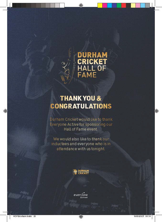
For this project I adapted a previous year's design as they wanted to keep it consistent year on year. This meant I kept the same gold and navy colours along with the same event Icon and background image. The adjustments I made were adding layers of texture to bring it more to life, which I believ improved the image. For this brochure the use was for just print so I used a workflow between photoshop to create the main visuals and then place them in Adobe indesign, using parent pages as well as bleed marks and their improved text features to layout the design.
This supports me in evidencing KSB: K1, K2, K7, S1, S2, S4, B1, B2, B4, B5.
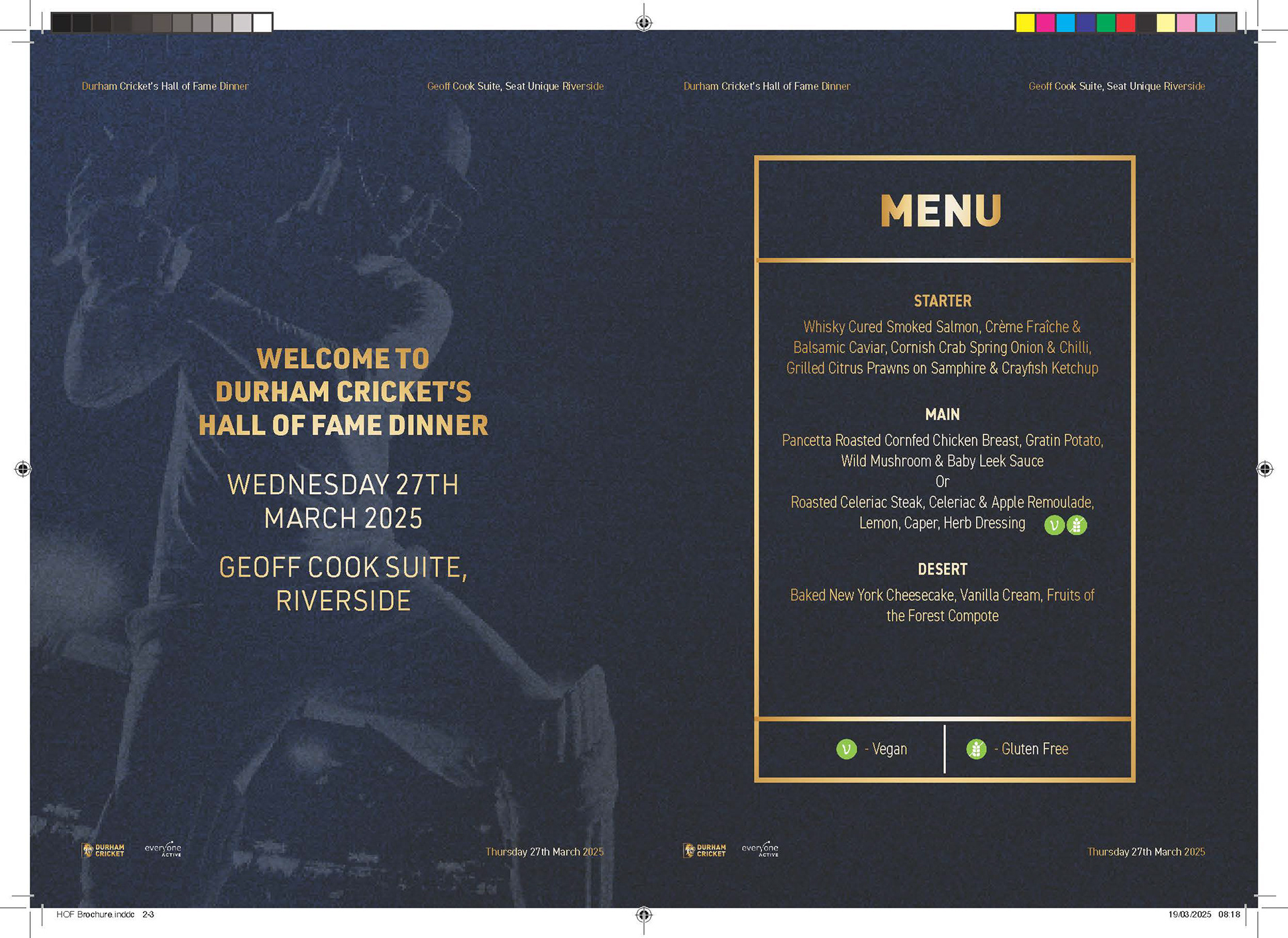
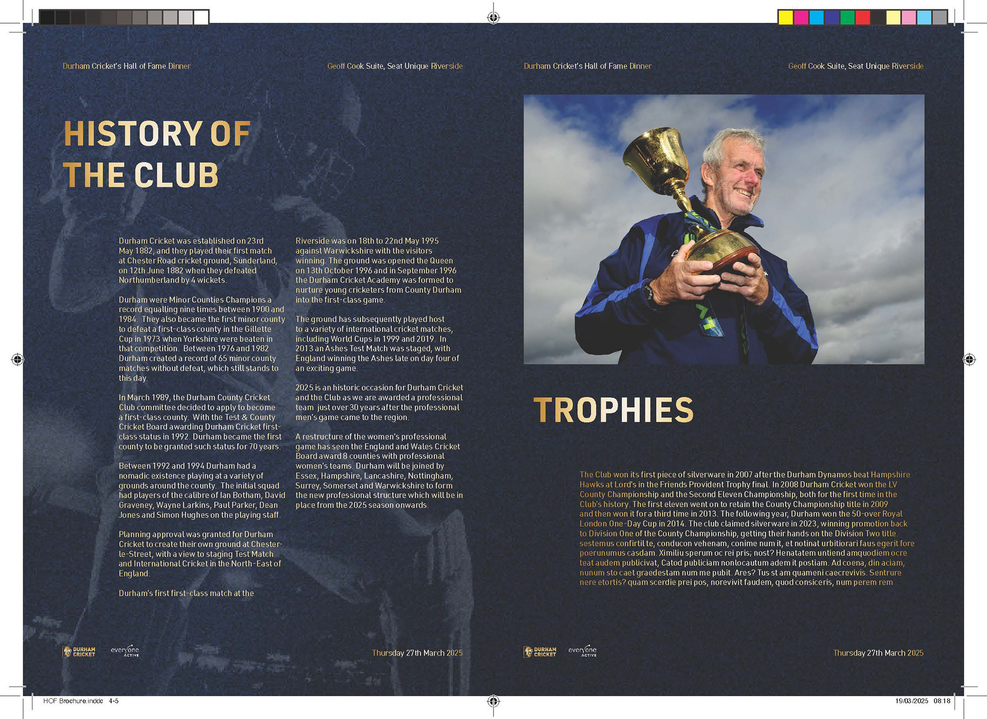
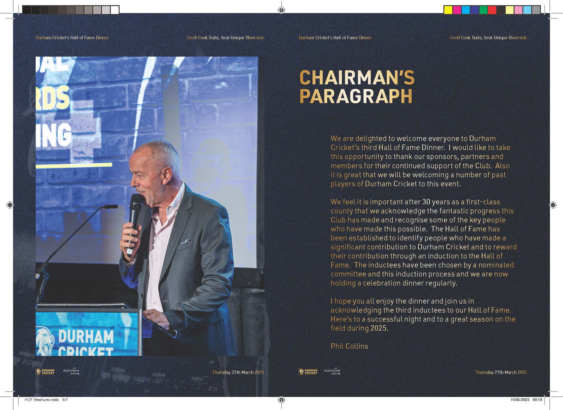
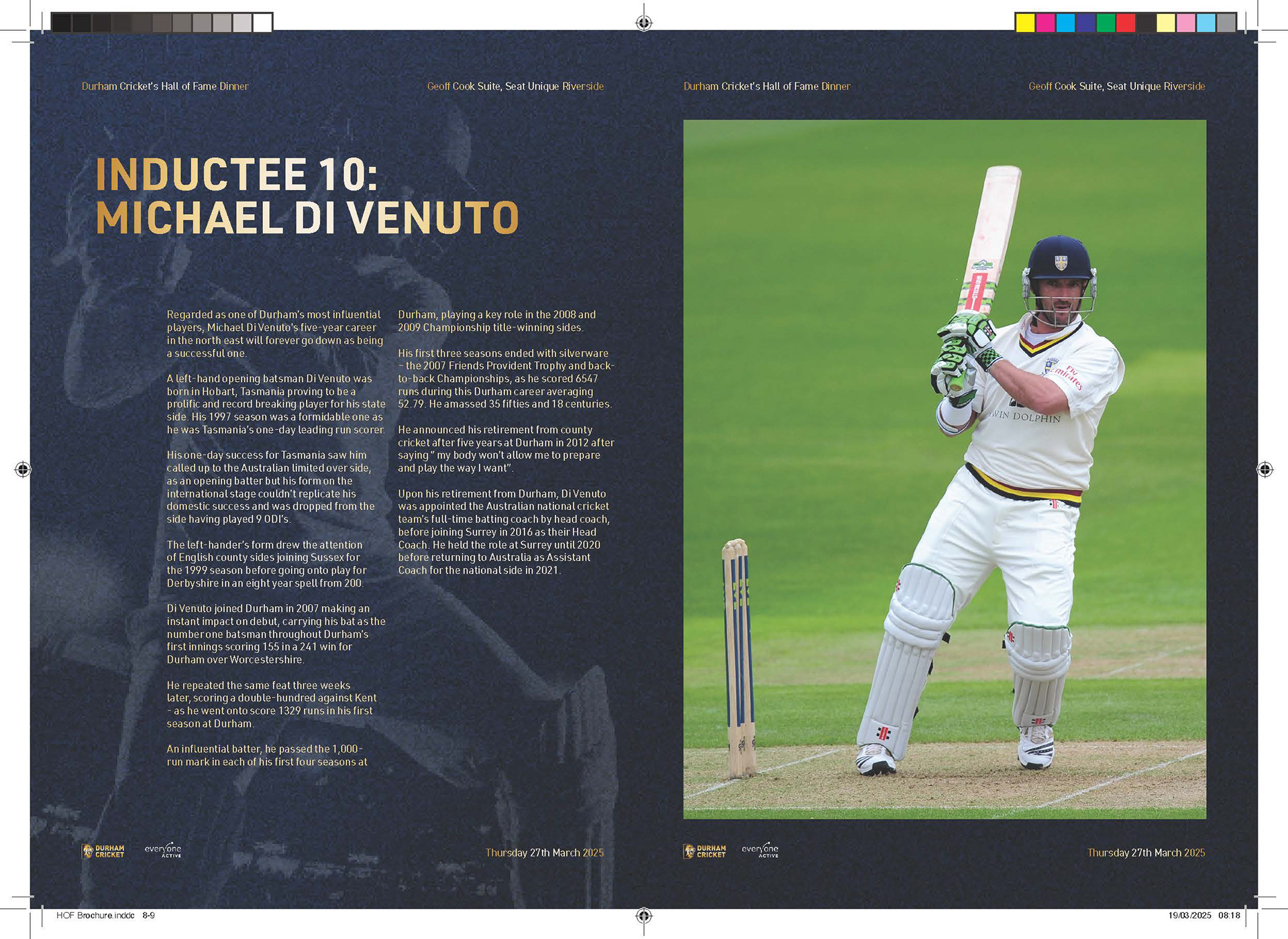
Project Reflection
This project really helped me build my skills in Adobe InDesign and create a workflow that works well for me. I was able to combine the advantages of different softwares to make the process more efficient and produce a polished final piece.
In InDesign, I made good use of parent pages to keep everything consistent across the whole document, which was especially useful for repeating elements like headers and page numbers. I also added a bleed so the final design would print cleanly without any white edges.
I used threaded text frames to let paragraphs flow seamlessly from one column or page to another, giving the layout a professional, newspaper-style look. This made it much easier to manage the content while keeping the design clean and well-structured.
This supports me in evidencing K1, K2, K7, S1, S2, S4, B1, B2, B4, B5.
Project Overview
Later in the Cricket Season I created both a T20 programme cover aswell as the year book cover. This gave me the freedom to become more creative and make something that would stand out from previous years designs while of course staying on brand with Durhams T20 colours and overall blue tones for the year book.
This supports me in evidencing KSB: K1, K2, K7, S1, S2, S4, B1, B2, B4, B5.
Project Reflection
For the front cover, I was given a tight deadline, but everyone was happy with the final result. It was a completely new style compared to previous years, which people really liked, so that was great to hear.
Like all designers, I gave myself a bit of criticism and noticed a few small details that stood out to me more than anyone else. The main issue I faced was starting the design in RGB and then converting it to CMYK for print. Since CMYK is naturally more muted, the exposure layers and the strong highlights and shadows I added lost some of their impact in the final print. The colours also came out slightly different to what I had intended, which I wasn’t too happy with.
Now I know for next time to start my working file in CMYK from the beginning so I can maintain consistency between screen and print. I also applied my new knowledge of Indesign by using a more efficient workflow, designing in Photoshop and then formatting the layout in Indesign to add bleed marks and prepare the file for print properly. This is something I learned from creating my first brochure in Photoshop, now discovering it is easier in Indesign.
Overall, I still think the design works really well as an eye-catching front cover. It has a movie-poster feel that makes it stand out and helps build excitement.
This supports me in evidencing KSB: K1, K2, S1, S2, S4, B1, B2, B4.
