Project Overview
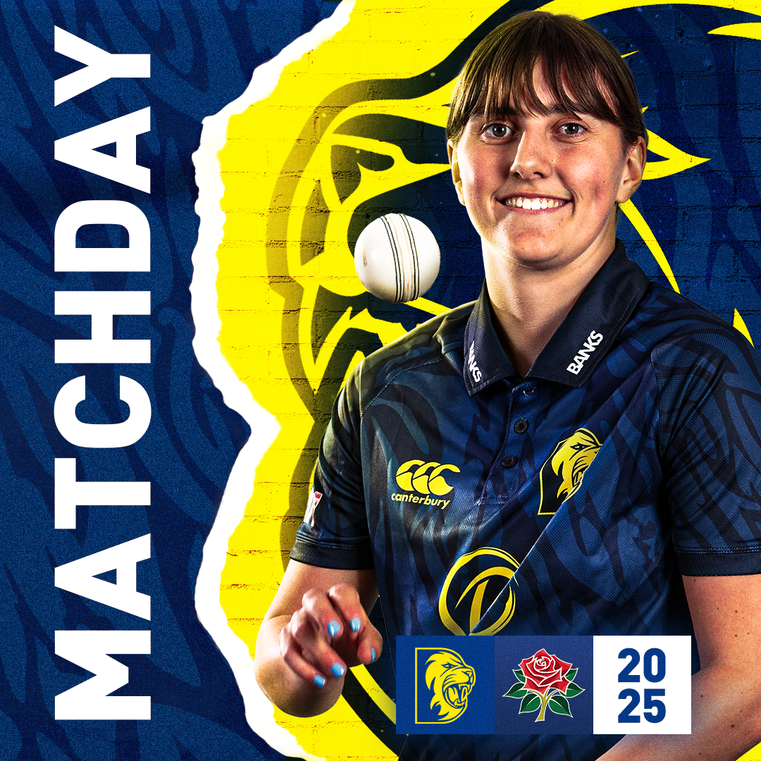
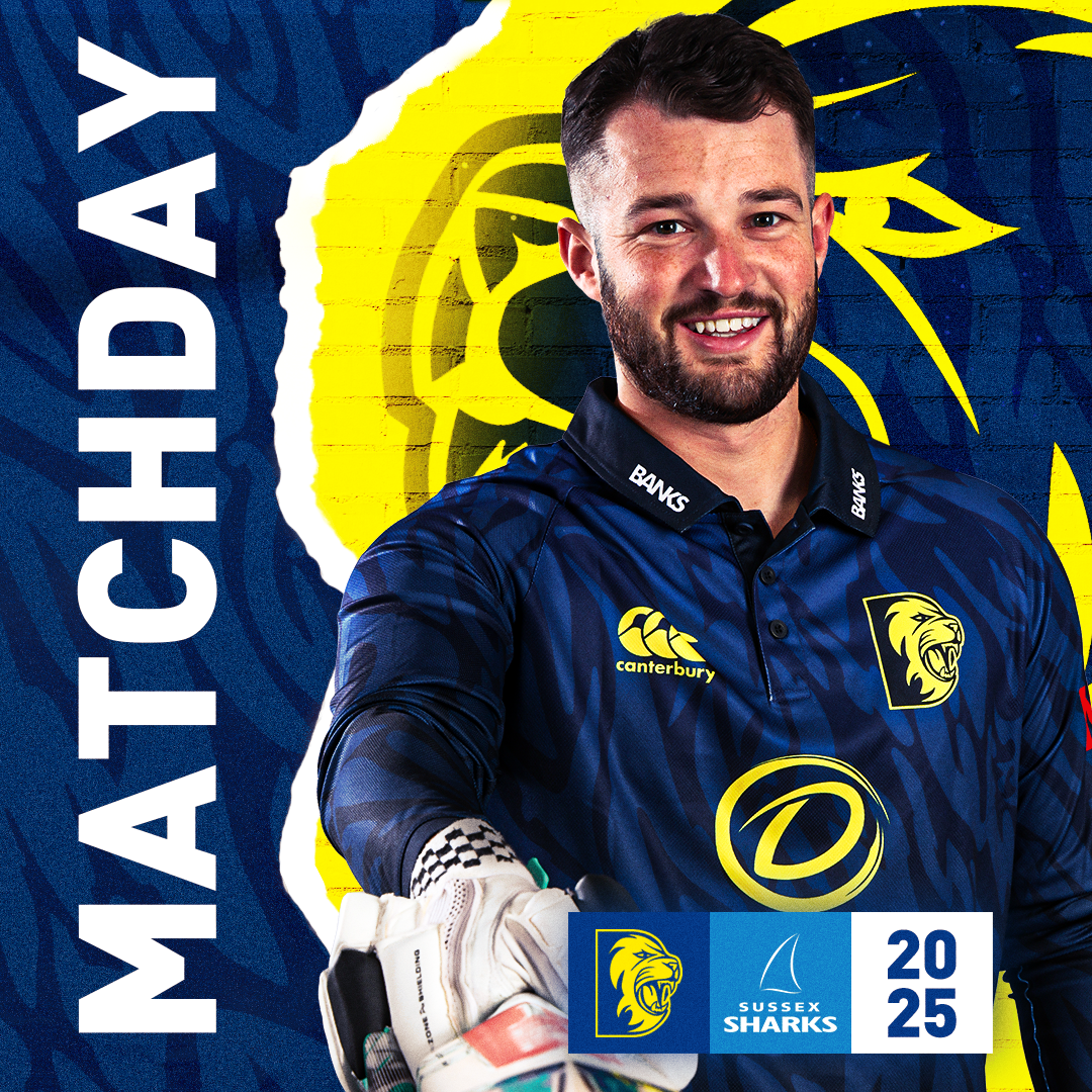
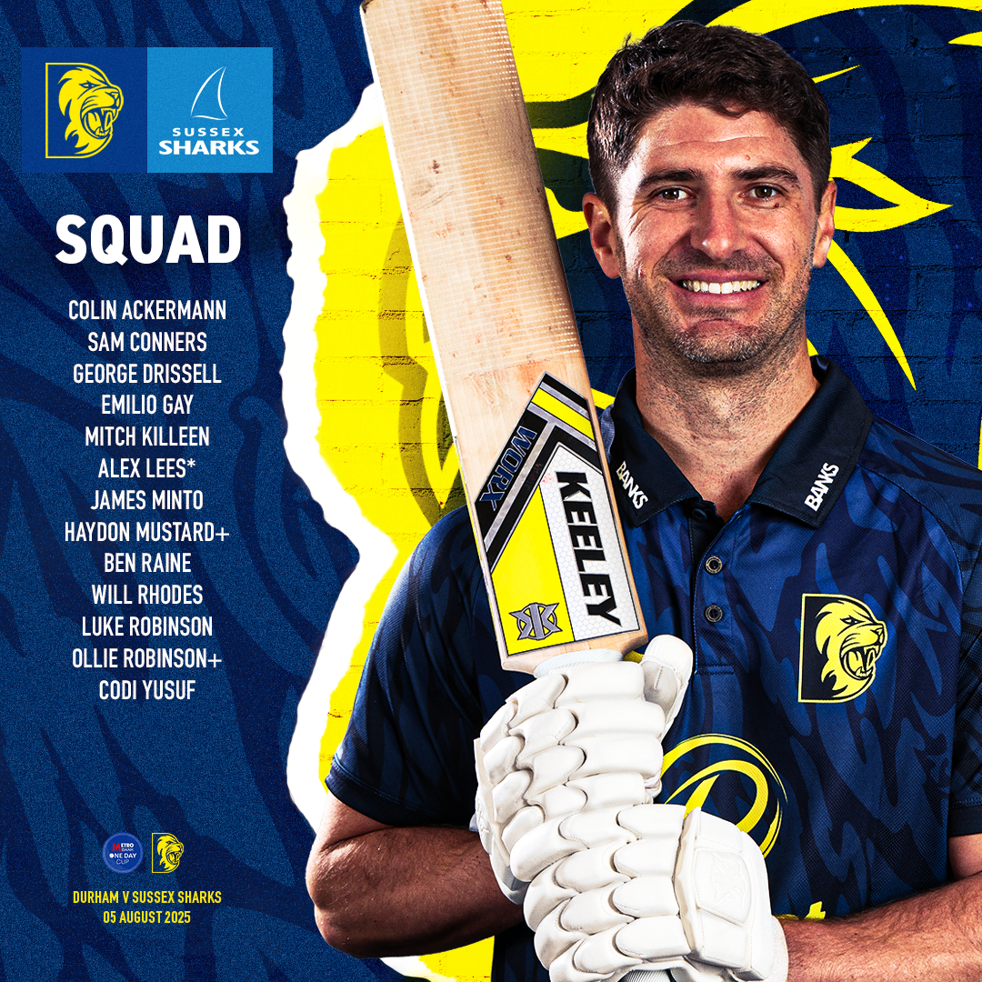
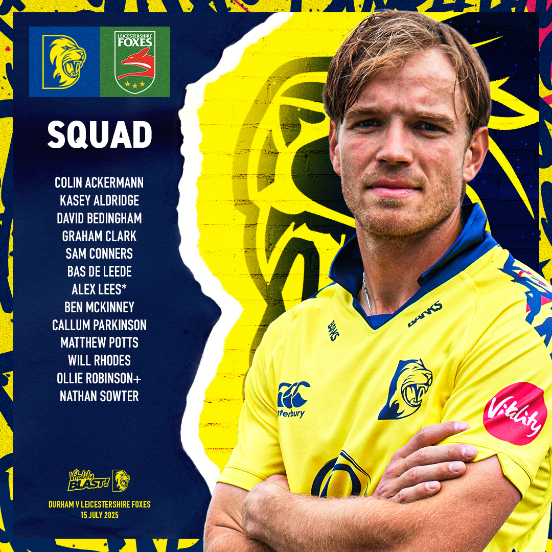
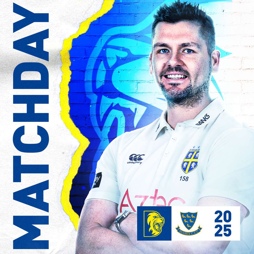
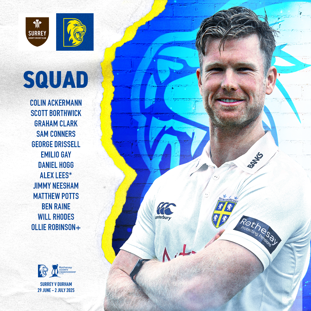
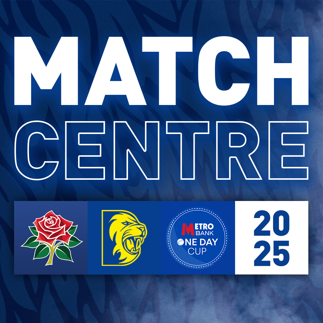
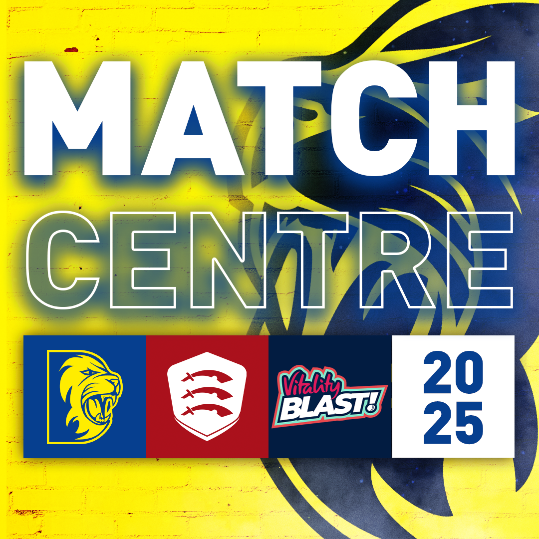
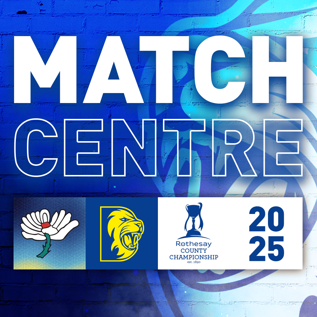
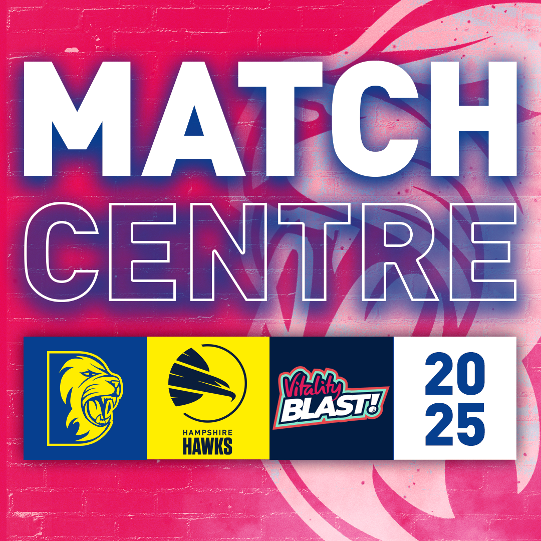
The aim of these graphics was to keep Durham fans updated with match day details, squad news and the starting XI. These are just a few examples of the type of content shared on match days, covering the different formats of the game. The blue designs were used for One Day Cup fixtures, yellow for T20s, and white for the County Championship.
These have become some of my favourite pieces to work on at Durham Cricket. I feel the designs have really improved since I joined, and it’s rewarding to see them stand out more on match days.
This work supports me in evidencing KSBs: K1, K2, K7, S1, S2, S4, B1, B2, B4 and B5.


Project Reflection
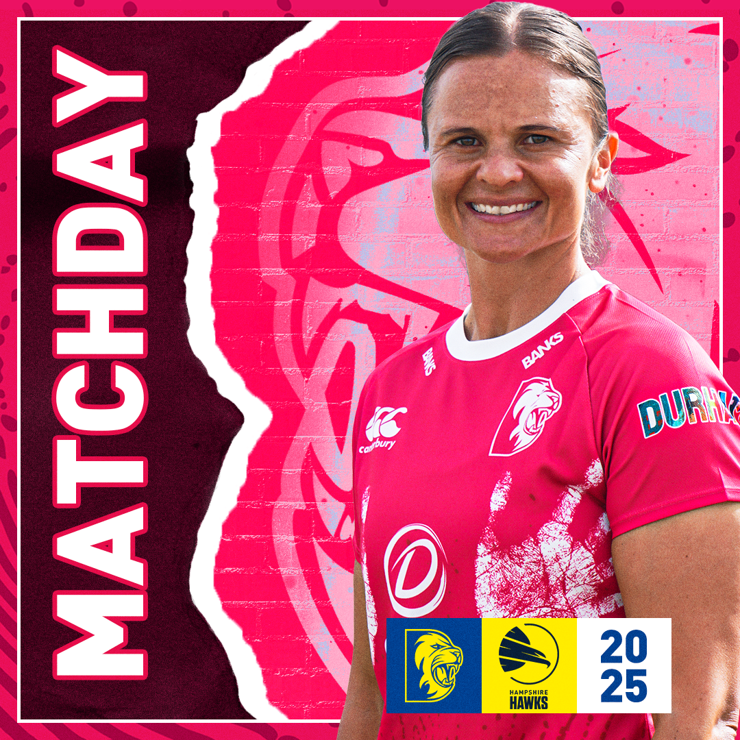
I’m really grateful to have had the opportunity to create these graphics, as well as to adapt them for special occasions. For example, the CoppaFeel! game where the girls wore pink to raise awareness showed how versatile the designs were, as they still worked seamlessly in the new colour. I also had creative freedom on Star Wars Day to replace the cricket bat with a lightsaber. That idea was directed by me as a way of adding some fun while drawing extra attention as a marketing strategy.
This set of work also really helped me develop my skills with shadows and highlights. For next year’s graphics, I plan to take more control over the photography direction. While the action shots worked well, I’ll make sure to tell the photographer not to worry too much about space above the head and to include more of the players’ legs or move further back. Some shots didn’t fit the desired size because the players’ legs ended too close to the bottom of the frame. This meant I had to Photoshop in other players’ legs and blend them using layer masks and other techniques. Next year, I can avoid that hassle by giving clearer directions during media day.
For action shots, I’ll also make sure side-on images with bats show the players with their hands and arms tucked in, rather than sticking out. This will give me more usable images, since some couldn’t be used because the arm or bat overlapped text.
Each graphic also made use of a pattern from the respective kit, which helped give the overall design a more cohesive and connected feel across all formats.
Overall, I’m really happy with how the designs turned out. They feel alive, and the mix of kit patterns and bold photography made them stand out on match days.
This supports me in evidencing KSBs: K1, K2, K7, S1, S2, S4, B1, B2, B4 and B5.