Project Overview:
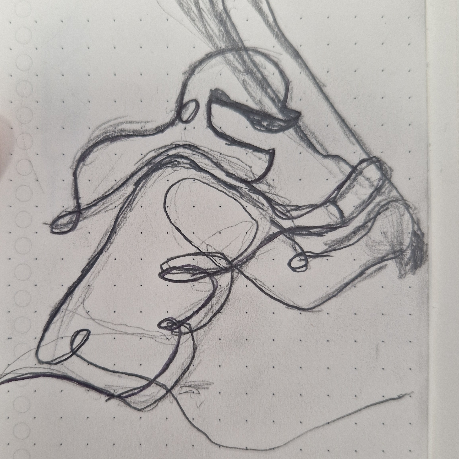
Creating the pin design was a really fun and rewarding experience. I started by sketching the idea by hand, then moved into vectorising it digitally to bring it to life. We wore these pins and handed them out during the historic first Tier 1 women’s game at the Riverside, and I felt genuinely proud to have played a part in such a special moment for the club. It was a small piece of design, but one that carried real meaning and impact.
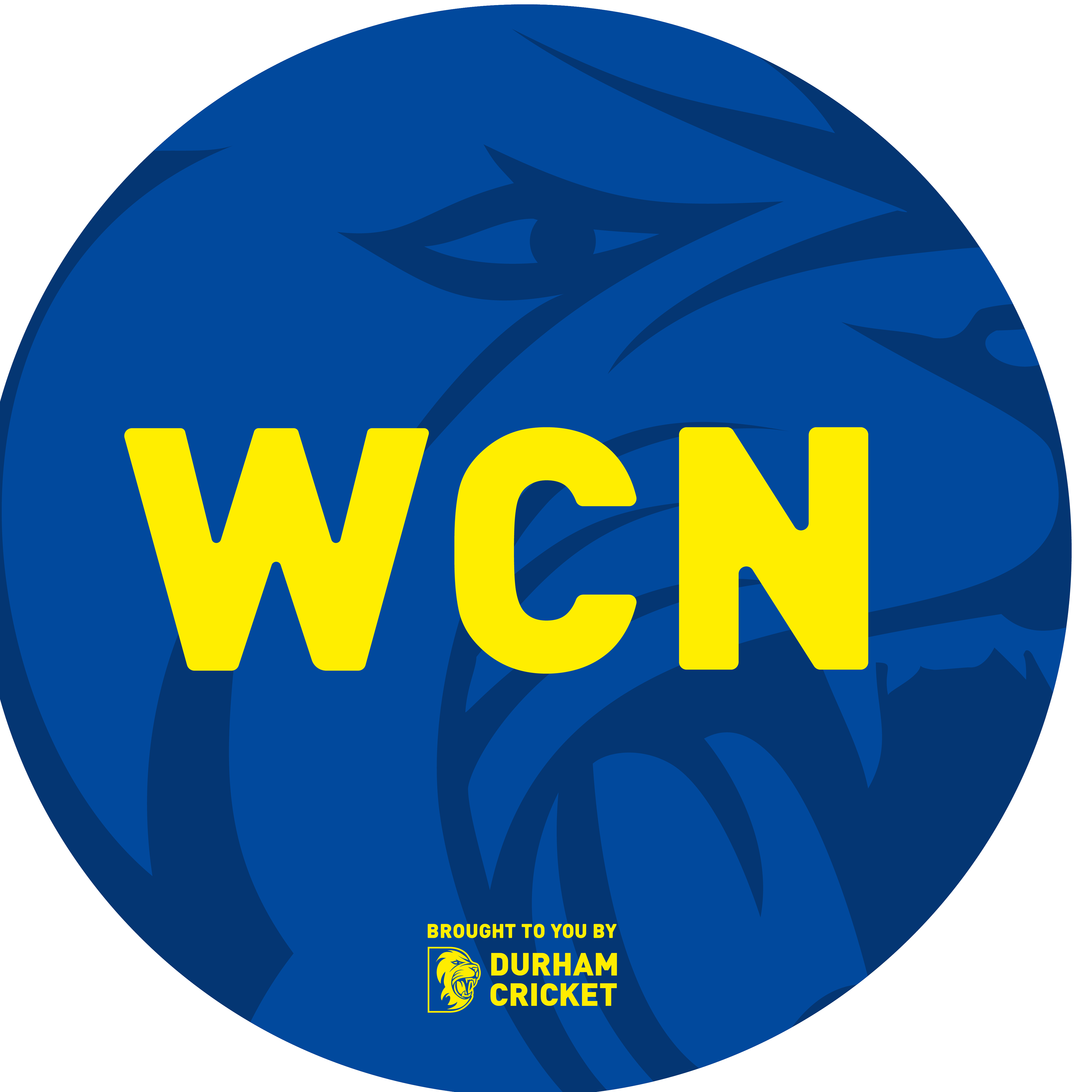
Alongside this, I also worked on the WCN (Women’s Cricket Network) logo, which was another enjoyable and important part of the project. Knowing that this was going to be used for the women’s webinar made the work feel even more meaningful.
This project helped develop my technical and creative skills across sketching, vectorisation, and creating work for real-world application. It also helped reinforce the importance of creating design with purpose, especially for moments that are meaningful to people and communities.
This supports me in evidencing KSB: K1, K2, K7, S1, S2, S4, B1, B2, B4, B5.

Women's Cricket Network (WCN) Logo - Reflection
For this project, I created a logo for the Women's Cricket Network that stayed consistent with the existing Durham Cricket brand, but introduced a softer feel by rounding the letters. This subtle tweak was made specifically for its use in webinars, following client feedback that the original type was too bold and strong.
However, as a sports brand, I felt it was important to retain strength in the design. I explained to the client that keeping brand consistency is key and that softening it too much could dilute the established identity. This taught me a valuable lesson about balancing client feedback with design principles. As designers, we’re hired not just to create visuals, but to make strategic decisions that protect and grow the brand. Clients will often respect you more when you explain the thinking behind your work — it shows you’re making decisions for the right reasons, not just following orders. A key rule I learned is: don't let the client become the art director.
This supports me in evidencing KSB: K2, K4, K7, S1, S2, S4, B1, B2.

Durham Pride Logo - Overview
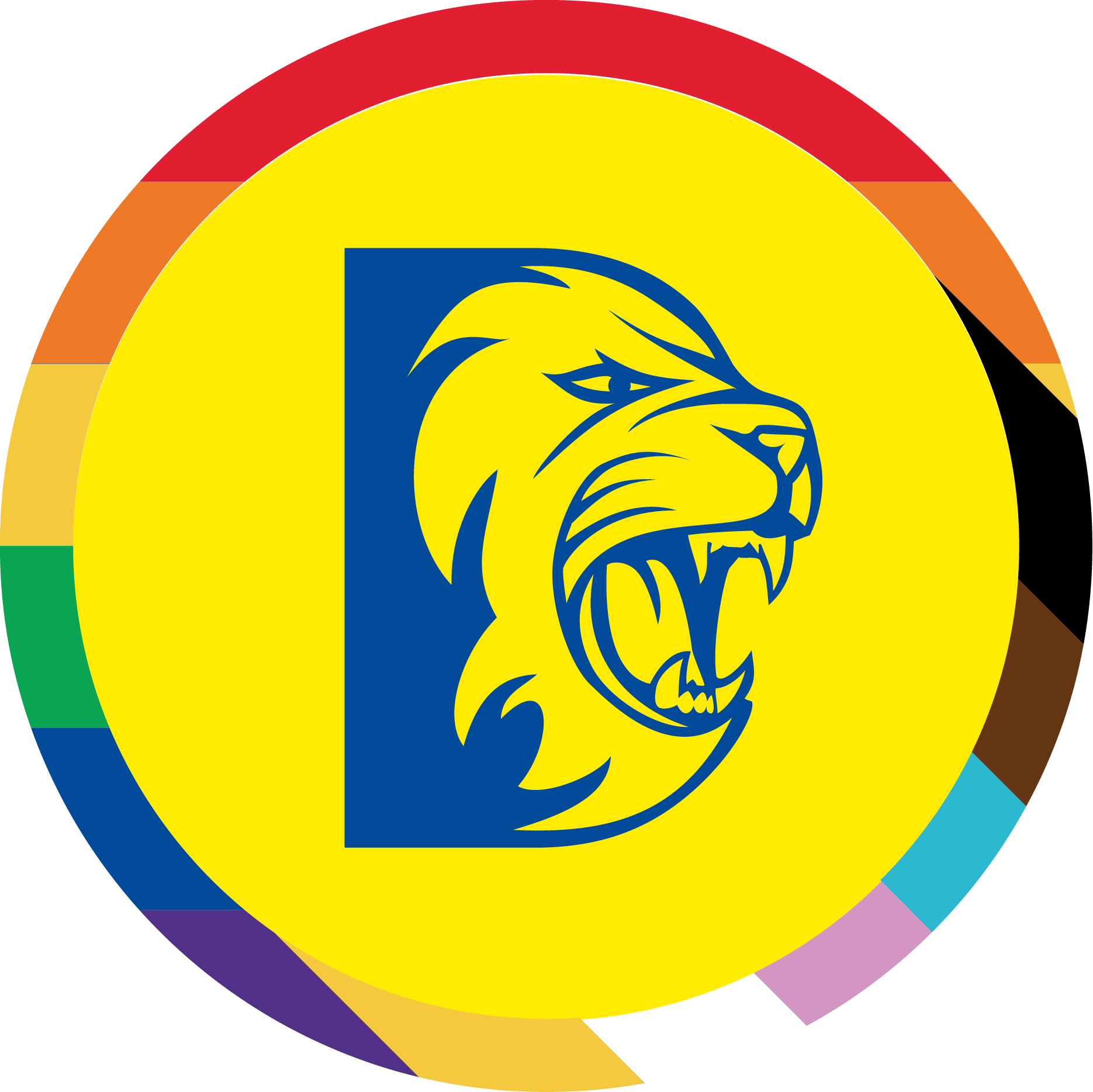
As part of our Pride Month campaign, I identified that the existing Durham Pride logo lacked legibility and was weakening our brand presence. I took the initiative to redesign it, introducing a cleaner version that used a border instead of a full rainbow fill. I also updated the flag to include more inclusive colours such as the trans flag stripes, ensuring broader representation.
Additionally, I created two tailored versions — one for the Men's team (yellow on blue) and one for the Women's team (blue on yellow) — to keep brand consistency across platforms. This redesign helped clarify our messaging, removed confusion, and strengthened our visual identity during an important campaign.
This supports me in evidencing KSB: K1, K2, K4, K7, S1, S2, S4, S5, B1, B2, B3, B4, B5.


Durham Pride Logo - Reflection
This type of work really helped me develop my eye for spotting when a design isn’t working. This project was self-directed, as I noticed the original logo had colour contrast issues that made it hard to use effectively. I came up with a solution by adding a ring or border around the logo, which worked perfectly without losing the core Durham identity.
The final outcome turned out really well, and the marketing team were very happy with the design solution. It reminded me of something that’s really important to me — at the end of the day, graphic design isn’t just about making something look nice. It’s about solving problems.
We solve those problems through creative thinking and by producing a solution that communicates a message in the most effective and efficient visual way.
This supports me in evidencing KSB: K1, K2, K7, S1, S2, S4, B1, B2, B4, B5.