Project Overview
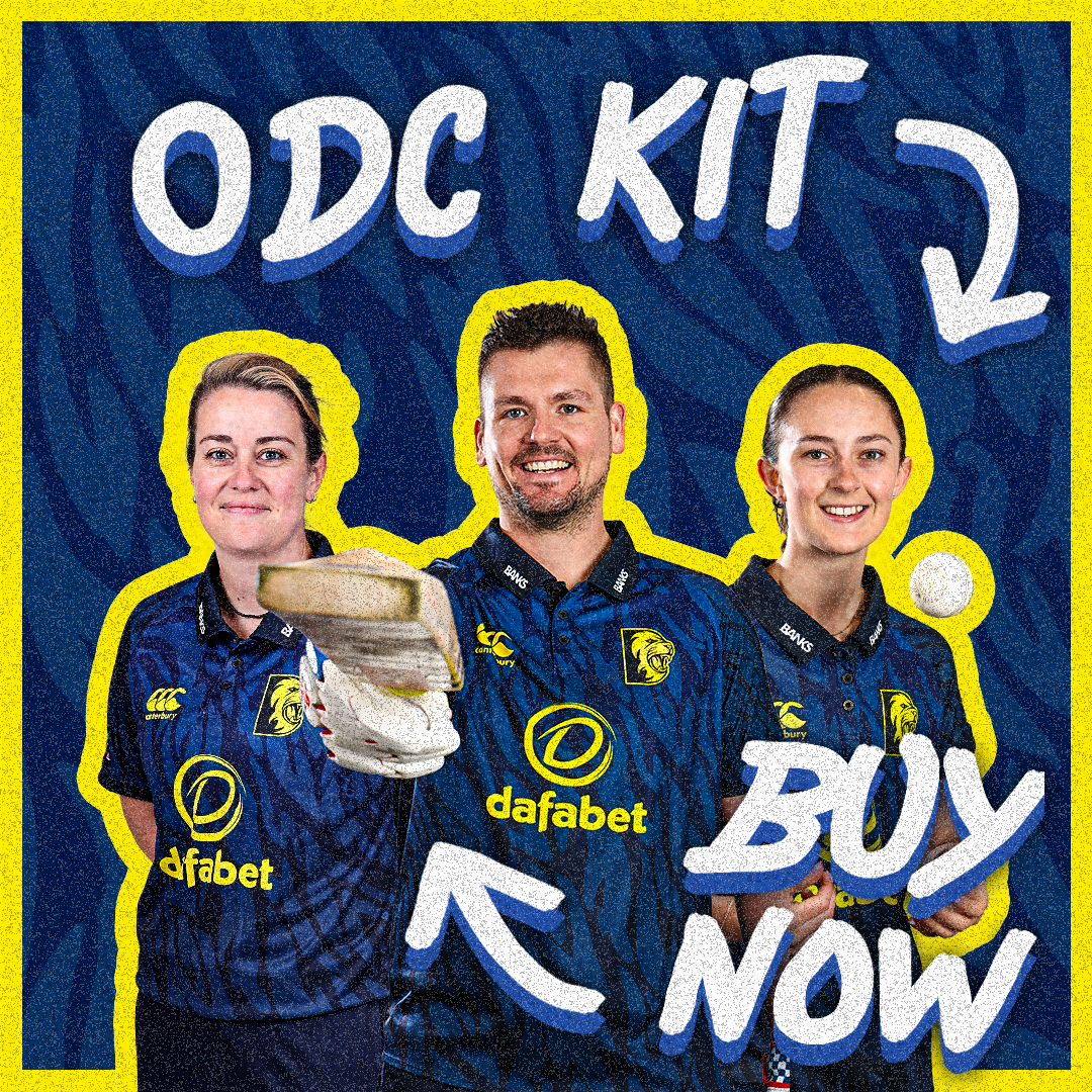
The aim of these graphics was to promote the 2025 kit launches and drive sales. I kept the design consistent as a ‘kit launch graphic’ by using a similar style to make it easily identifiable. This included my own customised typography, which used different brush styles to give an artistic feel. This worked well with the designs since the kits featured bold colours and a variety of patterns that really stood out. However, for the CoppaFeel! version, we didn’t have player photos, so I took a different approach.
This supports me in evidencing KSB: K1, K2, K7, S1, S2, S4, B1, B2, B4, B5.


Project Reflection
This set of work helped me develop my skills in maintaining a consistent base style for each graphic. For the kit launches, I made sure they all clearly used the same style rather than separate looks, so they are easily recognisable. People will remember the previous launch and immediately understand the purpose of the new graphic, which is to sell a different kit.
For the summer graphic, I used Adobe Photoshop’s new feature called dynamic type, which allowed me to stack the text evenly in width. This was really helpful because it’s much easier than manually adjusting each word. Using this new technique shows that I’m keeping up to date with more efficient methods and adapting my design workflows.
This supports me in evidencing KSB: K1, K2, K7, S1, S2, S4, B1, B2, B4, B5.