Project Overview
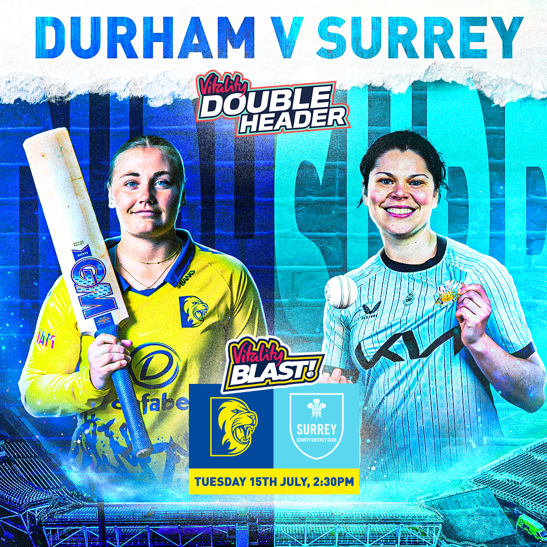
The aim of these graphics was to promote the upcoming T20 home games across social channels, with the goal of boosting ticket sales and getting fans excited by using a bold and visual style that grabs instant attention. I chose a split-down-the-middle design, separating Durham and the opposition to create a cool head-to-head look. For specific fixtures like Durham versus Lancashire, this worked really well because of the strong contrast between the blue and red colours.
This supports me in evidencing KSB: K1, K2, K7, S1, S2, S4, B1, B2, B4, B5.


Project Reflection
This set of work helped me develop my skills a lot, especially with shadows and highlights. The first graphic I created was the Lancashire one, and I received some really useful constructive criticism — the highlights were too much and made the players ‘look like aliens.’ I noticed this straight away and toned it down a lot in the designs that followed. However, I still kept the highlights to give the graphics a cinematic feel that really brings them to life.
I also made good use of Camera Raw filters, which we had experimented with during Demo and Do sessions. These filters proved very powerful for these designs, as they enhanced all the features I wanted to emphasise, such as texture grain, clarity, vibrance, and the highlights and shadows.
This supports me in evidencing KSB: K1, K2, K7, S1, S2, S4, B1, B2, B4, B5.Project Overview
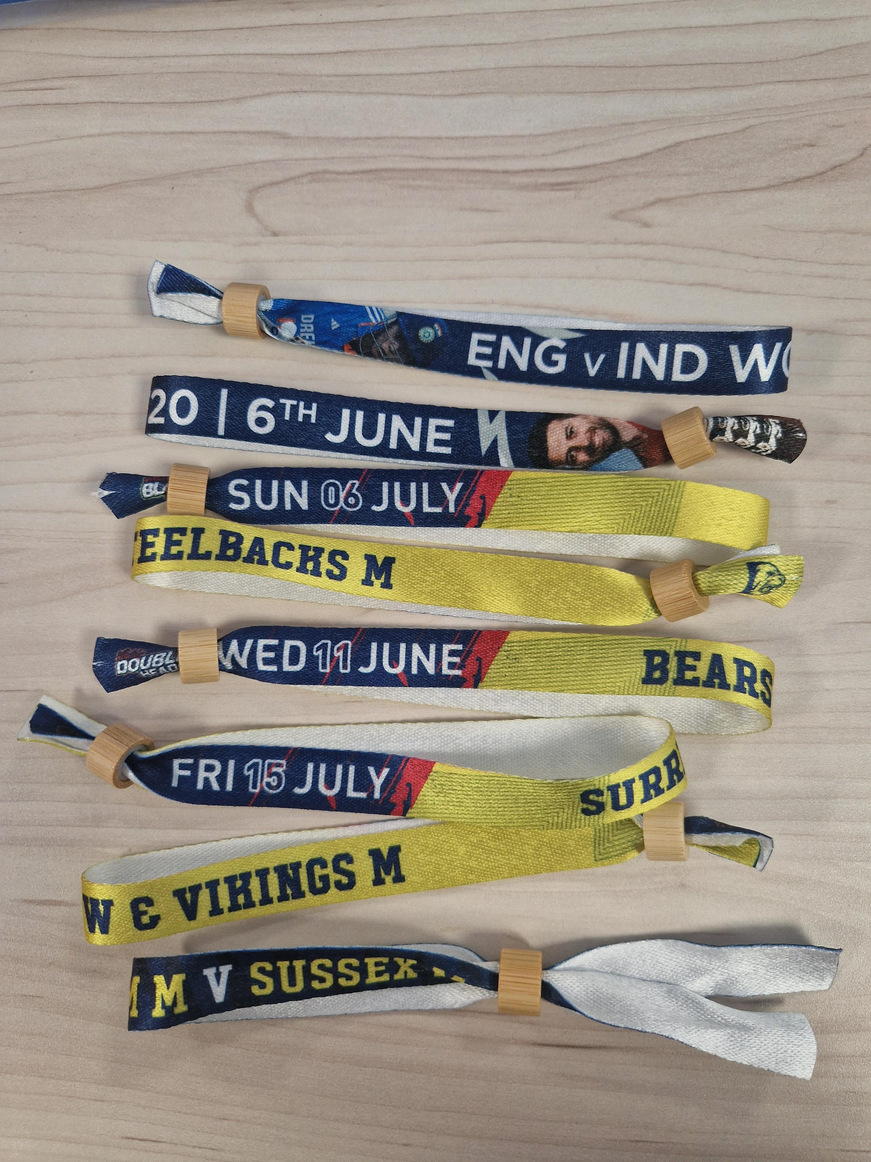
For every matchday, each person who comes to watch the game gets their own wristband. I was tasked with creating wristbands for each T20 game, as well as the internationals, the South North ODC game, and the T20 quarter-finals.
The design phase was done in Photoshop, and once the designs were finished, I exported them as PDFs and placed them onto a printing template for production. It was a fun project because I got to see the wristbands go from a digital design to a physical product that fans actually wore on matchdays.
This supports me in evidencing K1, K2, K4, K7, S1, S2, S4, B1, B2, B4.
Project Reflection
I really enjoyed this project as it was a bit different from my usual work. Designing the wristbands gave me the chance to play around with layouts, colours, and typography while keeping everything consistent with Durham’s branding. Using Photoshop worked really well, and I now feel more confident setting up artwork for print, including working to exact sizes and using the correct templates.
Seeing the wristbands in use on matchdays was really satisfying because it made the work feel tangible and rewarding. I also learned how important it is to be accurate when exporting and placing designs onto templates, as even small mistakes could affect how the wristbands were printed and cut.
This supports me in evidencing K1, K2, K4, K7, S1, S2, S4, B1, B2, B4.