Project Overview
I was tasked with creating a variety of advertisements to promote both our Men’s and Women’s International games hosted at the ground. I was given a very open design brief for this task, which allowed me to explore different patterns to appeal to the opposition’s market.
For the India advert, I created my own pattern using skills I developed during the Demo and Do sessions. Most of the pattern was heavily inspired by traditional Indian designs to help appeal to their audience. I also used the colour picker tool to take colours directly from the Indian cricket logo to keep the visuals familiar and recognisable, making them more likely to want to come and watch their international team play.
This task helped me a lot, especially with understanding the revision process. I had to subtly adjust specific elements over and over to make sure everything fit perfectly. I also had to resize the designs to make them compatible for different formats including Instagram stories and posts, Twitter, Facebook, and for A4 and A5 print. This took a lot of time and thought, especially when deciding where to strategically place information, which formats needed certain content removed, and what information should be kept.
I also had to carefully place QR codes and make sure the designs fit within the bleed marks for printed versions. This helped me learn to think ahead and ensure my design was responsive and adaptable to each format—something I really enjoyed learning.
This supports me in evidencing KSB: K1, K2, K7, S1, S2, S4, B1, B2, B4, B5.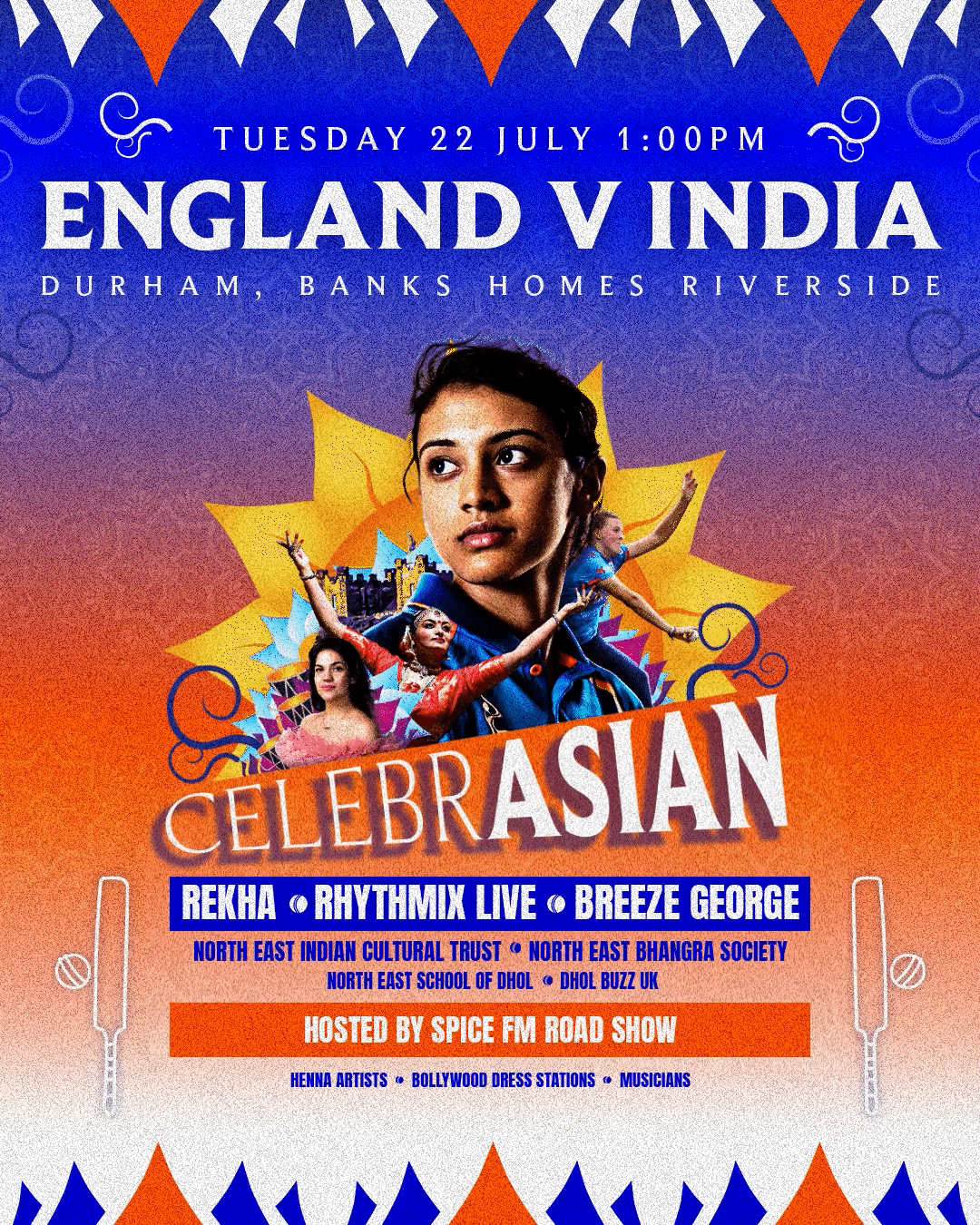


Project Reflection
Overall I was really happy with how the international promotional adverts turned out and I had a lot of fun creating them. It was a great chance to build on the software skills I learned through uni work and take them further by developing a workflow between Illustrator, Photoshop and InDesign.
I created repeat patterns and smaller vector graphic elements in Illustrator so they wouldn’t lose quality and gave me more flexibility with shape creation. I then brought those into Photoshop to build the main poster, adding in raster images, text and other key elements. I finished things off in InDesign where I handled formatting and added bleed marks, since it’s the best tool for preparing work for print.
This whole process made me realise how the different programs can work together and really complement each other. I was able to get the best out of each one and avoid their limitations by using them in the right way for their strengths.
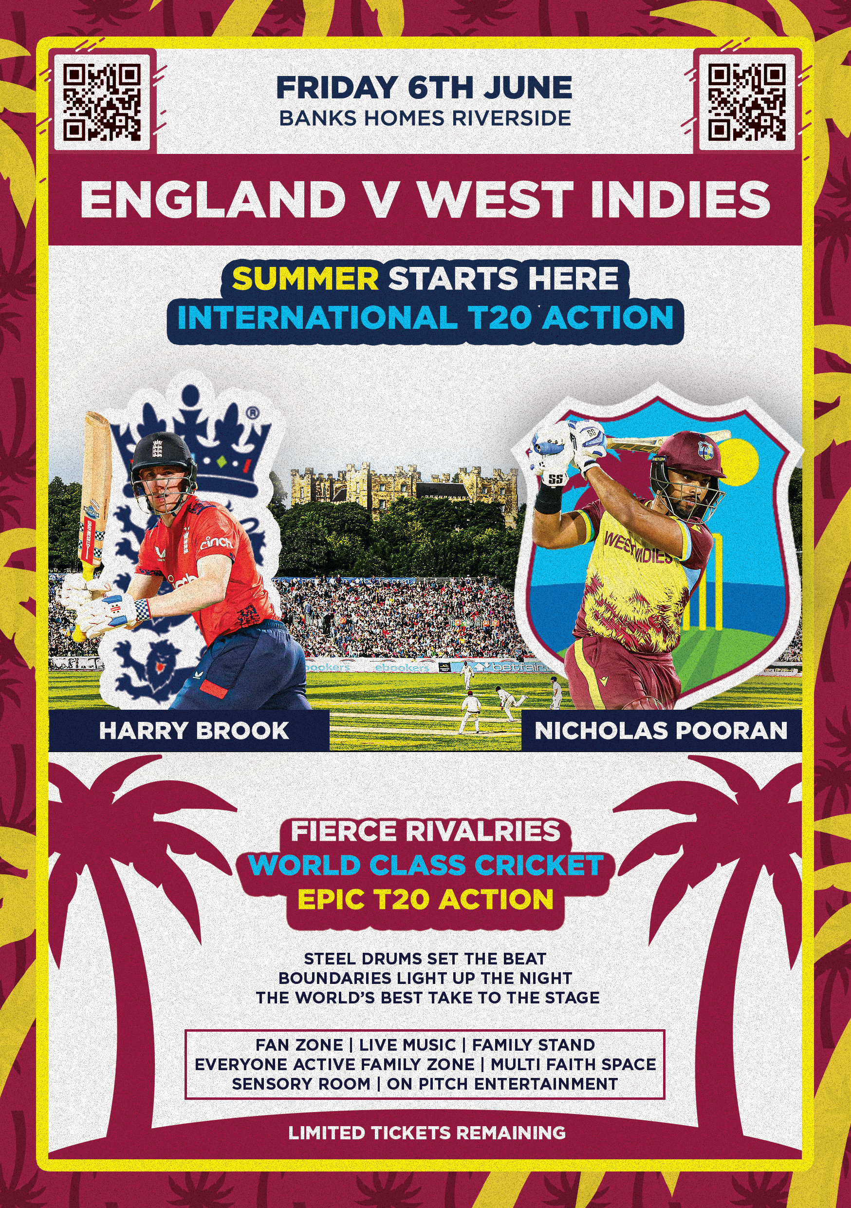
If I were to do it again, especially for the West Indies and India ads, I’d start with the images first and build the design around them. I found it tricky trying to fit images into an existing design without covering the badge or throwing off the balance. Next time, I’d try choosing two images that work well side by side, like a batter on each side, reflected to create more symmetry and give the design a more balanced feel.
This supports me in evidencing KSB: K1, K2, K7, S1, S2, S4, B1, B2, B4, B5.