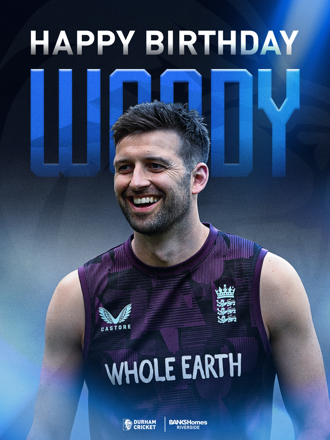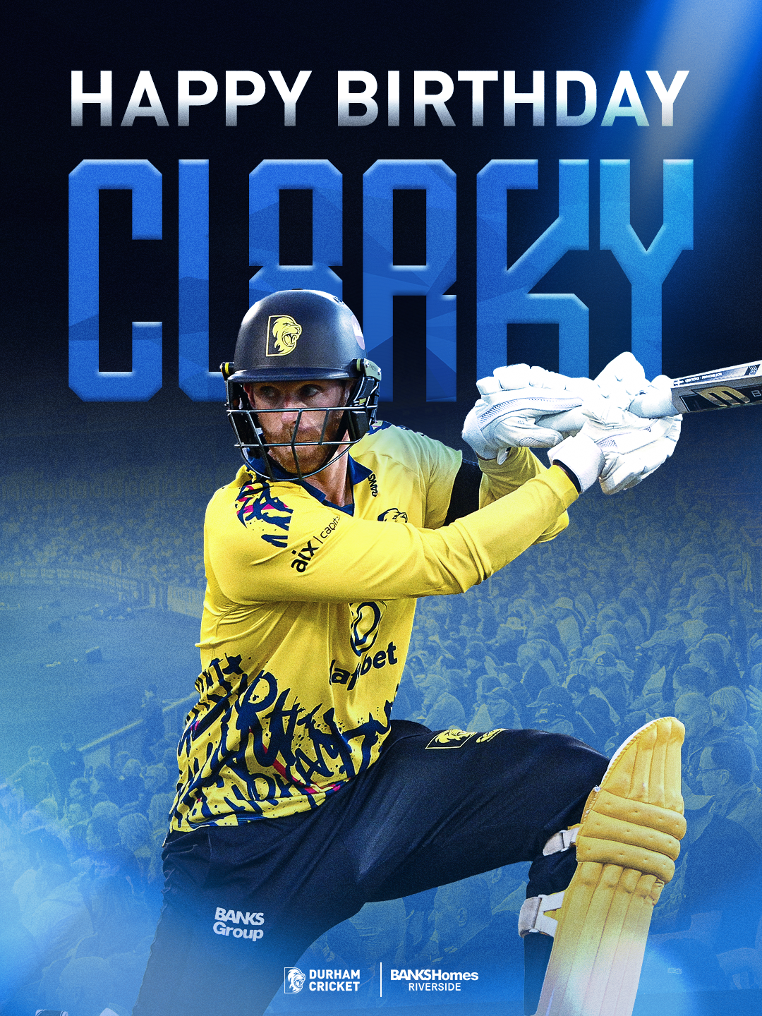
For this season’s birthday graphics, I wanted to create a cleaner and more refined approach compared to last year. Last season’s graphics were more heavily stylised and, looking back, I felt they did not feel connected enough to Durham’s identity. The editing style was also quite over the top, so this year I stripped the design back and focused on making the graphics feel more natural, polished and consistent.
This change came from my own self-reflection, as well as feedback and input from colleagues. I took this on board and used it to improve the design direction, making sure the birthday graphics felt more aligned with the rest of this year’s visuals. The cleaner approach works much better alongside the matchday graphics, which also use a more natural photography-led style.
The new design uses one main image of the player, keeping the focus clear and simple. Depending on the type of image used, I adapted the background slightly. For posed player imagery, I used the Durham Cricket logo faded behind the player to make the graphic feel more branded without becoming too busy. For action shots, I used faded ground imagery in the background, helping the design feel more connected to the match-day environment.
I also made sure the club logo, sponsor logos and other required information were placed appropriately along the bottom of the design. This helped keep the graphics professional, balanced and suitable for official club communication.
Overall, I think this was a strong improvement because the birthday graphics now feel more mature, natural and aligned with the wider Durham Cricket identity. They still celebrate the player, but in a way that feels cleaner, more flexible and much more consistent with the visual system used across the season.
This supports me in evidencing KSBs: K1, K2, K7, S1, S2, S4, S10, B1, B2, B4 and B5.