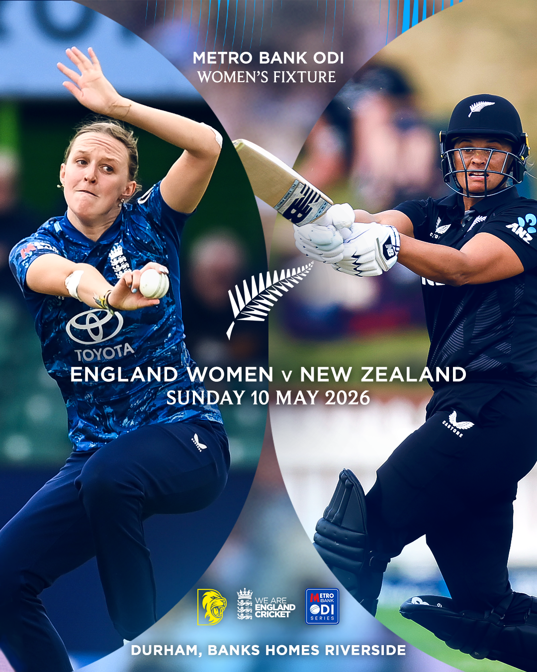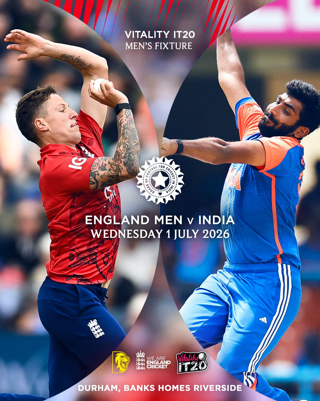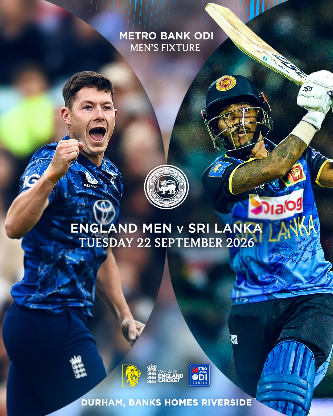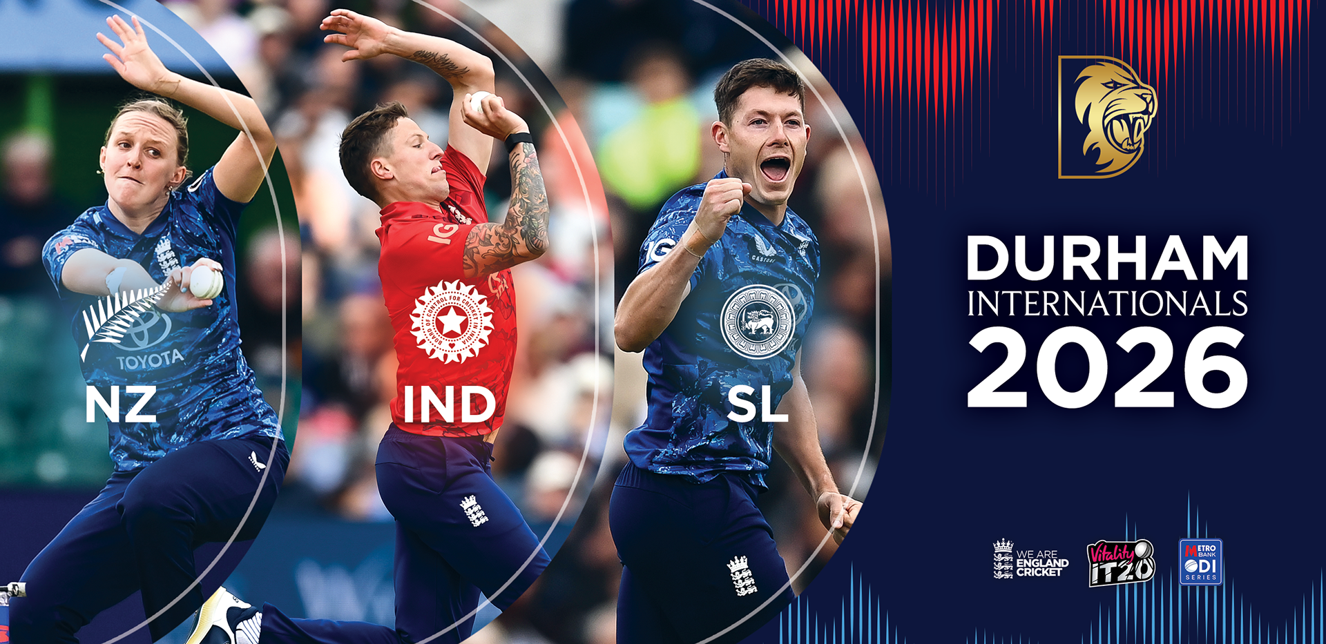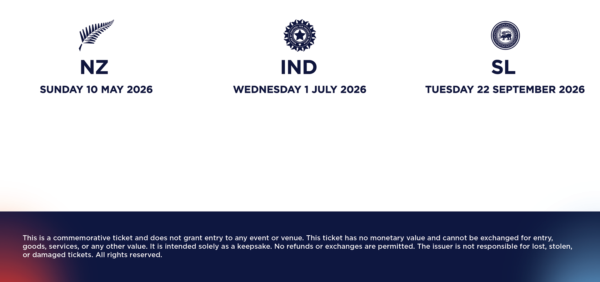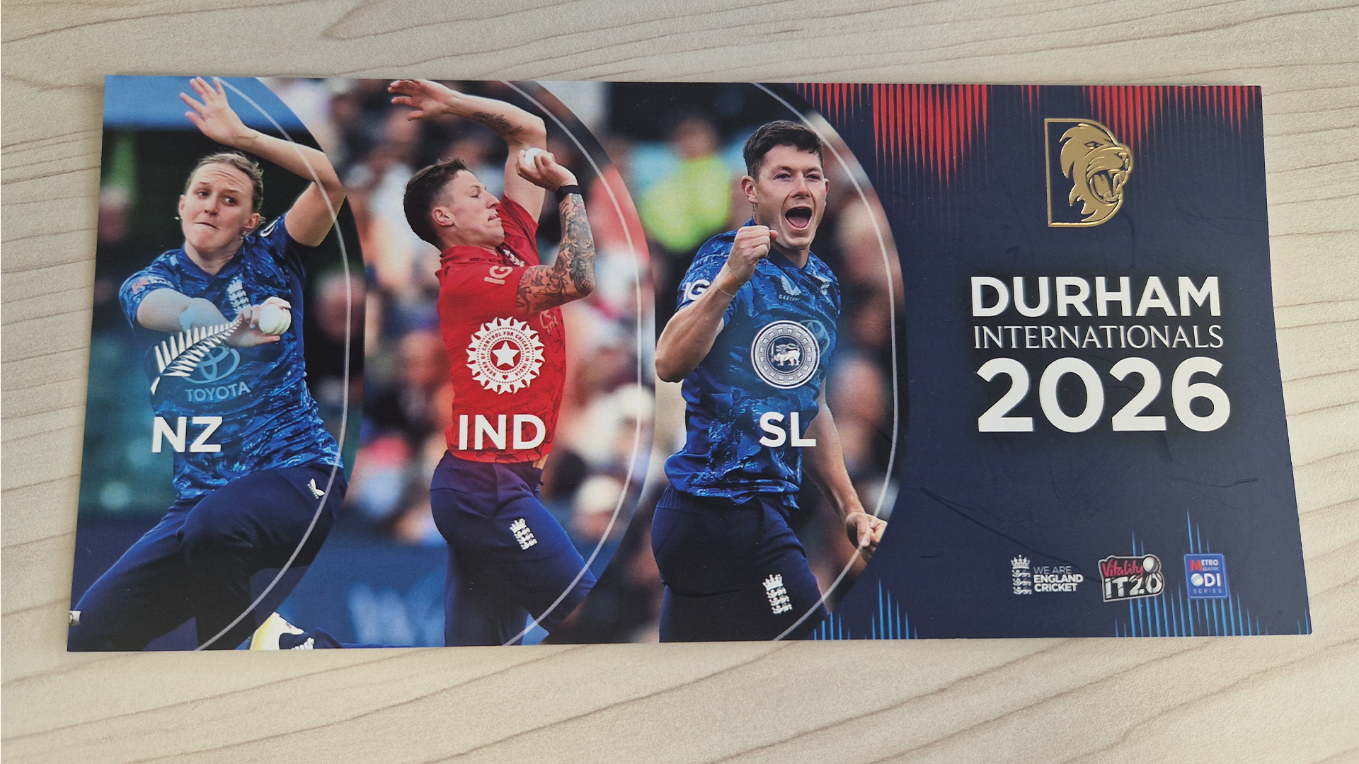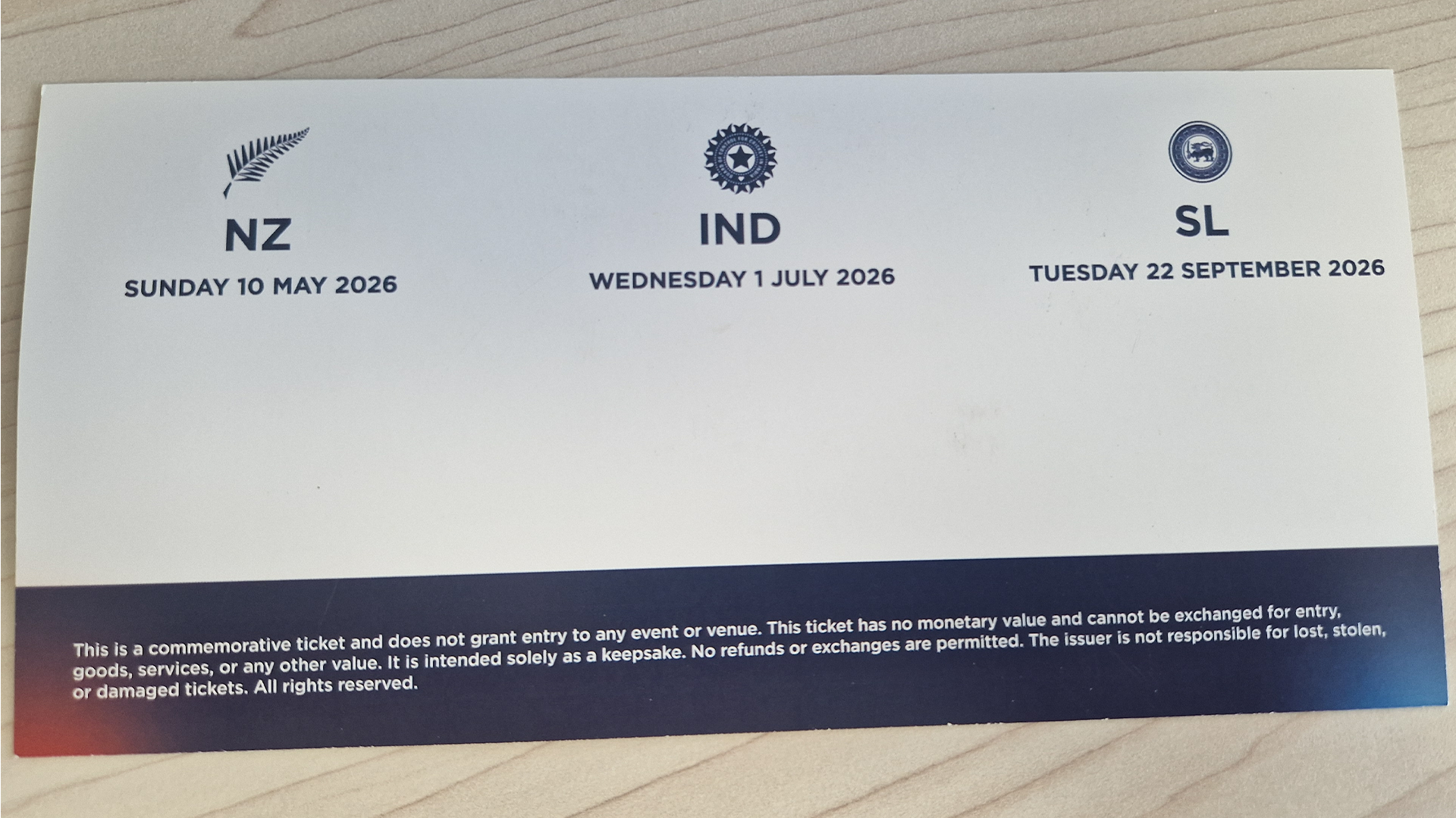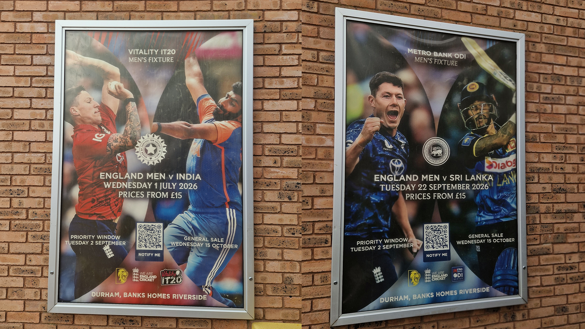
This collection of graphics was created in line with the ECB’s brand guidelines for the international season. Early on, before the campaign began, I was invited to a marketing meeting where I was able to look through the full ECB brand guidelines document. This was over 100 pages long, so it was important that I took the time to understand the system properly before creating any artwork.
Working with these guidelines helped me see how important a strong brand system is. The graphics needed to feel consistent with the ECB’s identity, while still being adapted for Durham’s marketing needs. I made sure the layouts, colours, typography, imagery and graphic elements were used correctly so the final designs felt professional, cohesive and on brand.
I later received feedback through the ECB that Durham had used their system really effectively in the graphics. This was great to hear, as it showed that I had understood the guidelines and applied them properly across the campaign. It also reinforced how useful clear brand guidelines can be when different organisations need to create work that still feels connected to one overall identity.
This project also influenced my own approach to Durham’s internal branding. After working with such a detailed guideline system, I started to think more about how Durham could benefit from a clearer set of design rules for its own graphics. This later encouraged me to begin developing guidelines for Durham, helping to make future content more consistent and easier to manage.
Overall, this was a valuable project because it challenged me to work within an established external brand system while still creating effective marketing graphics for Durham. It improved my understanding of consistency, brand application and the importance of clear design rules across a full campaign.
This supports me in evidencing KSBs: K1, K2, K5, K7, S1, S2, S4, S9, S10, B1, B2, B4 and B5.