Red Ball Cricket Signings
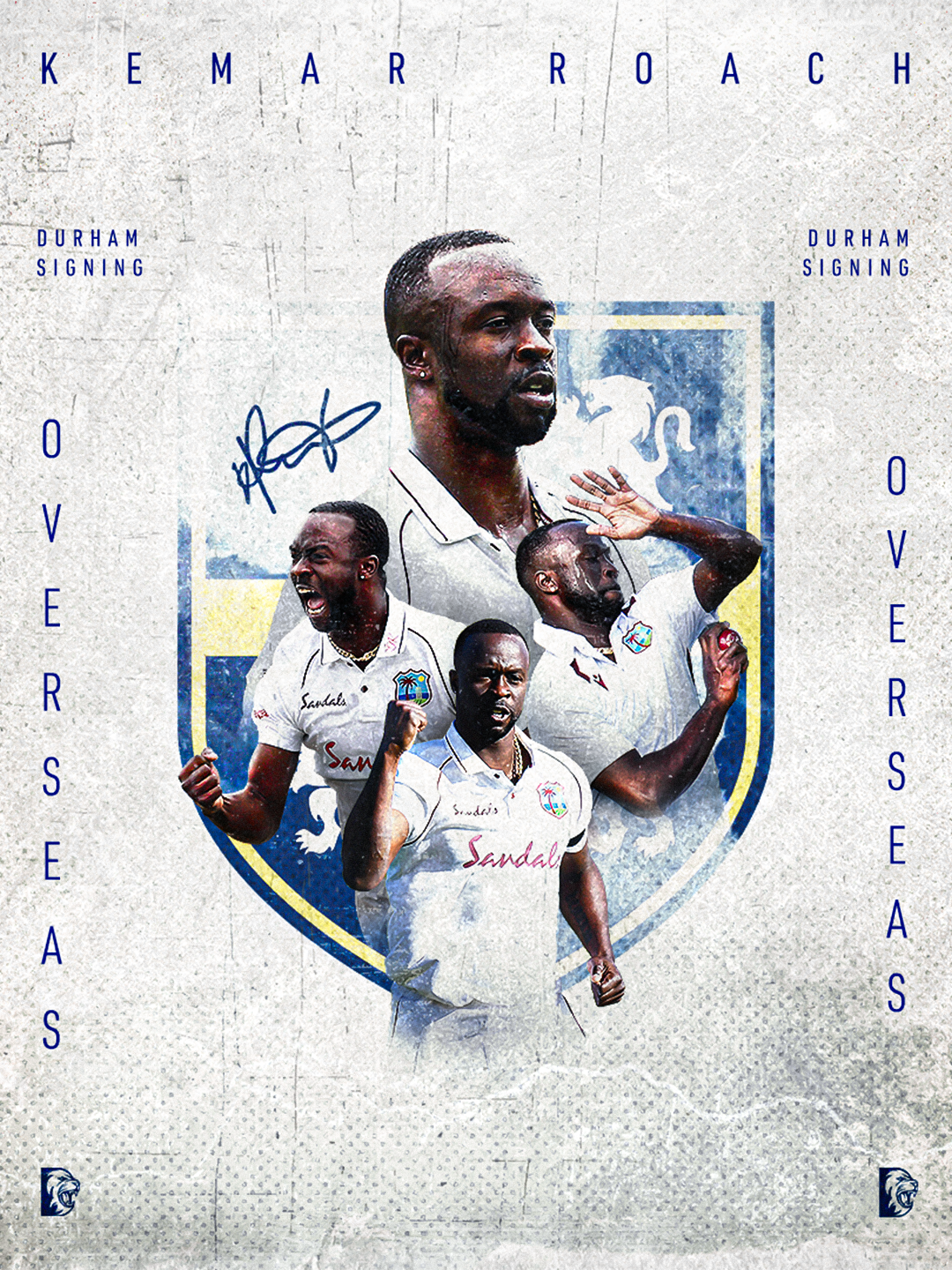
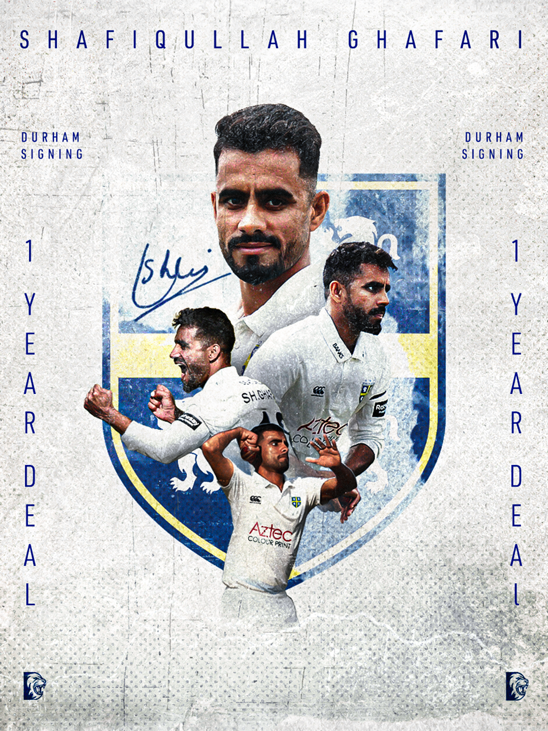
Similar to last year, I used a white-based graphic style for overseas signings and players who renewed their deals to play in the County Championship format. Red ball cricket is the oldest and most traditional form of the game, so the use of texture, grain and a more classic visual style felt appropriate for this type of announcement.
The main update to this year’s graphic was the implementation of the Durham Cricket crest behind the player in the centre of the design. I feel this elevates last year’s approach by adding more depth, structure and importance to the graphic. It also acts as an extra reminder that this is not just a general signing announcement, but a special Durham signing connected to the club’s identity and history.
Overall, this design keeps the traditional feel of County Championship cricket while making the graphic feel more premium and considered. The white base, subtle texture and central crest help the signing graphic feel clean, established and suited to the red ball format.
This supports me in evidencing KSBs: K1, K2, K7, S1, S2, S4, S9, S10, B1, B2, B4 and B5.
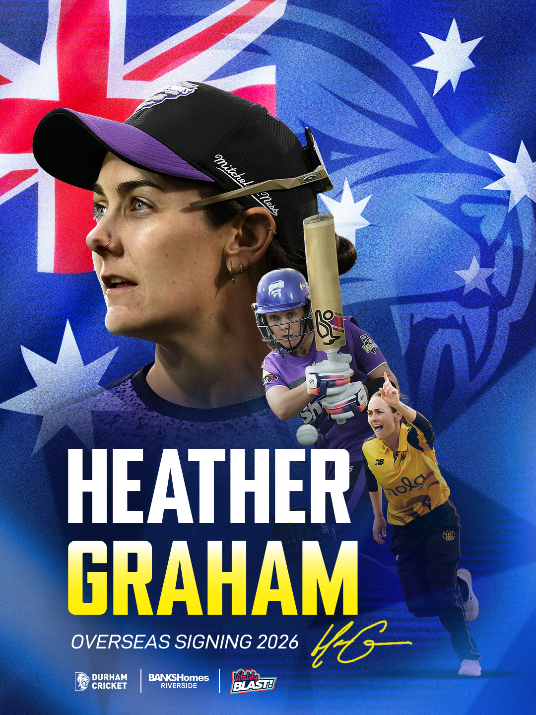
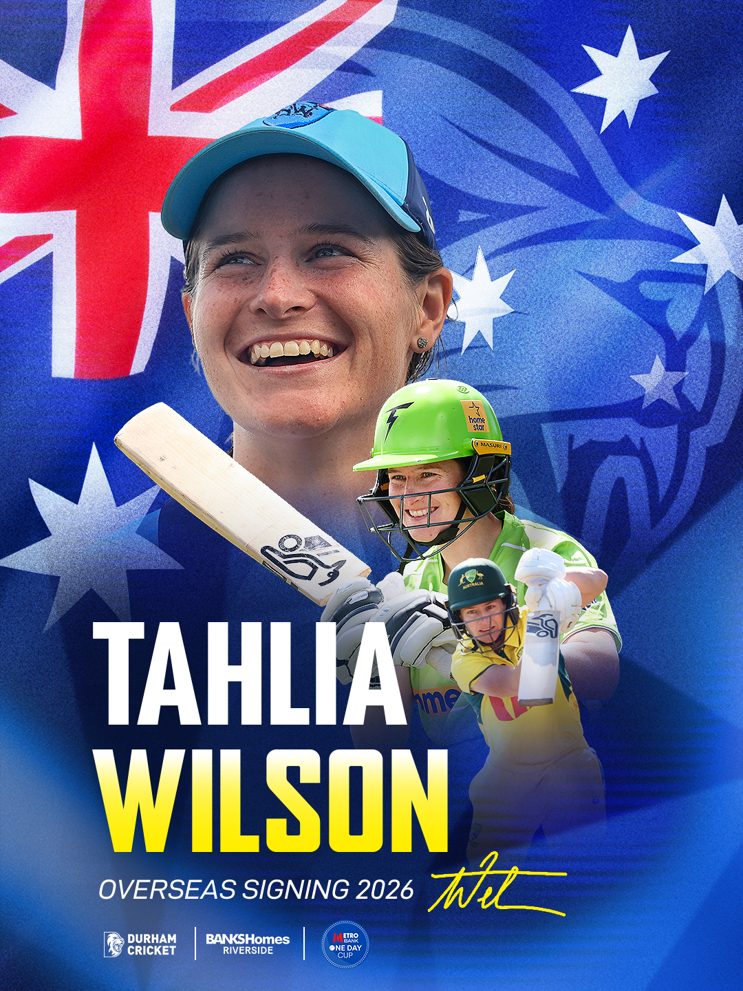
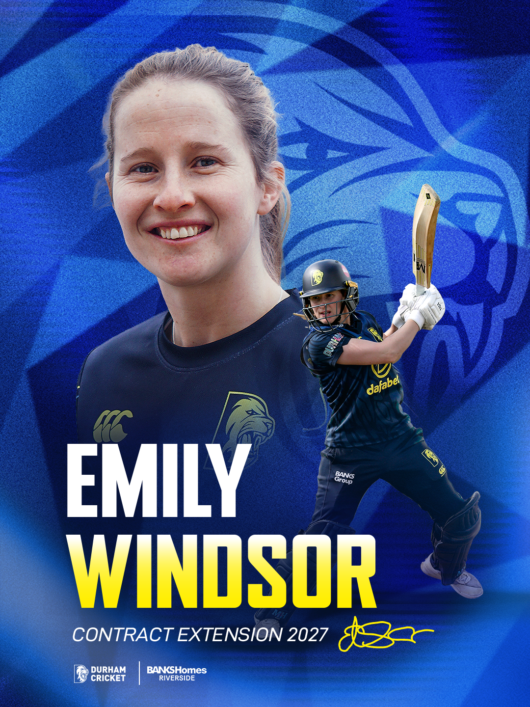
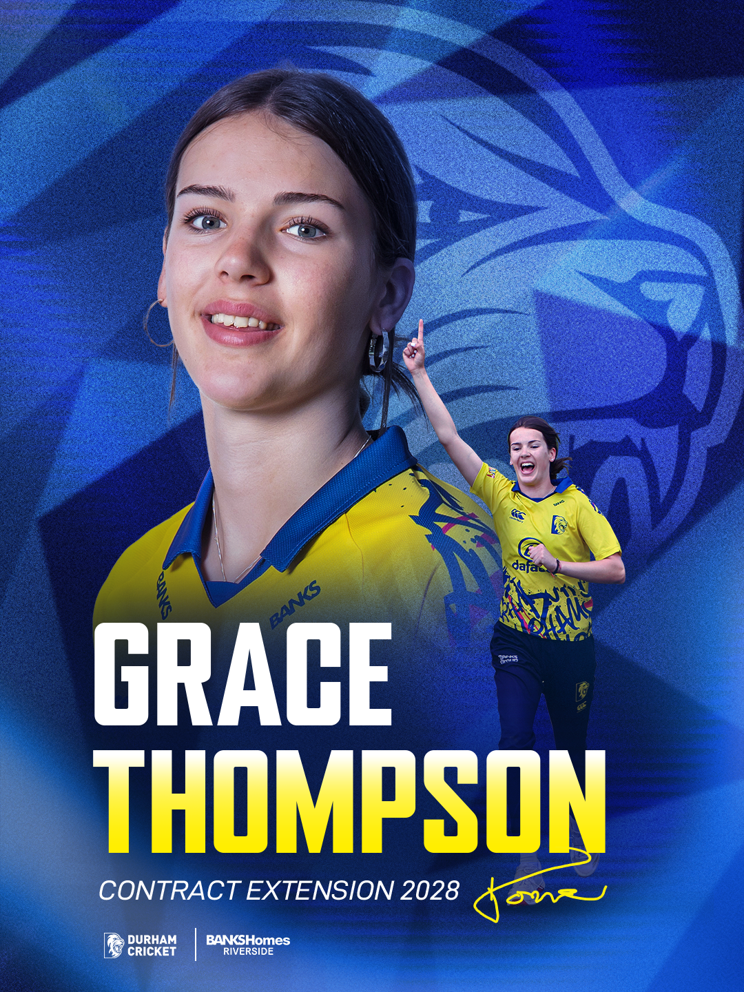
For the women’s signing and extension graphics, I used a consistent Durham blue visual style to keep the designs neutral across the white ball formats. Unlike the men’s County Championship signing graphic, these designs did not need to reference red ball cricket, as the women play across T20 and One Day Cup formats. Because of this, the blue design felt more suitable and connected to the wider Durham Cricket identity.
For overseas signings, such as Heather Graham and Tahlia Wilson, I added the player’s national flag into the background. This helped communicate straight away that they were overseas players, while also making the announcement feel more personal and specific to them. I liked this approach because it added extra meaning without needing to completely change the structure of the design.
For standard player extensions, I used the same graphic style but removed the flag background. This kept the design consistent with the overseas signing graphics, while making it clear that these were normal contract extension announcements rather than overseas signings. This meant the graphics could work as one connected system, with small visual changes depending on the type of announcement.
Overall, I think this approach worked well because it created a flexible template that could be adapted for different types of player news. I particularly liked the flag idea, as it added context in a simple but effective way. This is something I could potentially bring across to the white signing graphic next season, so overseas players still have that personal national identity while keeping the more traditional County Championship style.
This supports me in evidencing KSBs: K1, K2, K7, S1, S2, S4, S9, S10, B1, B2, B4 and B5.