T20 Brochure and Flyer Design
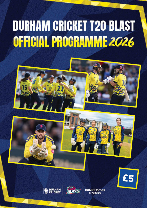
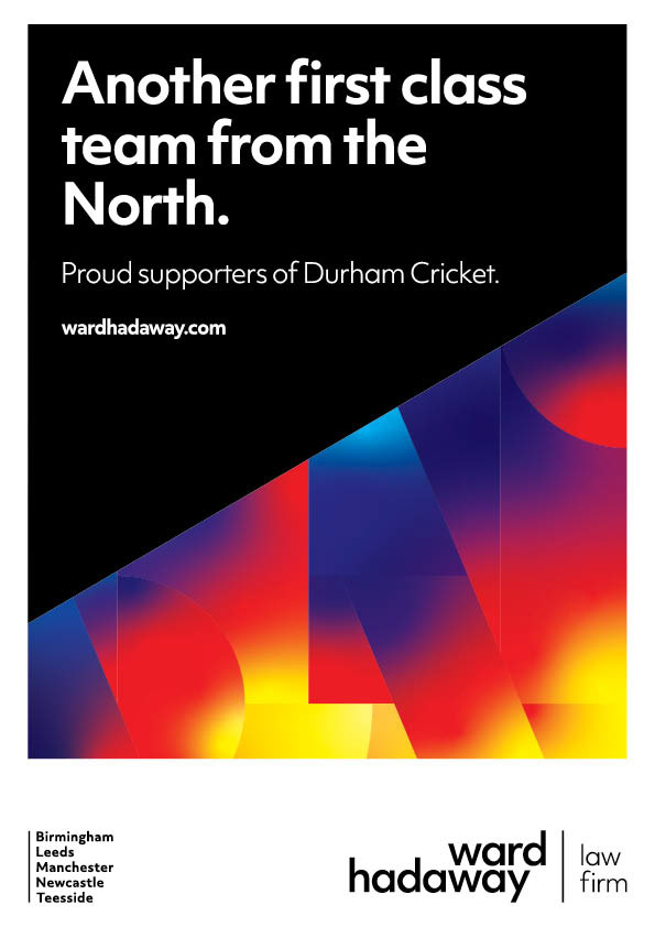
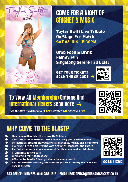
For the T20 brochure design, I wanted to create something that felt completely connected to the rest of this season’s T20 brand assets. I was really happy with the final outcome because it felt consistent, energetic and clearly part of the same visual system used across the matchday graphics, kit design and wider Blast campaign.
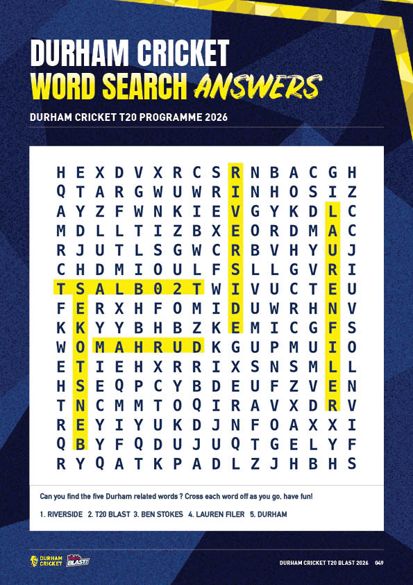
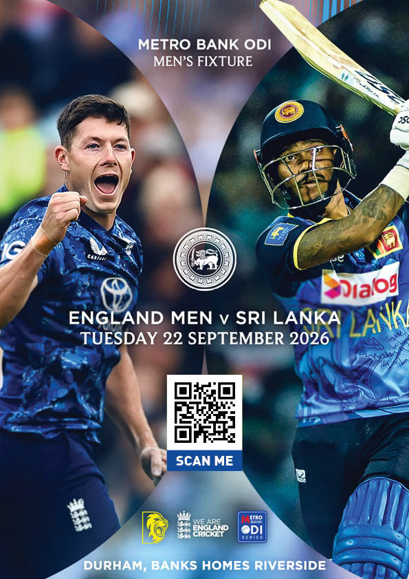
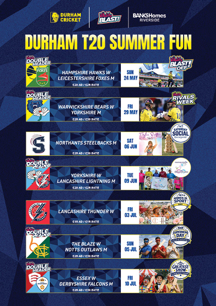
A key part of the design was using the patterns from the T20 kit, along with the wider Blast colour scheme and graphic style. This helped the brochure feel immediately recognisable as Durham Cricket’s T20 format. If someone was familiar with this season’s visuals, they would instantly be able to connect the brochure to the rest of the campaign.
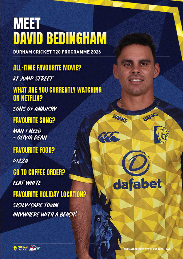
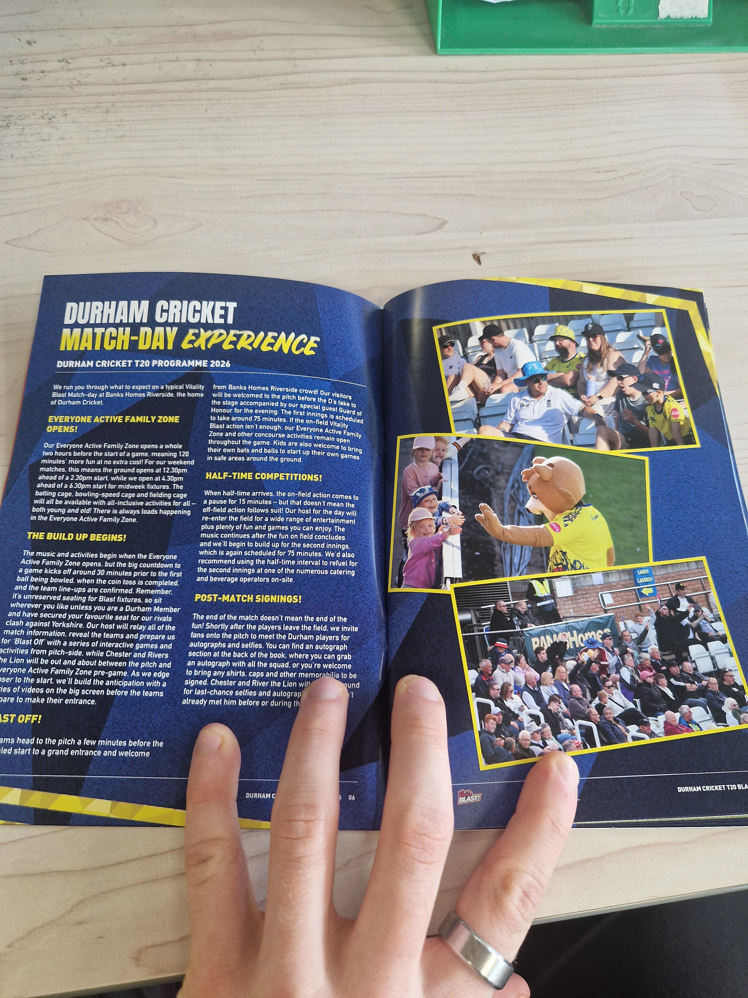
The general layout stayed consistent throughout the brochure, using a clear grid structure to keep the pages organised and easy to follow. I also used a mix of typography, scale and colour to highlight key wording and important information. This helped guide the reader through the content while keeping the pages visually engaging and connected to the wider T20 style.
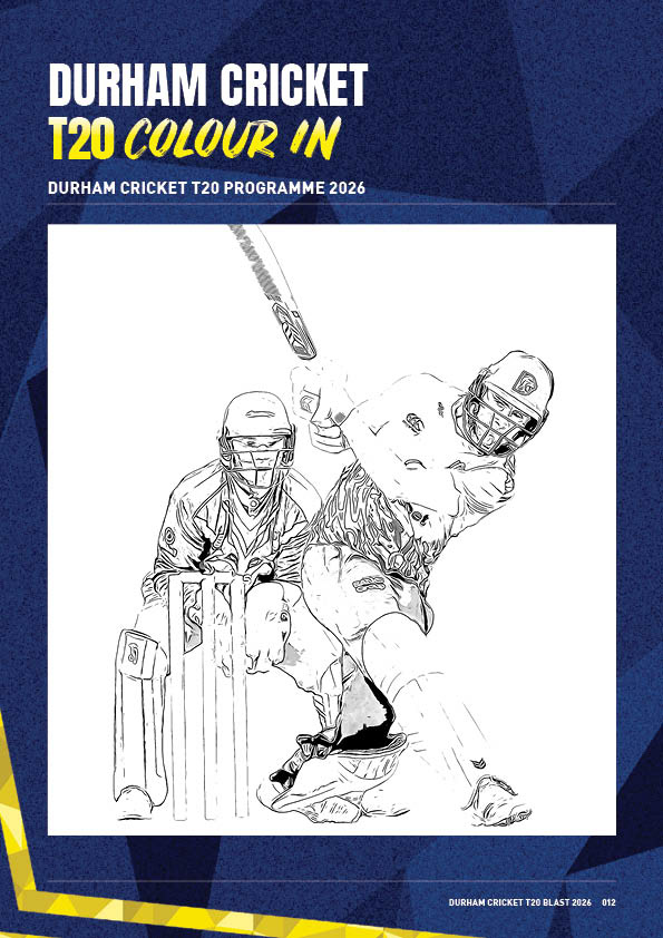
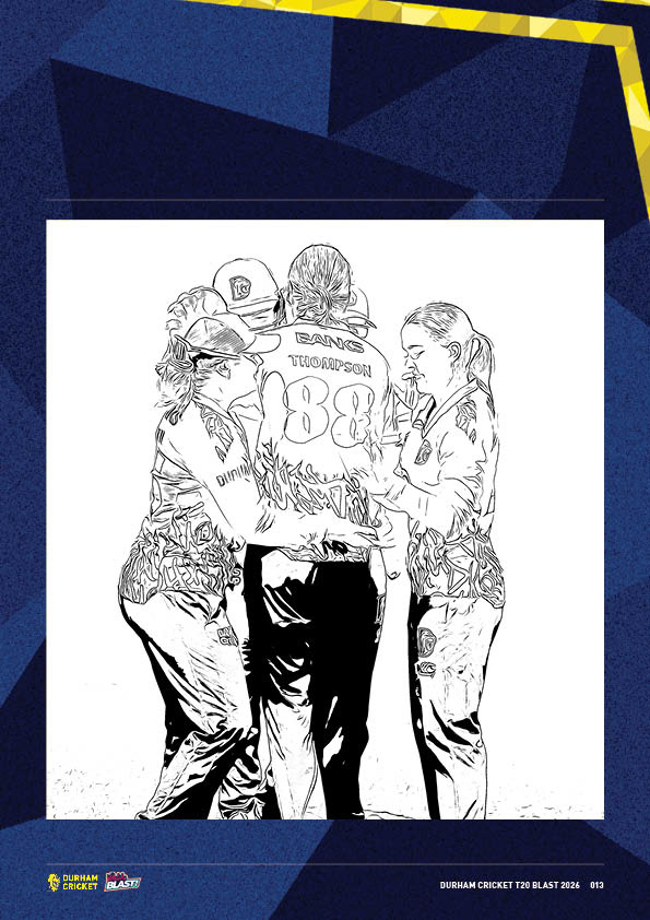
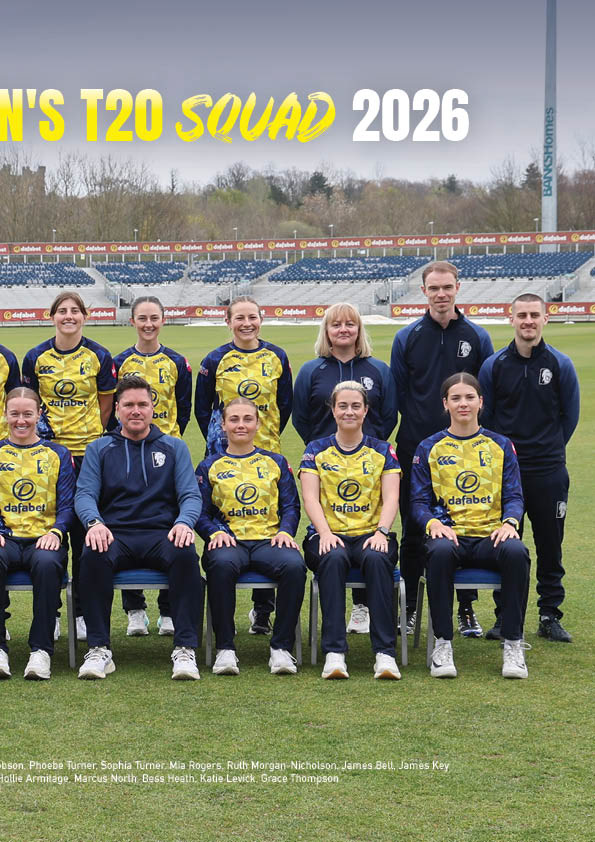
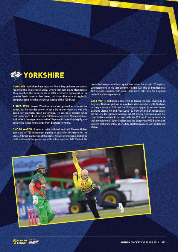
I also focused on smaller design details to make the layout feel more cohesive. For example, I used angled photography that matched the angle of the corner pattern, helping the images feel integrated into the design rather than placed on top of it. These small details helped bring the pages together and made the brochure feel more considered and professional.
Alongside the brochure, I also created a T20 flyer using the same pattern, colour scheme and visual approach. This helped extend the system across another piece of marketing material, while keeping everything consistent. The flyer and brochure worked together as part of the same campaign, rather than feeling like separate one-off designs.
Overall, I’m really pleased with this work because it shows how a strong visual system can be carried across different formats. The brochure and flyer both feel clearly connected to Durham Cricket and the T20 Blast, while still being practical, readable and suitable for marketing purposes.
This supports me in evidencing KSBs: K1, K2, K5, K7, S1, S2, S4, S9, S10, B1, B2, B4 and B5.