T20 Advertising Graphics
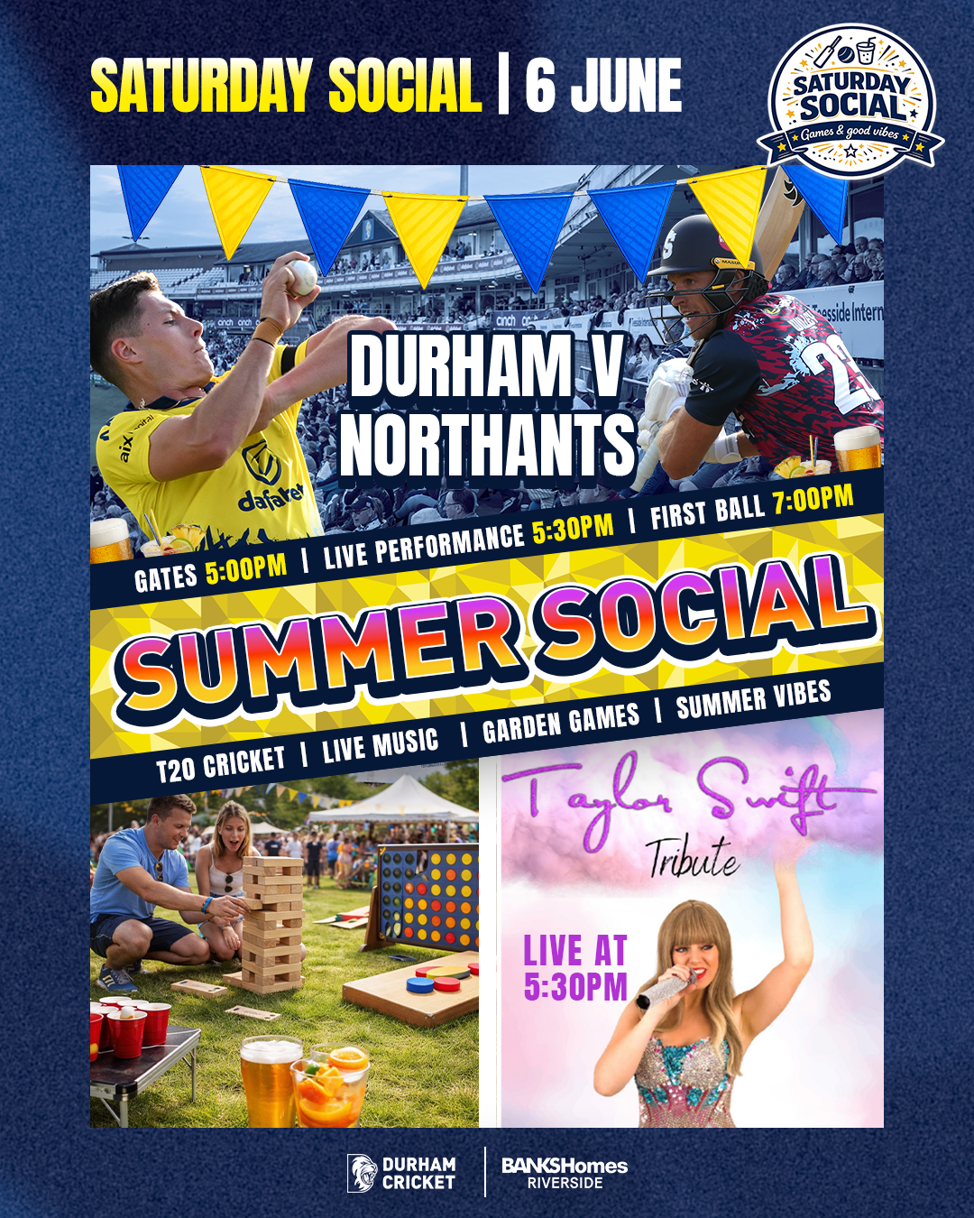
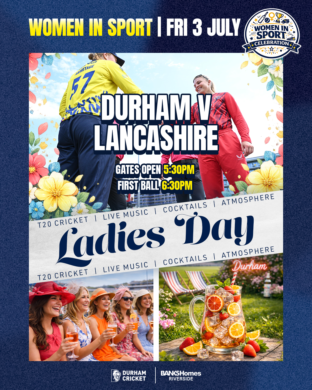
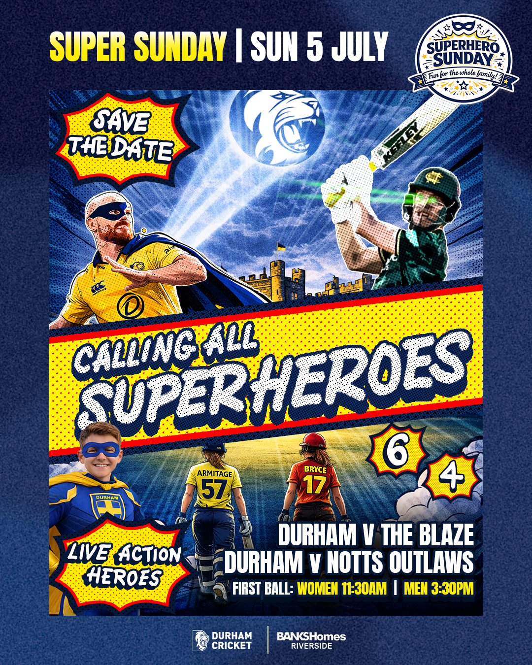
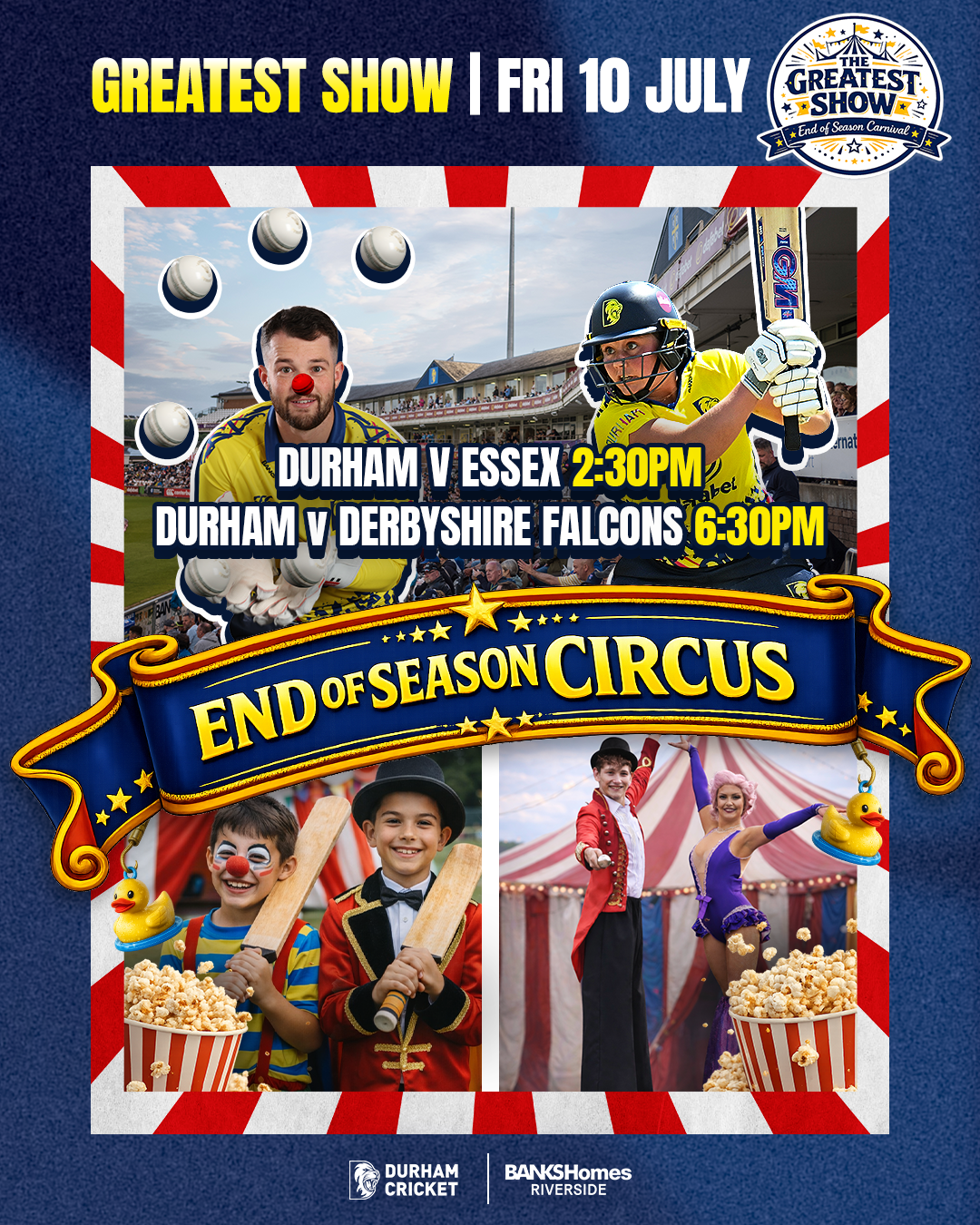
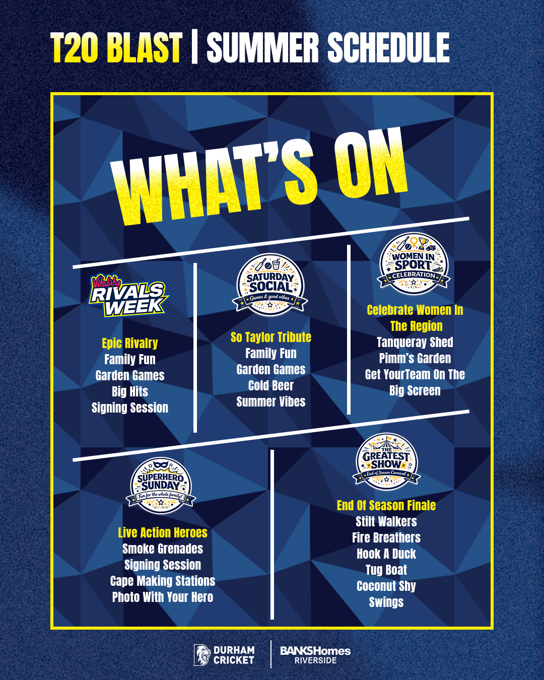
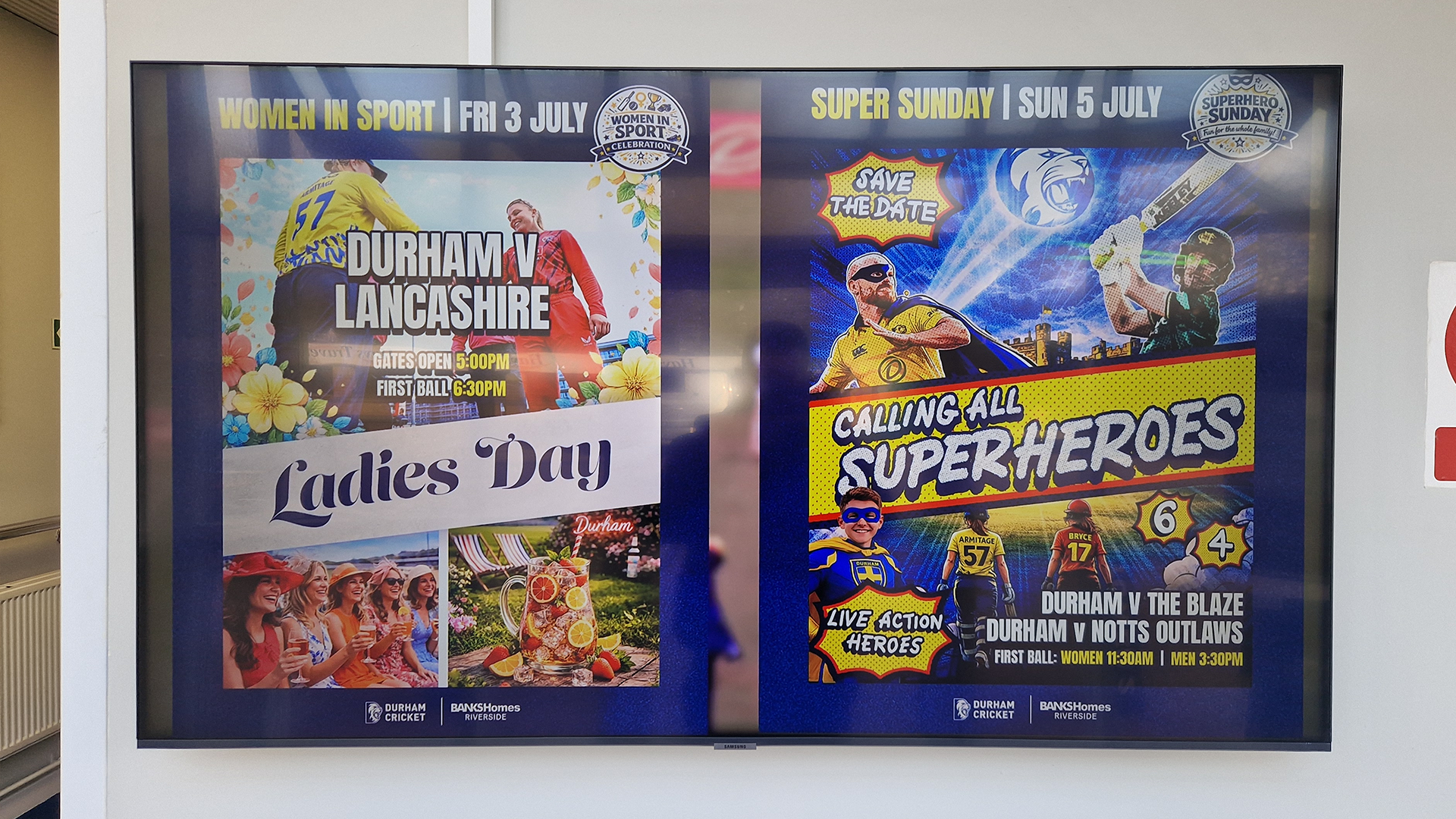
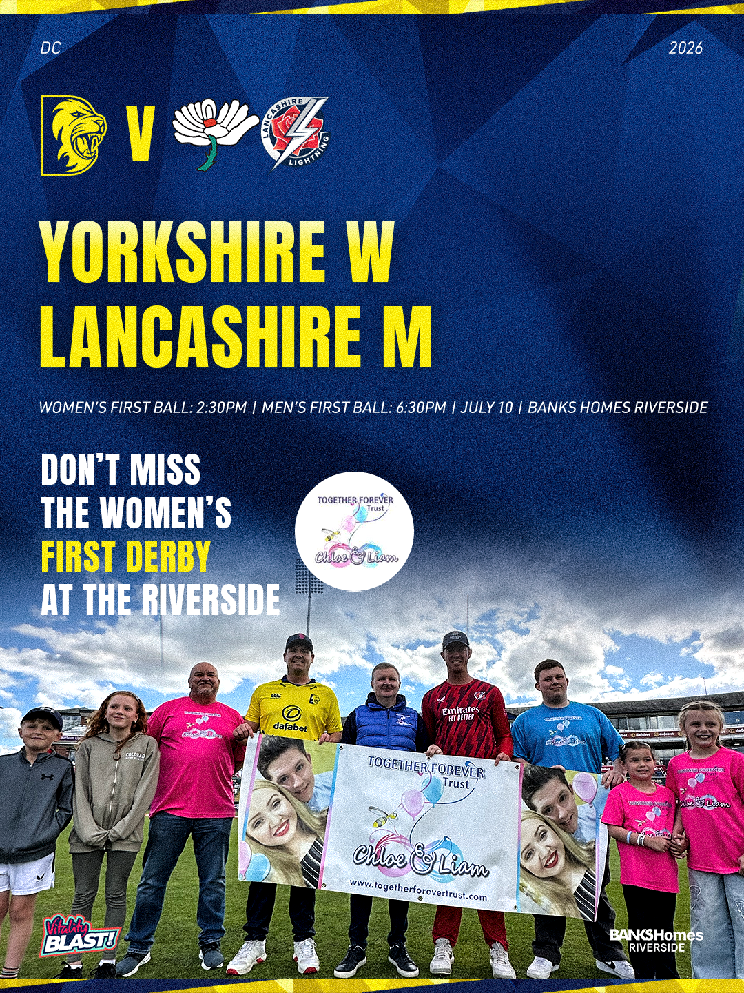
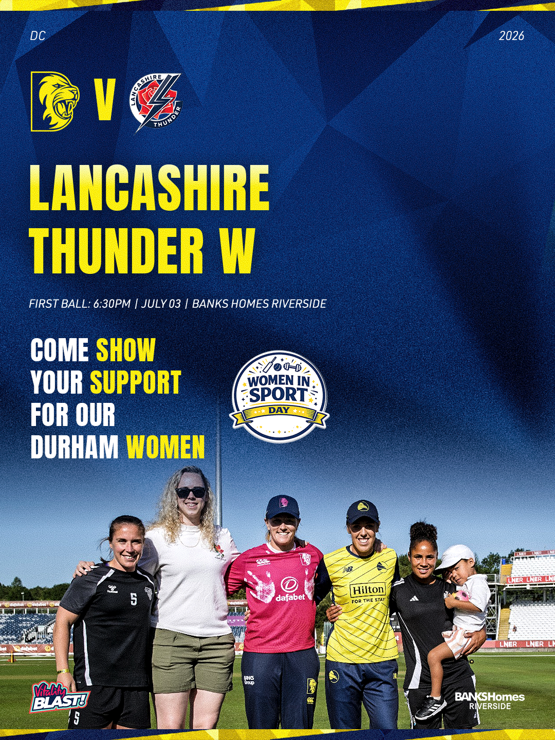
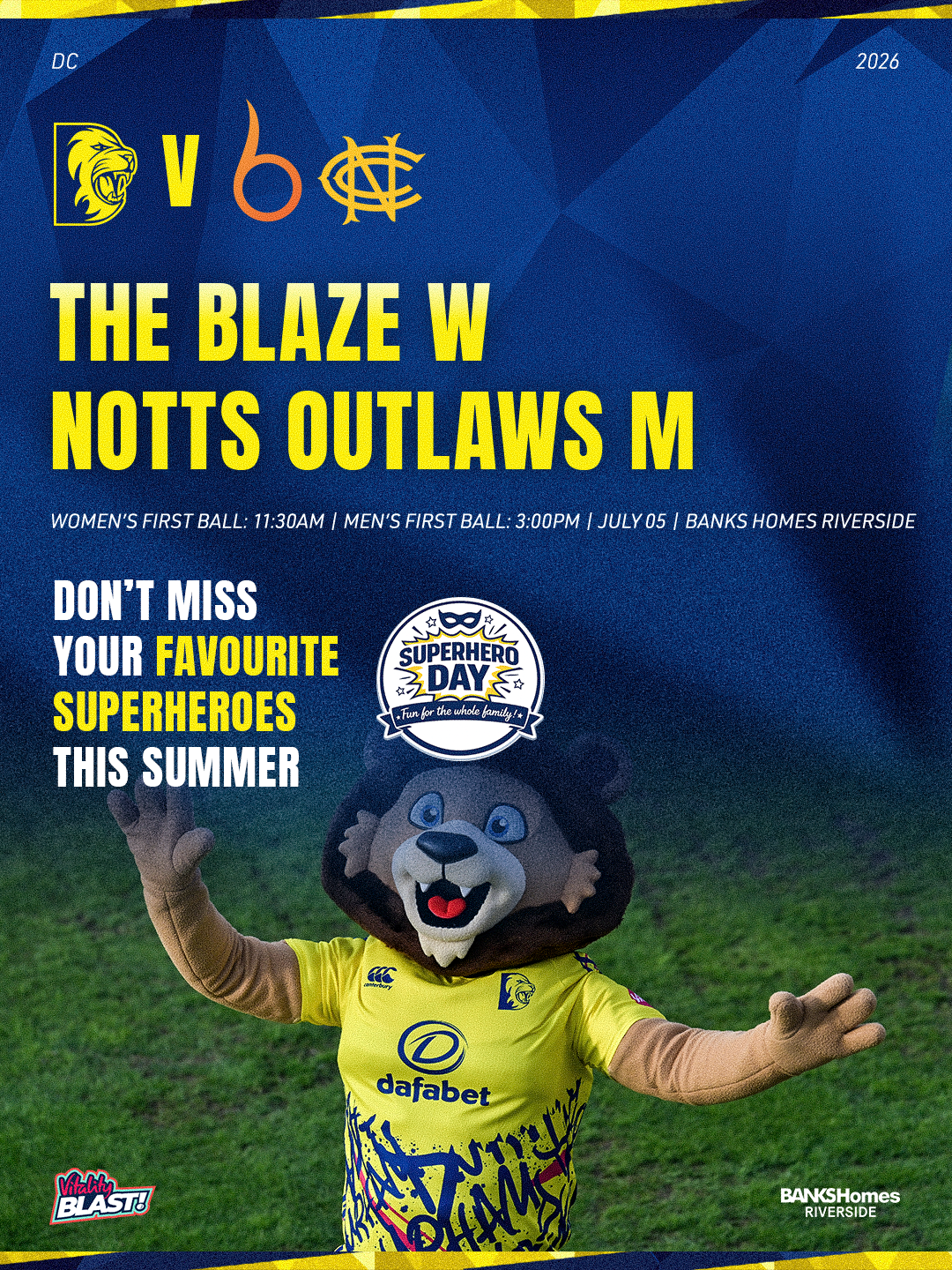
For this season’s T20 campaign, I created a range of advertising graphics that were designed to appeal to different audiences. Some of the adverts were more stylised and theme-based, focusing on the wider matchday experience rather than only the cricket itself. These designs were used to promote extra entertainment factors and help attract a broader audience, including families and people who may attend for the atmosphere, activities and overall day out.
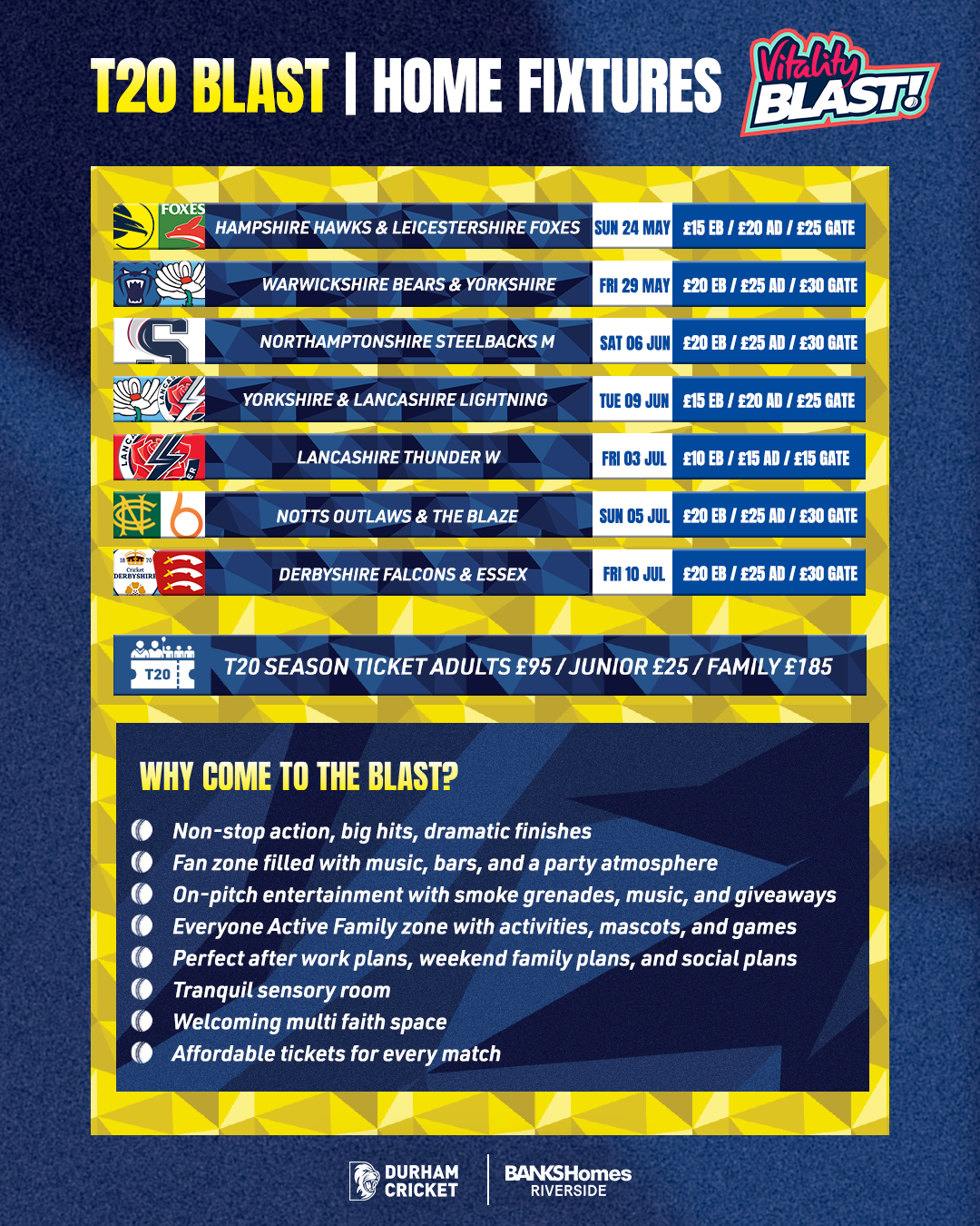
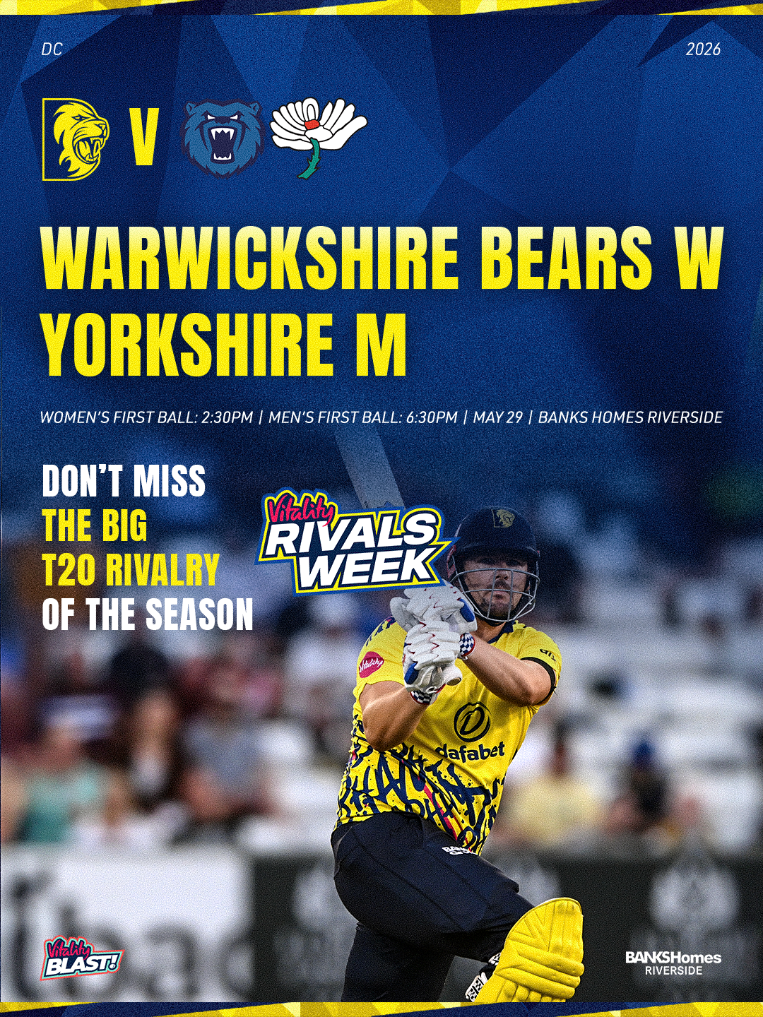
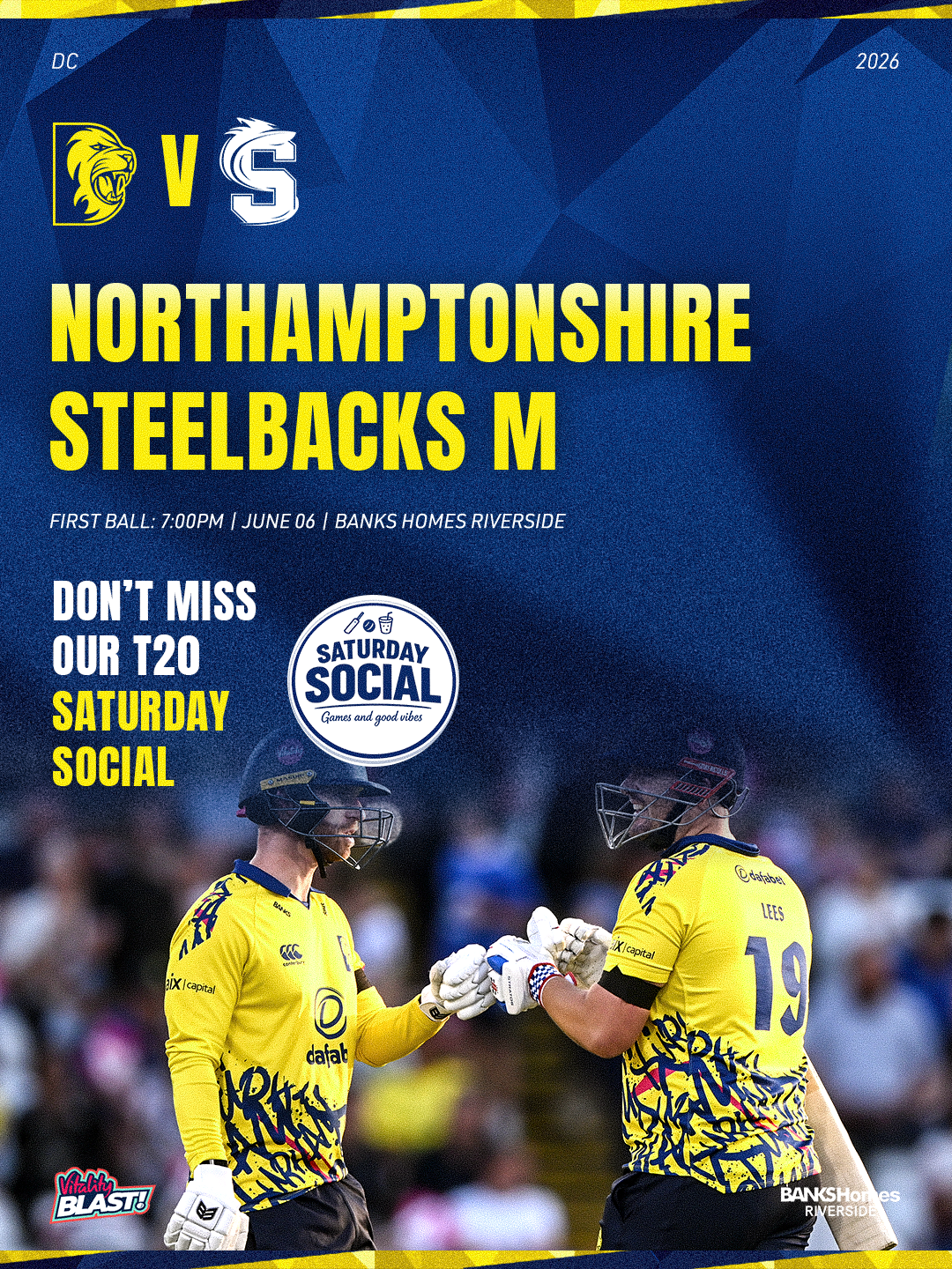
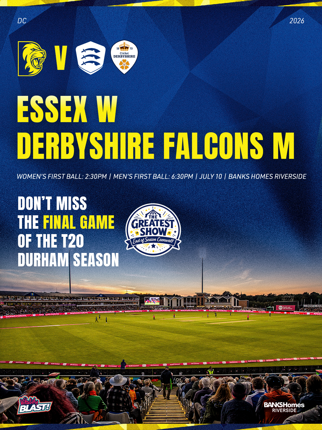
Alongside these, I also created a cleaner set of cricket-focused adverts aimed more directly at cricket fans. These designs used stronger cricket imagery and focused more on the players, fixtures and competitive side of the T20 format. This helped the campaign speak to people who are already interested in the sport, while the themed graphics worked harder to bring in a wider audience.
A key part of this project was making sure the adverts still felt connected to the wider T20 visual system. For the more generic cricket-based adverts, I used the T20 matchday graphic as a starting template. This helped keep the layout, colours, typography and overall style consistent with the matchday content used throughout the season. As a result, the adverts did not feel separate from the rest of the campaign, but instead worked as part of the same format identity.
I think this approach worked well because it gave the campaign variety without losing consistency. The themed adverts helped show T20 as more than just cricket, while the cleaner cricket-based adverts kept the focus on the game itself. Together, they created a more flexible advertising system that could target different audiences while still feeling clearly connected to Durham’s T20 brand.
This supports me in evidencing KSBs: K1, K2, K7, S1, S2, S4, S9, S10, B1, B2, B4 and B5.

Advert Evaluation
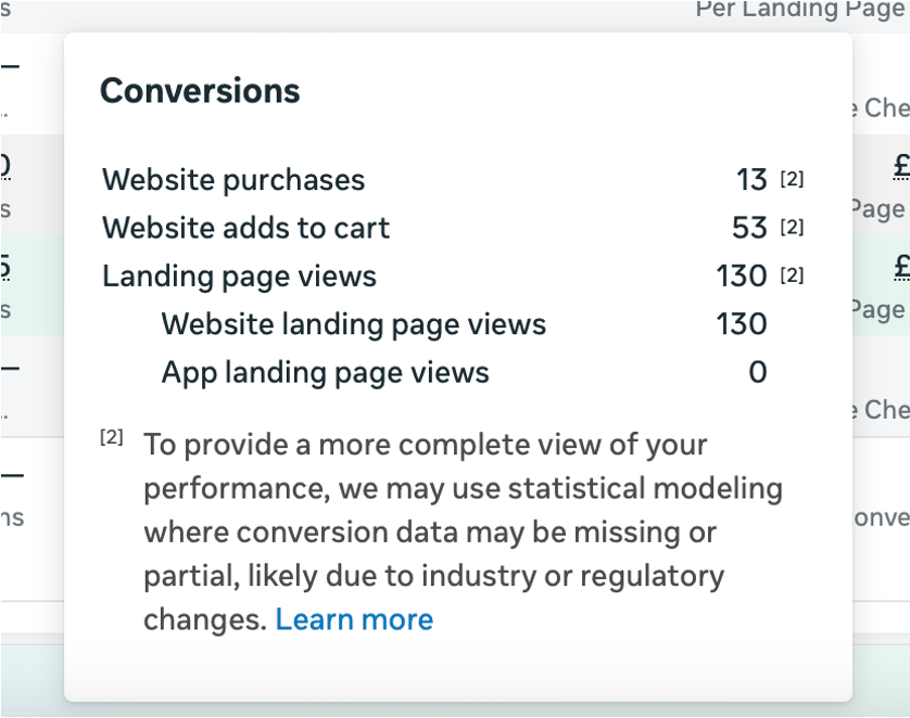
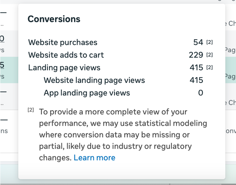
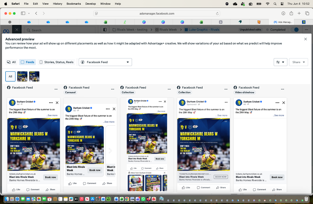
To evaluate the effectiveness of the T20 advert designs, I also received performance data from the Digital Marketer in my team. This allowed me to see how different creative approaches performed when used in live Meta placements across Facebook and Instagram.
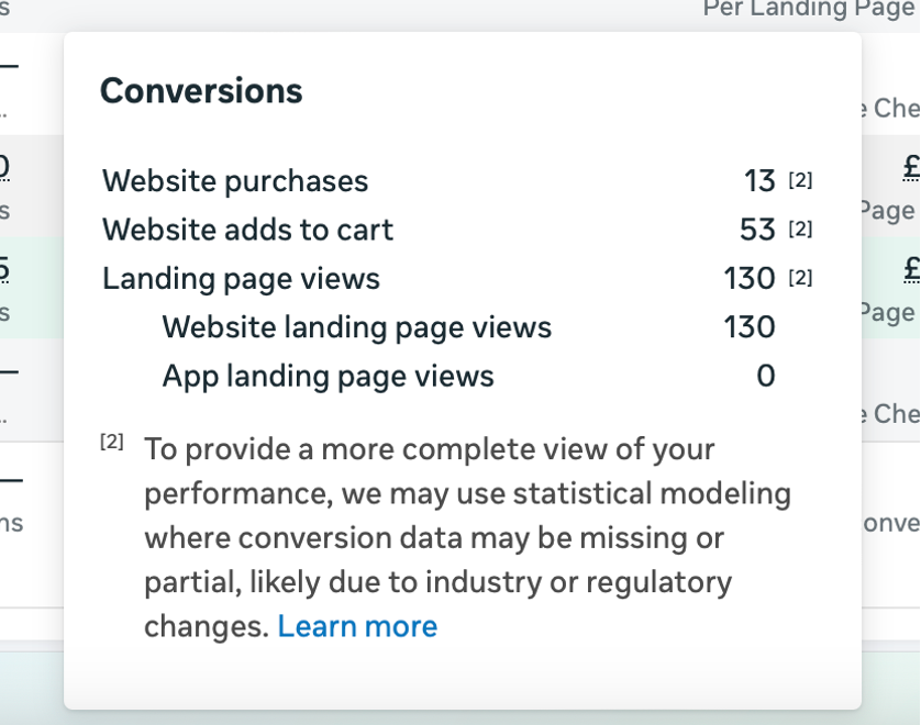
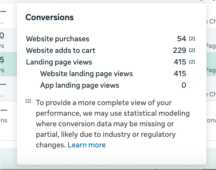
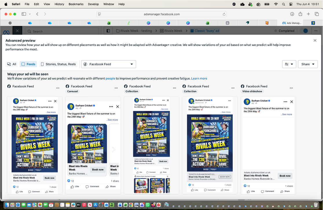
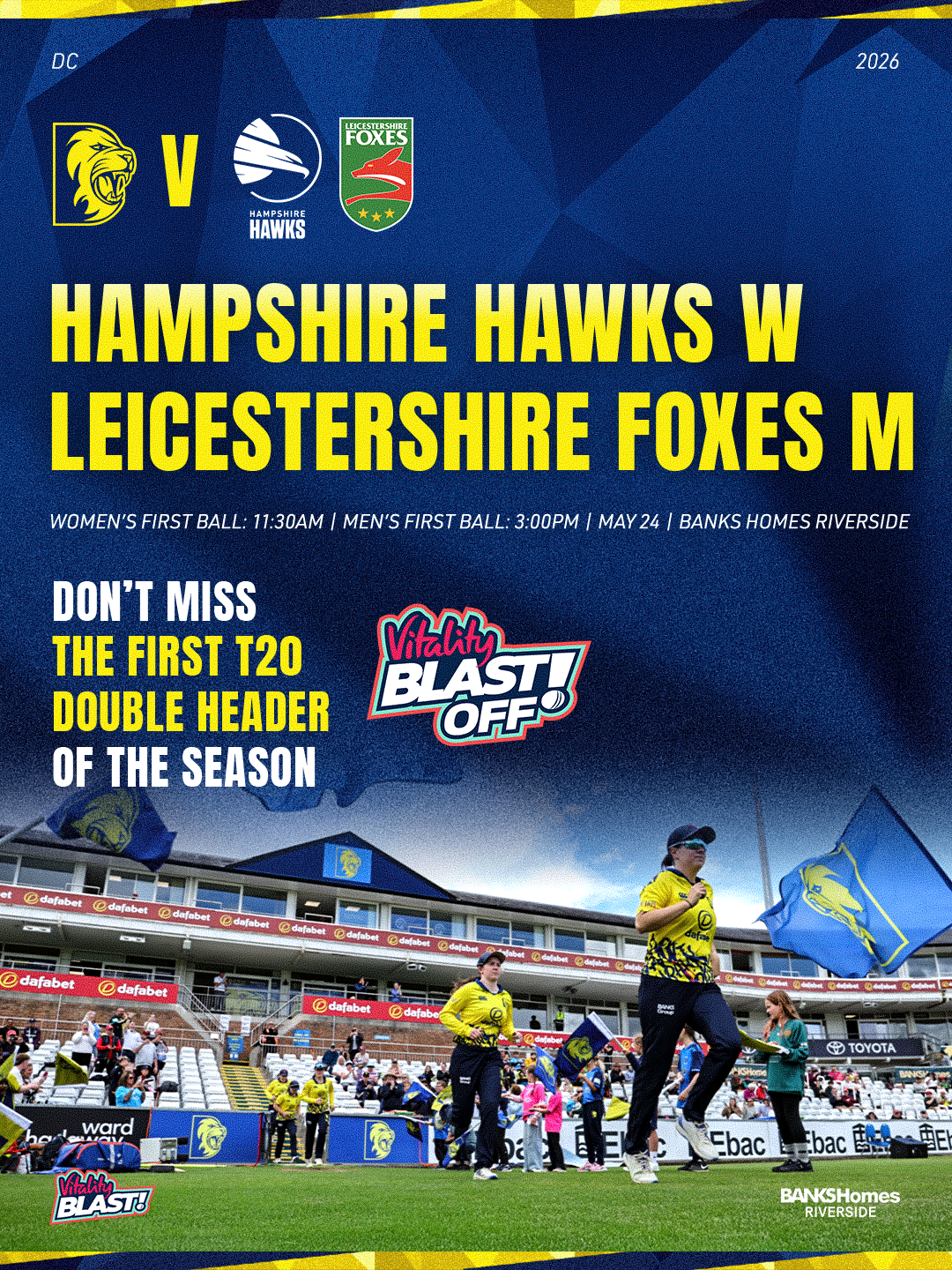
The test compared two different advert directions. One design was more theme based, using a busier and more entertainment focused style to appeal to a wider market beyond just regular cricket supporters. The other design was cleaner and more cricket focused, with a simpler layout that targeted the core cricket audience more directly.
Both designs were used in a test environment with the same spend and similar viewership levels, meaning the results could be compared more fairly. Based on the data, the cleaner cricket focused graphic performed better. This showed that, for this campaign, the more direct and refined design approach was more effective with the target audience.
As a result, I used this cleaner design style as the template for the next upcoming advert I had to create. This helped me understand how important it is to use performance data to inform design decisions, rather than just relying on personal preference or what looks most visually exciting. It also showed me how design can be shaped by audience behaviour, campaign goals and real marketing results.
Busy V Clean