Project Overview
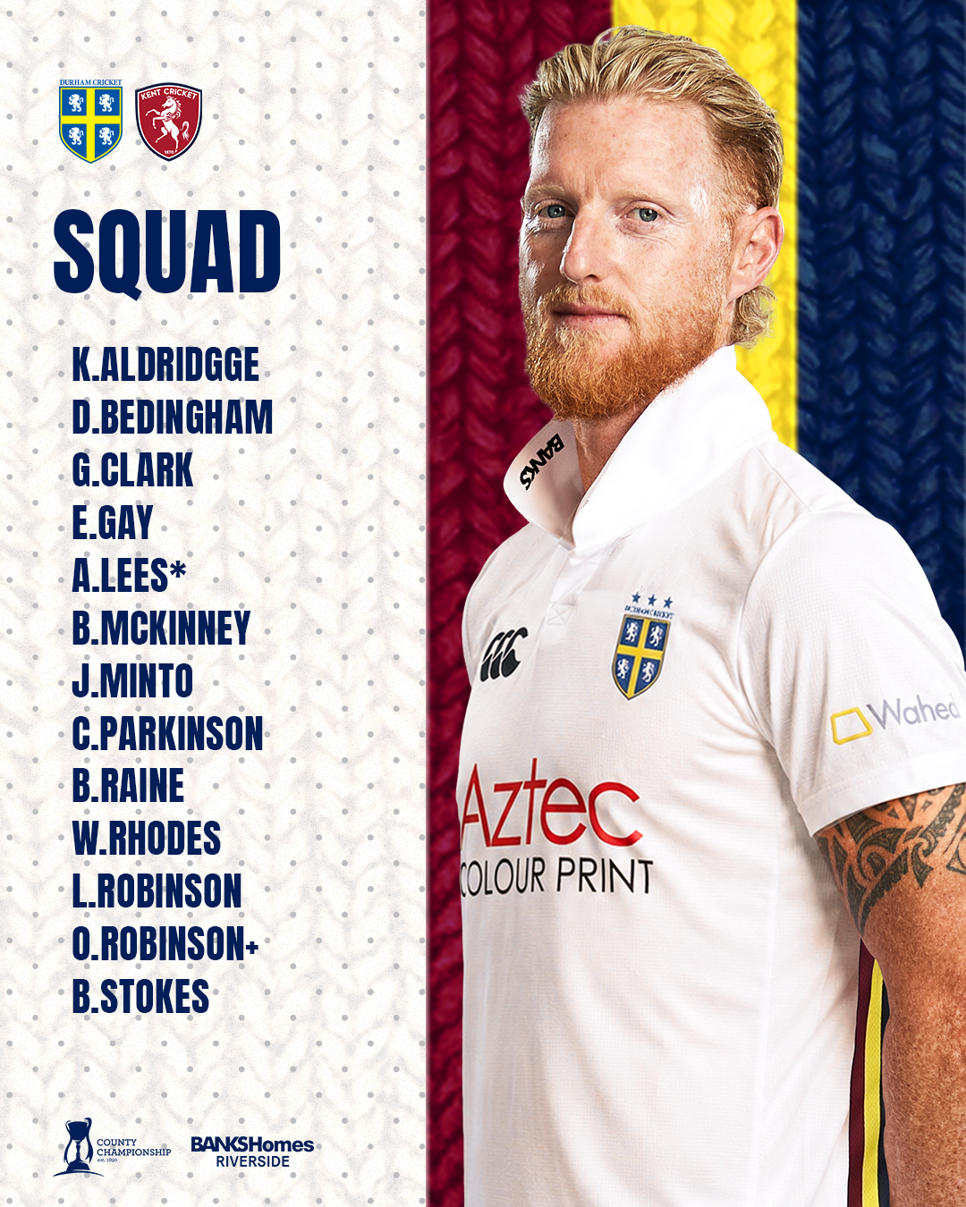
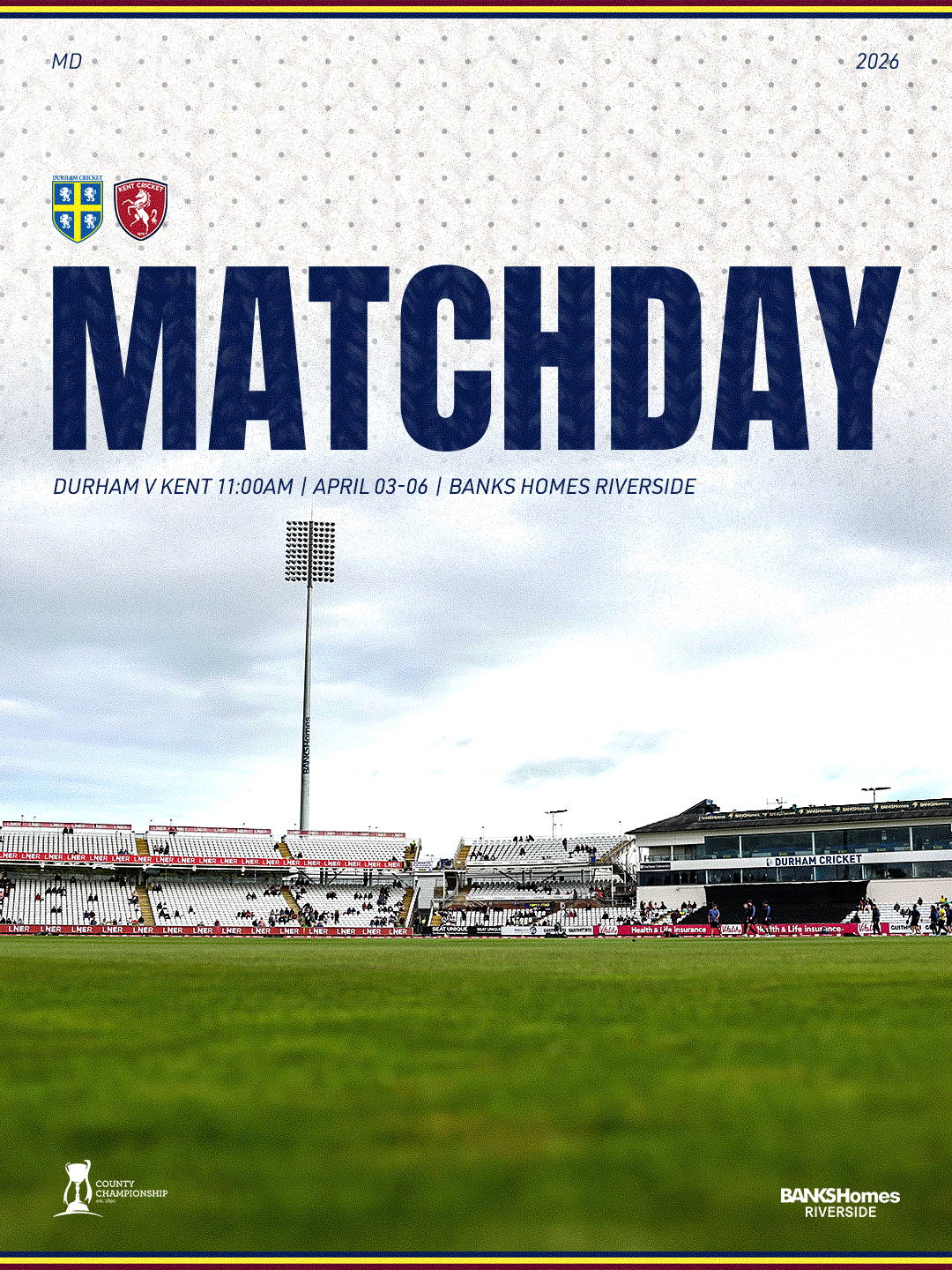
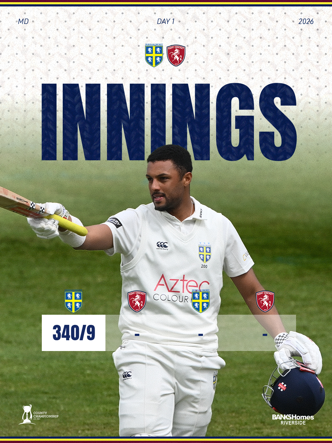
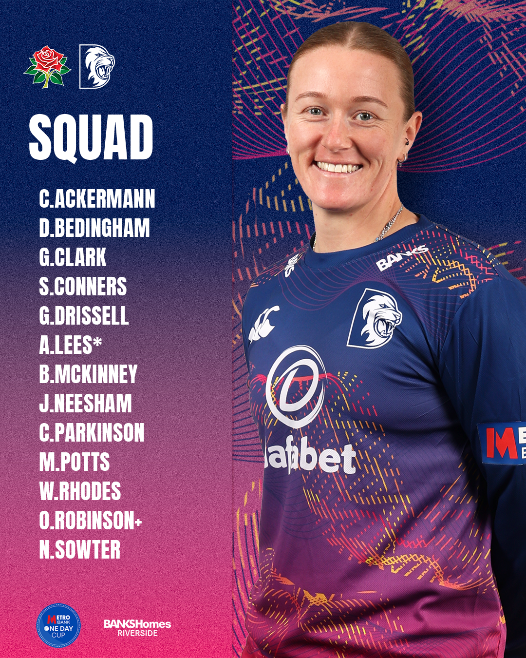
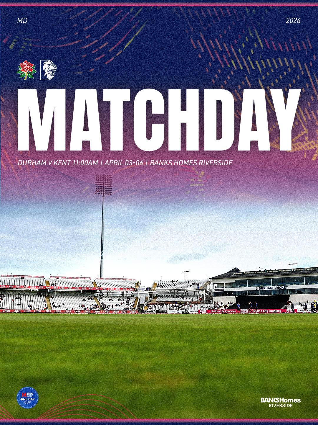
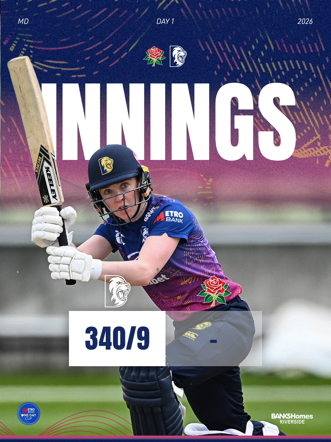
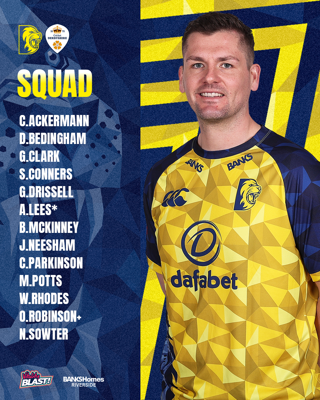
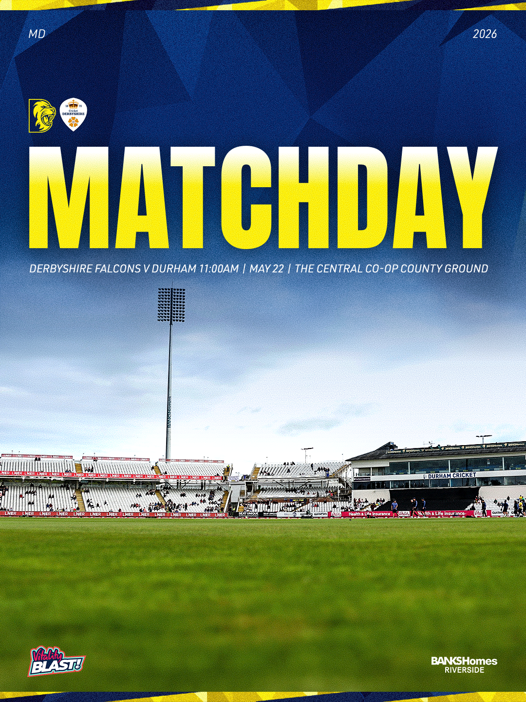
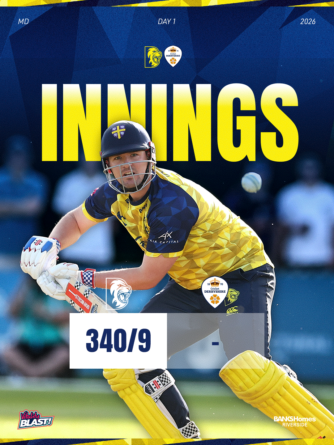
Similar to last year's match graphics, the purpose of these are to communicate with the Durham fans, updating them on key match details, squad news and the starting XI. These are just a few examples of the type of content shared on match days, covering the different formats of the game. The blue designs were used for One Day Cup fixtures, yellow for T20s, and white for the County Championship.
These have become some of my favourite pieces as a whole due to them working so well as part of their systems separated by game format and setup perfectly for my team to edit, colour coding layers etc. The designs have really improved since I joined, and it’s rewarding to see them stand out more on match days.
This work supports me in evidencing KSBs: K1, K2, K7, S1, S2, S4, B1, B2, B4 and B5.
Project Reflection
This year’s matchday graphics feel like a much stronger and more consistent system. Rather than creating separate designs that only worked on their own, I developed a clear template structure that could be adapted across each format while still feeling part of the same campaign. Each format had its own colour treatment and pattern, but the layout, typography and overall visual style stayed consistent. This helped the graphics feel more professional, organised and recognisable across the season.
One of the biggest improvements was the use of ground imagery and match photography for score and innings graphics. This worked much better than repeating the same player cut-out approach used on the lineup or squad graphics. By using more atmospheric imagery from the ground and real moments from the game, the match updates felt more alive and connected to the event itself. It also meant each graphic had its own purpose, rather than feeling like a repeated version of another asset.
The different designs now feel more balanced as a full set. The lineup and squad graphics still focus on the players, while the score and innings graphics focus more on the match environment and key moments. This creates more variety across social media, while still keeping a satisfying level of consistency through the use of templates, colours, patterns and typography.
Another strength of this year’s system was how easy the files were for colleagues to edit. I set the Photoshop files up as clear templates, meaning they only needed to swap out the photos rather than rebuild the graphic each time. The player overlapping the text was created using a duplicated image layer, but the file was organised with colour-coded groups, labelled layers and locked elements. This made the effect easy to update while also protecting the main structure of the design, so the graphic was not easy to accidentally mess up.
I think this system works really well because it gives the match-day graphics a clear identity without making every post look exactly the same. The graphics feel connected, but not repetitive. This has helped me understand how important a strong design system can be, especially when creating a large number of assets across a busy sports season.
Overall, I’m really happy with how the match-day graphics have developed this year. They feel cleaner, more flexible and more professional than previous versions. The biggest improvement is that they now work as a full visual system, rather than just individual designs. They are also more practical for the team to use, which makes them stronger as real-world design assets.
This supports me in evidencing KSBs: K1, K2, K7, S1, S2, S4, S9, S10, B1, B2, B4 and B5.